Google has begun rolling out a new, feature-rich layout for the Google Play store on Android, inspired by its new Material Design philosophy.
Material Design homescreens have already landed for Google’s Docs, Sheets and Slides services on the web, while we’ve seen a revamp teased for Chrome OS, and this is in line with them. Apps, music and content sports cover art, the menu for apps is brighter and details are more pronounced and easier to read, among other things.
The image from Anandtech shows the previous previous of the Play Store app (left), compared to the new one (right).

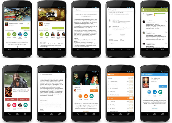
Google’s Kirill Grouchnikov shows more samples:
Google says the new design is being introduced gradually over “the coming days,” so you may need to wait patiently before it arrives on your device.
➤ @GooglePlay [Twitter] | Via Engadget
Get the TNW newsletter
Get the most important tech news in your inbox each week.