Yesterday, Google began rolling out a brand new Search page design in the US — coincidentally right as the Presidential Election reached its climax. The timing may or may not have been intentional, but either way you’ll be forgiven if you’re only just noticing the new design now as the political fog settles.
At first look, your first impression of Google’s new (currently US-only) Search page may be positive. There are many impressive traits in the new layout, largely relating to how uncluttered the design is, despite the massive amount of work that is inherently involved in generating quality search results. One improvement involves Google Image Search, which now lets you scroll straight into a full-screen grid of photos, thanks to a responsive design and continuous scrolling.
But then, as the new car smell wears off (on the Internet, that takes about 10 minutes), strange design decisions start to blemish an otherwise successful step in the evolution of Search. First, let’s take a look at the new design, and then we’ll dive headfirst into the problems:
Redundancy
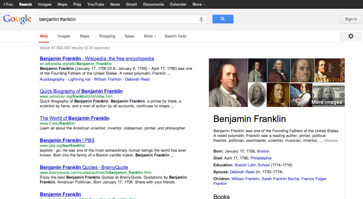
In simplifying an already simple design, Google has made its navigation more redundant than ever before. While there are many situations where navigational elements and features should repeat themselves, such as in workhorse apps like Photoshop, there’s really no excuse for what users (logged in and logged out) are seeing:
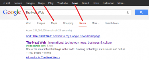
Something strange is happening in the above screenshot; Google is using duplicate names for navigational elements which yield different results.
How can this become a problem? Here’s an example:
After a performing a Web search, there are now two aligned links for News. Both links look similar, but perform different actions. If you click the lower link, Google will remember your current search and re-perform that search for relevant news stories. Clicking the top News link in the black navigation bar, however, resets your search and shows recent news stories instead.
On the contrary, the two Images links perform nearly the same exact function, both showing you relevant image results for your search, with a few exceptions.
To be clear, this issue has existed in various forms in the past. Now it has been exacerbated.
With the new design, I’m concerned that Google’s redundant navigation takes up space while confusing users. Of course, I’m aware of the purpose of Google’s omnipresent black bar, but for many users, emphasizing secondary search navigation in this way will lead to problems. Strange enough, the top black bar isn’t present at all for encrypted searches (example).
Knowledge Graph and holy white space
Minimalism has become a highly valued design trait to the mainstream, partially thanks to Bauhaus and Swiss Style-influenced companies like Apple. But minimalism isn’t about under-utilized space, and that’s what Google is providing its users in many of their searches.
First let’s look (again) at a useful example of how the new design can take advantage of Google’s recently expanded knowledge graph results:
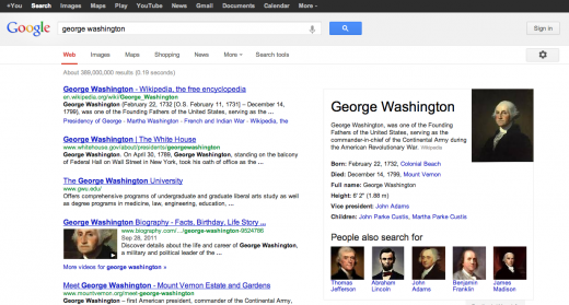
In the above search, Knowledge Graph’s key details and related results will be helpful to many users. But what happens when a search simply doesn’t trigger the knowledge graph at all?
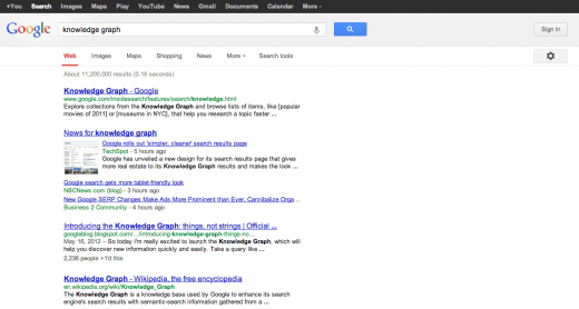
If you search for a term like “knowledge graph,” you’re left with an insane amount of white space. Even as Google’s Knowledge Graph improves, emerging topics will likely always end up barren in this design.
As far as possible solutions go, simply stretching out the search results wouldn’t help, but there has to be a better way to utilize that empty space. Previously, advertisements filled up the right side of the page, and now for many users, those ad blocks have completely disappeared (perhaps temporarily).
The design we’re seeing now doesn’t feel lighter and more efficient, but instead is emptier. That’s not minimalism.
An unfinished rollout
Perform a Web search for something random and then click the lower Maps link.

This is what you’ll get:
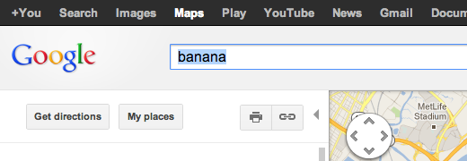
Where’d the secondary UI go? It should have stayed in place, as it does after clicking Images and Shopping. This may simply be a byproduct of Google’s famously slow rollouts, but it’s still a strange inconsistency.
Context
Google has generally done an impressive job with redesigns over the past few years. Especially when you consider how popular its products are, improving upon the world’s most popular site without angering a ton of users takes an insane amount of work.
With this in mind, it’s still confusing that Google would hit some of these roadblocks in the first place. The tech giant has enough resources and clout to hire the best designers around, and yet it has hit some elementary bumps.
As always, Google loves to iterate, and it wouldn’t surprise us at all if this new design continues to be adjusted incrementally. Here’s to hoping improvements come soon.
Image credit: Adam Berry / Getty Images
Get the TNW newsletter
Get the most important tech news in your inbox each week.

