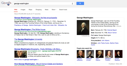
Google today announced some changes to its search page for users in the United States, with a cleaner interface containing fewer elements.
This follows moves to simplify and refocus search result layouts on tablets and smartphones in the last year.
The safe search dropdown, for instance, is nowhere in sight. By removing ads from the sidebar, the design puts a further focus on the Knowledge Graph with attempts to provide information directly from the results rather than a simple list of links.
Search tools are now accessible via the “Search tools” button underneath the main search bar and above the search results, not to the left of them as they once were. The cogwheel for advanced options is in the same place, on the right hand side of the screen.
Google says it is working to get the redesign out internationally shortly.
Image Credit: AFP/Getty Images
Get the TNW newsletter
Get the most important tech news in your inbox each week.


