![Google testing sleek new tablet-friendly search layout [Update: Now live]](https://media.thenextweb.com/2011/07/google-lego.avif)
Google is testing a new layout which appears designed to bring to tablet devices the new design aesthetic we’ve recently seen applied to the likes of Calendar and Gmail. Update below.
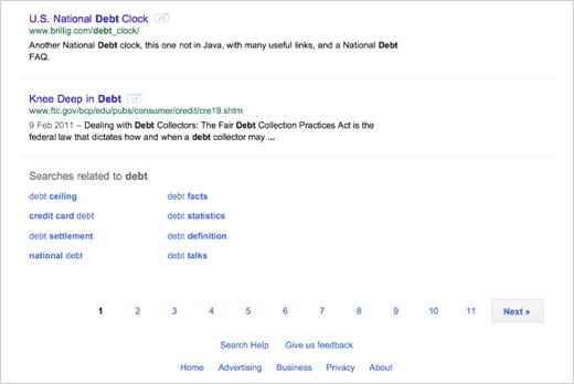
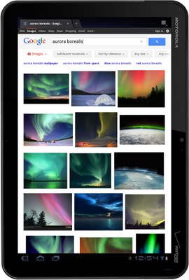
As reported by Digital Inspiration, the screenshots below show a navigation bar across the top of the screen replacing the previous sidebar navigation, complete with drop-down menus for filtering results. Additionally, the ‘Goooooooooogle’ graphic at the foot of the screen is gone, replaced by a cleaner, if less fun, row of numbers to navigate to later pages.
While Digital Inspiration’s Amit Agarwal doesn’t specifically state in his report that this is a tablet-focused redesign, he has confirmed to us separately that he accessed the new look via his iPad. This tallies with a couple of other reports we’ve spotted around Twitter of a tablet-friendly design being tested.
As with most Google design tests, it appears to be entirely by chance whether you’re served the standard layout or the new interface, and there’s no guarantee that the new one will see a wider rollout. Still, it looks impressive to us and we can’t wait to give it a go.
Update: Google has announced on its official blog that the new tablet-friendly search layout is going live starting now on Android 3.1+ devices and the iPad in 36 languages. The feature will be rolling out to users starting today and you can visit Google on your tablet to see if it’s available to you.
Get the TNW newsletter
Get the most important tech news in your inbox each week.