Windows RT, Microsoft’s Windows 8 spinoff that only ran touch-friendly apps, kinda sucked.
The Surface and Surface 2 it powered were admittedly nice pieces of hardware, but the ecosystem of touch apps just wasn’t there. Windows RT couldn’t escape the shadow of legacy applications, so the people who did buy a Surface gravitated to the more powerful – and more expensive – Pro series to run ‘real’ software.
Enter Microsoft’s new $499 Surface 3, available for preorder today and due for release May 5.
This time it’s running full-fledged Windows 8.1 – Windows 10 is a free upgrade upon release this summer – meaning Windows RT has once and for all disappeared into the aether. Good riddance; this is a real laptop.
…Or tablet, I guess. The dichotomy of the Surface line is as present as ever here, but there’s no question the Surface 3 makes more sense as a tablet than the Pro model.
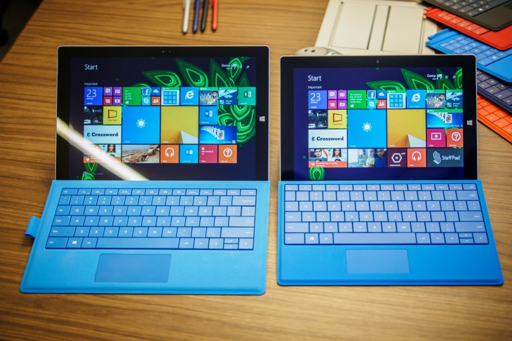
Most obviously, it’s smaller. It’s not quite as diminutive as that rumored 7-inch Surface Mini would have been, but the 10.8-inch screen immediately makes it better suited for toting everywhere than the 12-inch Pro. It also serves to separate the two lines clearly; previously both models shared a 10.6-inch display.
Like its larger brother, the Surface 3 has mercifully made the transition to a 3:2 aspect ratio display – photographer-friendly and much better for any vertical content – which comes in at a 1920 x 1280 resolution. That’s a sharp 214 ppi, and at first glance color reproduction seems on par with the Pro’s excellent display.
Microsoft, thankfully, didn’t cut corners with the build either. It actually took me a moment to realize I was holding a new, smaller device when it was handed to me. The materials are virtually identical. That’s a good thing, and in some ways it one-ups the SP3 too.
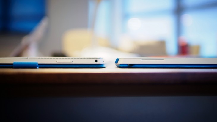
It’s a wee bit thinner and lighter, for instance – 8.7mm thick and 1.37 pounds (622 grams). Granted, it’s not giving the iPad Air 2 a fight (6.1mm, 437g), but it slightly beats out older models like the third gen iPad (9.4mm, 662g).
There are also no fans this time around, so it runs silently. In fact, the only gaps in the chassis are the ports and the Dolby-powered speakers. For you tablet photographers, there’s an auto-focusing 8MP camera on the rear and 3.5MP shooter in the front.
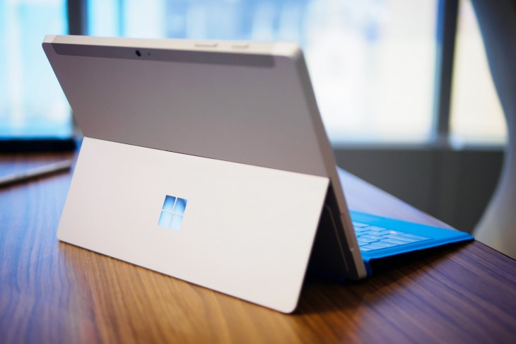
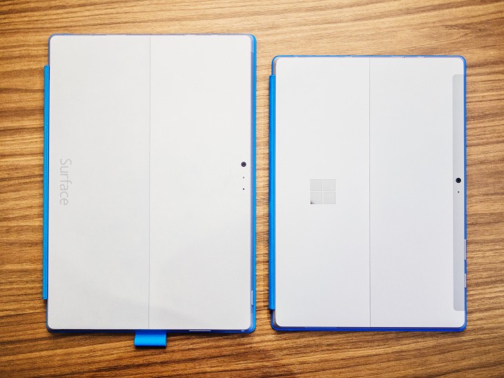
There’s a shiny new Microsoft logo on the back now, a notable design departure from previous hardware and replacing the old etched “Surface” text. The company recently found that ‘Microsoft’ branding performs better than its individual product names, so the move isn’t totally surprising. Besides, Microsoft probably feels a little left out from the sea of glowing half-eaten apples in college lecture halls.
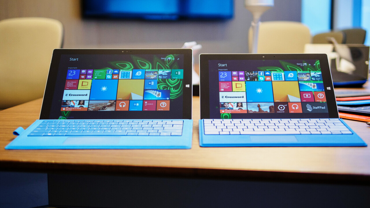
My favorite hardware update on the Surface 3 might actually be the subtlest though: the new Type Cover. Like the one for the SP3, it magnetically latches to the display’s bottom bezel to set the keyboard at an angle, but the typing experience is somehow better on the smaller device.
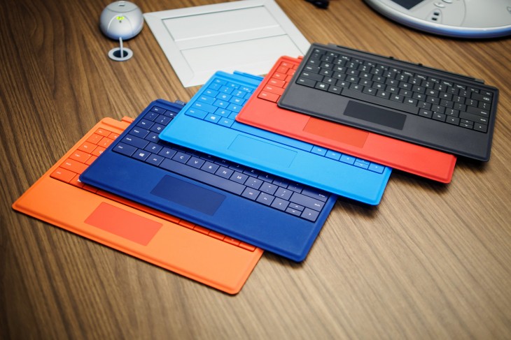
The keys are still full-sized and backlit, but Microsoft says their clickiness factor has been upgraded to more satisfactory levels while simultaneously being quieter. Travel was still a bit shallow, but both those claims proved true in my side-by-side tests.
The new keyboard also flexes less; whether that’s because of internal reinforcement or simply being being smaller, I don’t know, but I’m not complaining. I’m still not sure the Type Cover can compare to some of the better ultrabook keyboards yet, but it’s an improvement over the SP3’s version and miles ahead of the one on the Surface 2.
On the other hand, the trackpad is a little smaller to match the display, but Microsoft says it’s more responsive now. I didn’t immediately notice a difference in my time with it.
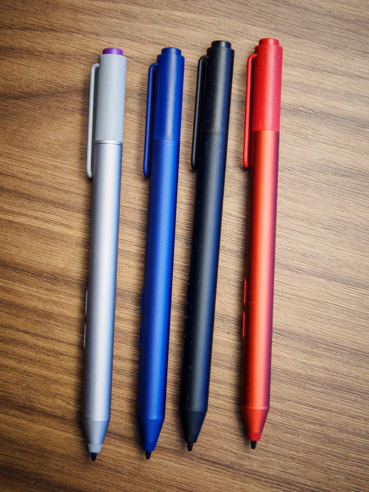
My other favorite thing is the new Surface Pen. Okay, it’s not really new. It just comes in red, blue and black in addition to silver now, and I really want a blue one. Colors!
The company did have to make some compromises with the kickstand though; there are 3 positions this time around. That’s one step more than previous Surface models (it’ll now lay nearly flat for drawing), but definitely a downgrade from the SP3’s full range of motion. Apparently the mechanism on the Pro is larger and more complex than the design team could afford on the smaller device, but it still makes me a bit sad.
Moving underneath the chassis, the internals are unsurprisingly entry-level. The $499 base configuration nets you just 2GB of RAM (ugh) and a 64GB SSD (expandable via microSD). The only other configuration is a $599 build that bumps things up to a more reasonable 4GB of RAM and 128GB, but otherwise has identical specs. There’ll be an LTE version later this year that’ll run on Verizon and T-Mobile in the US, but Microsoft’s not revealing anything else about that model yet.
That said, the Surface 3 might have a temporary performance advantage over competitors by being the first to use Intel’s new quad-core Atom x7 processor, dropping the old ARM chipsets in favor of x86 architecture. The x7 runs at a base 1.6Ghz clock speed, and can crank up to 2.4Ghz when needed. The main bullet point for the Cherry Trail chipset, however, is graphics performance; Intel is claiming a 2x improvement over the previous generation.
In our brief trial, applications loaded snappily and navigation throughout both the Modern UI and desktop interfaces was smooth. We only had one or two programs open though; we’ll see how that 2GB of RAM fares once we start loading up those all those fancy Project Spartan tabs.
All that hardware should net you 10 hours of video playback battery life, according to Microsoft. Hopefully that translates to decent workday longevity, as even my Netflix binges aren’t quite that long.
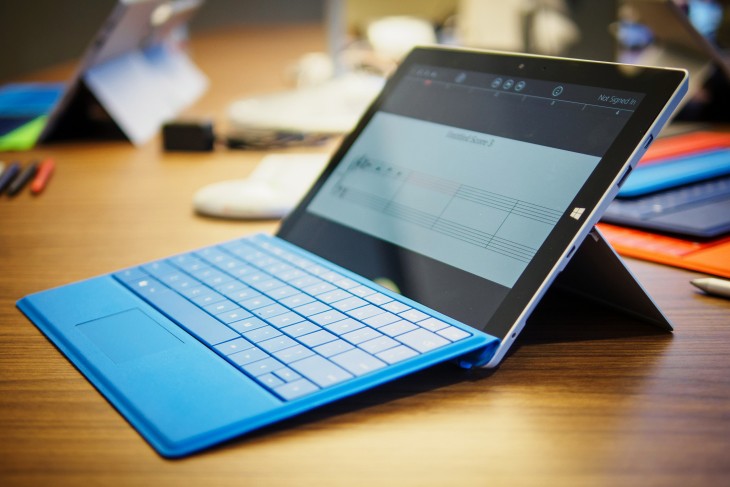
Your port selection is pretty much the same as on the Surface Pro 3: a headphone jack, singular MiniDisplay and USB 3.0 ports, and a microSD slot. A $199 dock with 4 USB ports and Gigabit Ethernet will be made available after launch.
Charging it will be a bit more convenient now too; the Surface is replacing the proprietary adapter with a high-power Micro USB port. When I asked why it didn’t go the USB-C route, a la new MacBook and Chromebook Pixel, Microsoft simply told me it wants you to be able to charge your device anywhere. You lose the magnetic plug, but in return can use your phone charger if you forget the Surface’s.
All things considered, my first impressions of the Surface 3 are refreshingly encouraging, with a few qualms.
In particular, Microsoft still doesn’t include the Type Cover ($129) and Surface Pen ($49) at the base price. I get that it wants to offer choice, but the touch-only app selection just isn’t very strong for most users and likely won’t be for a while. I’ve never seen a Surface in the wild without at least a keyboard cover, so that effectively brings the entry price up to $628. I’m also still wary about how 2GB RAM will fare on full Windows, even at $499. But hey, it includes a 1-year subscription to Office 365 and 1TB of OneDrive storage, so I guess that’s something.
Still, by not crippling it with underpowered software, the cheaper, more portable Surface instantly becomes a better value than its predecessors. Microsoft might just have a fighting chance at getting its shiny new logo into college classrooms and Starbucks coffee shops everywhere, and the party doesn’t even really start until Windows 10 rolls around.
We’ll be running the Surface 3 through its paces soon to see how it holds up in the real world; stay tuned for our full review.
Read Next: Everything Microsoft Announced at its Windows 10 Event; Microsoft Surface Pro 3 Review
Get the TNW newsletter
Get the most important tech news in your inbox each week.
