Facebook today announced it has started rolling out the streamlined desktop look for Pages to everyone worldwide. All Pages should have access to the new design by the end of the week.
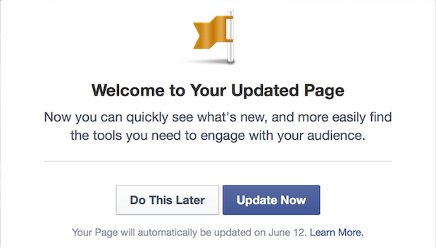
Admins accessing their Pages today will see a tour of the refreshed design, and after completing it, they can switch to the new design right away. Every Page will automatically switch to the updated design two weeks after the tour has been viewed.
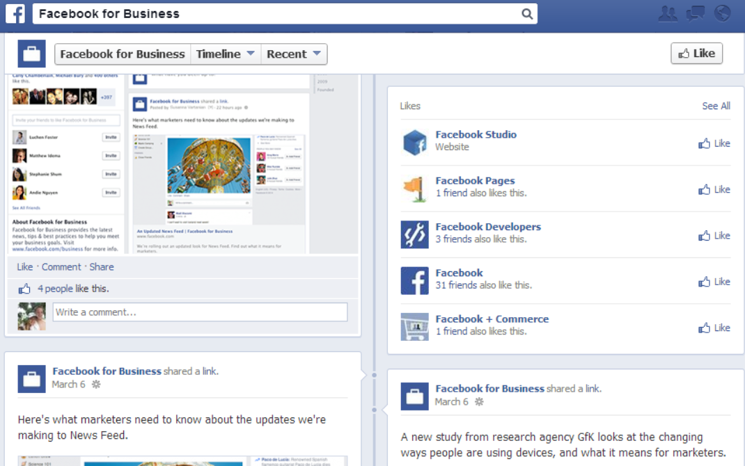
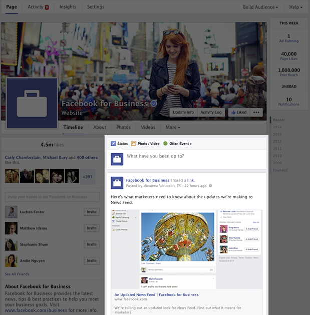
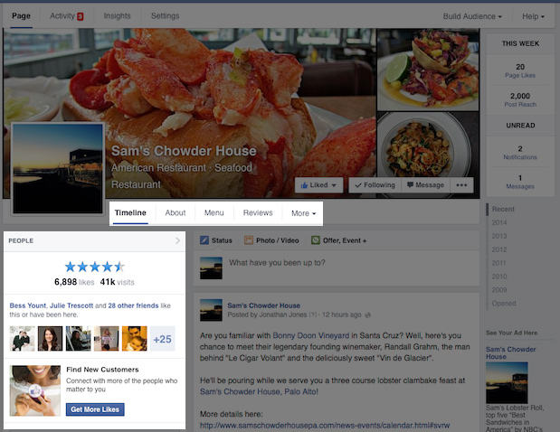
Facebook began pushing the new design in March, with the biggest change being that all posts are now in one column, just like on user profiles. As a result, posts will appear the same on your Page as they do in the News Feed (stacked on top of one another, as opposed to staggered from left to right).
Here’s the old design:
Here’s the new design that some Facebook Pages already have, and everyone will get soon enough:
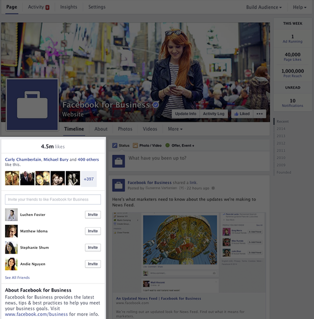
The left-hand side column lists all the information about the Page, including a map, possible hours of business, phone number, website URL, as well as photos and videos. All posts are kept on the right-hand side.
Facebook has now completely reversed its previous multiple-column design, which many simply found unnecessarily confusing. The company started to switch user profiles to the one-column design in March 2013, and finished doing so last May. With the final transition of Pages, the social network has finally dumped the format that forced users to scan two columns back and forth while scrolling.
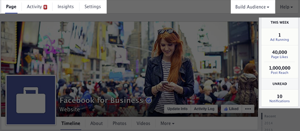
That’s on the user side. Page admins will be happy to know they can now view information about the ads they’re running, new likes, unread notifications, and messages no matter where they are on the Page.
There’s one new change that has been implemented since the redesign in March. Admins can now adjust the placement of sections in the top navigation menu and left-column menu:
Facebook has also added new navigation options at the top for accessing Page activity, insights, and settings. The new Build Audience menu takes admins to their Ads Manager account.
Lastly, there’s also a new “Pages to Watch” feature in the Page Insights tool that lets admins track and compare the performance of Pages similar to their own, including key stats and the past week’s most engaging posts.
As we said before, this is a massive update to Facebook Pages. We’ve been enjoying it on our Facebook Page for a few weeks now, and are looking forward to seeing it everywhere on the site.
Top Image Credit: Brendan Smialowski/AFP/Getty Images
Get the TNW newsletter
Get the most important tech news in your inbox each week.
