Facebook today announced a new streamlined look for Pages on desktop that is meant to help both users and Page admins find what they’re looking for. The new design will start rolling out “this week.”
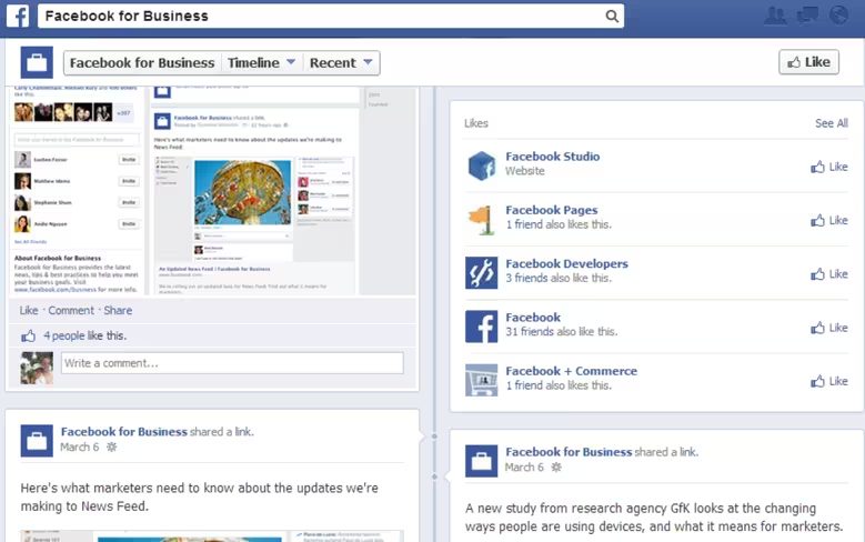
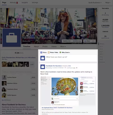
The biggest change is the Timeline for Pages design: all posts are now in one column, just like on user profiles. As a result, posts will appear the same on your Page as they do in the News Feed (stacked on top of one another, as opposed to staggered from left to right).
Here’s the design that most Facebook users currently see:
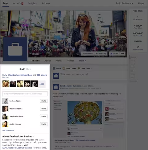
Here’s the new design that Facebook will be moving everyone over to:
You’ll notice that the left-side column includes all the information about the Page, including a map, possible hours of business, phone number, website URL, as well as photos and videos. This is further confirmation by Facebook that the previous multiple-column design was simply too confusing; the company has decided to put all posts on the right side and all other information on the left.
In fact, Facebook only started to switch user profiles to the one-column design in March 2013, and finished doing so last May. Now Pages are following suit, finally ridding the social network of the format that forced users to scan two columns back and forth while scrolling.
That’s on the user side. Page admins will be happy to know they can now view information about the ads they’re running, new likes, unread notifications, and messages no matter where they are on the Page.
Facebook has also added new navigation options at the top for accessing Page activity, insights, and settings. The new Build Audience menu takes admins to their Ads Manager account.
Lastly, Facebook is also adding a new “Pages to Watch” feature in the Page Insights tool. It lets admins track and compare the performance of Pages similar to their own, including key stats and the past week’s most engaging posts.
All in all, this is a massive update to Facebook Pages, and one that we can’t wait to appear on our own.
Top Image Credit: Brendan Smialowski/AFP/Getty Images
Get the TNW newsletter
Get the most important tech news in your inbox each week.


