Gamification was not long ago the darling of business talk.
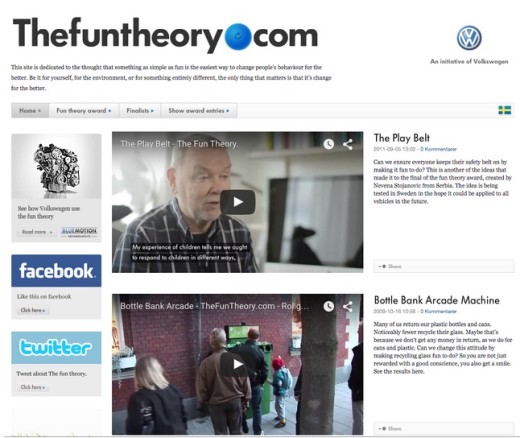
Successful initiatives like Volkswagen’s campaign The Fun Theory proved that incorporating elements of games can help achieve tangible goals while increasing customer enjoyment. At some point, when Foursquare had its glory days, it seemed that almost anything could be turned into a game by adding points, badges and rankings.

Photo credit: Fun Theory
But it turned out that gamification wasn’t a piece of cake. Most gamified systems produced mild results, and some caused the opposite effects to those desired.
Early poster children of gamification even started to detach themselves from it.
Foursquare, for instance, ended up delegating all gamification features to a separate app named Swarm that never really managed to stay as relevant as its parent. Stack Overflow explains its success as having nothing to do with the points and badges. And according to Gartner, the penetration of gamification in enterprise last year was no more than 10 percent.
Even gamification companies acknowledge that it isn’t the panacea everyone thought it was in 2011.The mere mention of gamification sounds a bit outdated and tired these days.
Where gamification went wrong
But how did it turn into this?
As I explained in UX Design Trends 2015 & 2016, there are four factors to blame:
The very notion of a “game”. I really dislike the name “gamification”. It conveys the erroneous notion that everything should look and behave like games. Many companies, product leaders and consultants, eager to jump on the buzzword wagon, have taken “gamification” literally, creating a pile of goofy products, apps and systems.
(Ab)use of points, badges and leaderboards. This is the most visible and annoying aspect of gamification. Product designers started to attach virtual currencies to anything, under the silly premise that if you offer people something to collect, they will try to collect it no matter what. But virtual economies add cognitive noise, introducing unwanted distortions both when they are worth too much and when they are worth nothing.
Displacement of rewards. It’s been demonstrated that offering any kind of reward on behaviors that should happen spontaneously puts people into “transaction mode”, altering the original motivations system and leaving them less motivated than before. This includes, of course, virtual currencies and rewards.
Condescending tone. Many gamified systems, for the sake of keeping users motivated, adopt a patronizing treatment, congratulating people in an overly cheerful voice for everything they do. Here, “user-friendly” was somehow interpreted as “toddler-friendly”, something that I suspect most adults won’t appreciate. A system that assumes that you need to be constantly led by the hand makes you feel sort of disabled (Clippy, anyone?). No one likes being treated as a puppy.
Having said all of this, gamification as a design approach has introduced very valuable insights and methodologies to product and system design, which if leveraged, can make a difference on the user experience. I’m not interested in determining whether these insights should be called gamification or not; but identifying these good parts will certainly allow designers and strategists make good use of them.
Examples of Gamification Done Right
Let’s forget for a while all the points, badges and rewards stuff, so we can observe some unlikely examples of game mechanics producing quite good results.
Duolingo: Adding fun to something that people already wanted to do
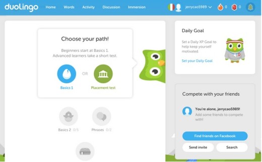
This is the only example of a properly gamified system I included. Learning languages in Duolingo is really fun, light and motivating. Its effectiveness in helping people learning a language from scratch has been scientifically proven.
The key is that it provides a fun way of learning something that people already wanted to learn. People really want to learn languages for fun, for travel, for business, for relationships, etc. It’s so important to us that we’re willing to learn it the boring way – through courses, reading books, and taking tests.

Photo credit: Duolingo
Duolingo is superior because it tackles a tough subject (learning a new language) with a light approach, and provides the student with a sense of progress. By making you advance through levels, it gives you an objective measure of your advancement. Passing these levels is just the right amount of difficulty, so you will probably make a few mistakes, which in turn actually enhances the sense of unpredictability that is key to keeping you engaged.
But none of this would work, of course, if people wouldn’t want to learn languages in first place.
2. Sublime Text: making power users even more empowered
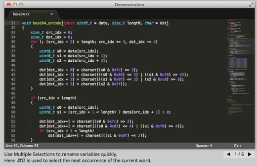
This example may leave you perplexed, as it’s a seemingly simple text editor used mainly for writing code. Probably not even the Sublime developers thought of gamification when creating it. But that’s why Sublime Text is such a brilliant example: it understands that the core delight of gamification lies in natural discoverability, not a forced sense of progress.

Photo credit: Sublime Text
Sublime Text gives power users nice tools for enhancing their productivity, while keeping the interface incredibly simple to novice users (who can still use the app right away without much thinking). Users must discover these controls (literally), as most of them are buried in menus and are not self-explanatory at all.
Maybe you hear from one fellow developer that Package Control lets you install amazing extensions and customizations. Maybe you see another developer use a cool selection shortcut to edit several lines at once. Or maybe you just stumble across an article listing some hidden gimmicks. As you get better with the tool, you find better tricks. Over time, the feedback loop improves your productivity while making the experience quite addictive.
This sense of discovery and mastery, balanced with a barebone but slick interface, makes Sublime Text really fun to use. None of these enhancements gets in your way or tries to be clever with badges or artificial “level up” notifications. Sublime Text represents the spirit of gamification: the discoverables entice users to continue using the app, which rewards their time with better mastery of the system.
User empowerment is core to every step of the experience, and no gamified system could ask for more.
3. GitHub: a true leaderboard and a valuable currency
GitHub is a weird hybrid of a repository hosting service and a social network. As a repository service it works quite well, but the social features are what makes it shine as the largest repository of code in the world.

Photo credit: ZURB Foundation via Github
Like no other platform, GitHub allows developers to showcase and visualize their work. This is true in many of their features: from the most followed or forked repositories, to the network graph visualizer, the profile contributions graph, and so on. These tools allow one to assess the quality of a developer in a rational way, so the prestige earned in the platform is completely deserved.
That’s why many companies actually are relying much more on GitHub profiles than CV’s or LinkedIn profiles to hire developers, and developers in turn show proudly their GitHub profiles as proof of their talent.
The currency of GitHub is true work, which is infinitely more valuable than any point system. Any currency system prone to abuse devalues rapidly (looking at you, LinkedIn’s skills recommendation system).
4. Trello: visualizing progress and accomplishment
Most to-do list systems leave you feeling overwhelmed. They remind you constantly of the things you haven’t done. The more tasks you pile up, the less likely you are to achieve them.
Trello is a notable exception, starting with that it is not a typical to-do list system: like the Kanban methodology from which it draws inspiration, it acknowledges that tasks may have different states, and that the binary “done” and “not done” approach is not useful for most purposes. Intermediate states allow you to differentiate the tasks you started from the things you have not. This is crucial, because starting a task is the most difficult part. A binary to-do list won’t let you see that.

Photo credit: Sitepoint via Trello
Dragging and dropping cards across stacks is natural and helps you feel that you are actually making a task move forward. And, most importantly, you have a stack of “done” cards, so you can see things you already achieved, which in turn motivates you to achieve more. You don’t need to be awarded with badges – the intrinsic reward of seeing a task done is enough. Trello succeeds by recognizing that the things you’ve done matter as much as the ones you haven’t done yet.
8 Tips for Better Gamification
These examples allows us to derive some useful insights for user experience design:
- Make the users feel smarter. Enhance the tasks that the user already has to do by removing obstacles and barriers. Guide by hand the first time, then allow users to do it by themselves. Avoid a patronizing tone and keep congratulations to a minimum.
- Enable discovery of advanced features. When you hide advanced features, you simultaneously make things simpler for novice users while giving power users a sense of accomplishment and exclusivity. As described in Interaction Design Best Practices (written by the prototyping app UXPin), the discovery of new features gives users tiny, random rewards that makes them more productive and engaged.
- Create slick, elegant UI. Well-thought interfaces, with good performance, smooth transitions, consistent tone and polished design, make users themselves feel more polished and their tasks better executed. Check out Web UI Design for the Human Eye for more interface design tips.
- Let users define their standards for progress. People have wildly different notions of “better”. Don’t enforce your rules on them. Rather, give users ways to set their own milestones and act as a measurement tool rather than a coach.
- Show users how far they’ve progressed. Make them see their achievements in an objective, rational way. Remind them subtly of how they were when they first began.
- Design for “flow”. Cut out interruptions. Allow users to immerse completely in a task. Offer discrete feedback to what’s happening. And if it’s possible, allow users to lose their sense of time. When you are motivated, time flies.
- Avoid the trap of virtual currencies. Virtual currencies, like real currencies, can rapidly become unmanageable and inflate or deflate. If the currency devalues, it will be no more than noise and added complexity. And if it becomes too valuable (for example, because it’s tied to money incentives), people will start to trade it and will find ways to cheat or corrupt the system.
And lastly, don’t force things to be a game. This should be pretty obvious by now. Imposing a game over existing social or behavioral dynamics will make everyone feel awkward. Real games are fun precisely because they are opt-in, not forced. I think we are finally understanding this critical distinction.
If you found this post helpful, take a look at the free e-book UX Design Trends 2015 & 2016 that I helped write. Tips & techniques are provided for gamification (and many other trends). There’s also deconstructed examples from 71 companies, which helps teach through real practice.
Read Next: Gamification and the Process of Game Thinking
Image credit: Shutterstock
Get the TNW newsletter
Get the most important tech news in your inbox each week.


