Sure, there’s some time left before high definition becomes universal, but looking at the statistics, it’s certainly moving that way fast. With Apple’s retina displays offering twice the old ppi, it’s just a matter of time before HD becomes less of a special surprise and more of a common expectation.
Source: “HD.” Sean Mason. Creative Commons.
But while your users simply have to go out and buy an HD device to appreciate it, the designers have to put in a lot more work on their end.
In this article, we’ll explain a few quick techniques to adapt your design process for a future in HD.
Understanding HD Design
Simply put, high definition devices display images with a higher density of pixels per inch (ppi or dpi, interchangeably). Technically, anything greater than 200 ppi is considered high definition. Compare this to the typical standard definition display – the foundation the Internet was built on – which is only 72 ppi.
At the moment, here’s where the devices currently stand:
- iPhone 5 & 6: 326 ppi
- iPhone 6 +: 401 ppi
- iPad Retina & Air: 264 ppi
- iPad Mini: 326 ppi
- Samsung Galaxy S5: 432ppi
- Samsung Galaxy S6: 577ppi
- HTC One M9: 441 ppi
- LG G3: 534 ppi
Meanwhile, the new Retina iMac, MacBook Pro, and MacBook Air all offer around 220 ppi.
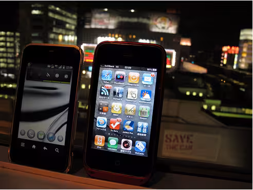
Source: “Smartphone Bar.” Miki Yoshihito. Creative Commons.
What we’re seeing is a steady rise in resolution rates across all digital products as the technology war continues. As a result, more and more designers are jumping on board, and we’re seeing a rise in HD backgrounds (as well as other images) for websites. The crisper images open a lot of doors for designers to get creative, but at the same time brings with it a whole new set of problems we’re still trying to solve.
The Problem of HD for Designers
Naturally, the higher resolution means more data, which means longer loading times. Right away, designers in HD are struggling to minimize the weight of their files, whether making room elsewhere, or adopting alternate design methods (which we’ll discuss below).
The other major factor is how standard 72 ppi visuals look on HD devices. At best, they fall flat, especially in comparison to other sites who’ve already adapted to HD. This problem will only worsen with time, as more sites switch to HD and make standard sites appear more lacking.
Another consideration is whether you should alienate one group of people to cater to another. In 2012 it was reported that at least half of all American households owned at least one Apple device, so if you decide on HD, it will certainly not go unseen.
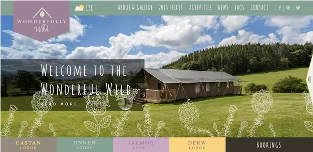
Source: Wonderfully Wild
Additionally, HD visuals, whether video or images, just plain cost more. That means you’re paying more for content that takes longer to load. Even if you’re providing your own content, the tools necessary to create HD visuals are still expensive.
So the question is, are the benefits of designing in HD worth it? Our designers at UXPin say yes – even if you can still get by with standard definition at the moment, the popularity of HD will only continue to grow. The sooner you adapt, the better you’ll be prepared for the future.
Luckily, you’re not the only designer with a headache when it comes to HD. So far, designers have discovered some workarounds and new methods to solving the problems of HD design.
Useful HD Design Techniques
As described in the free e-book Web Design Trends 2015 & 2016, the methods we list below will help you tailor your design process to HD, without having to sacrifice too much.
1. Scale Vector Graphics
Before discussing the rise of scale vector graphics (SVG), we should first explain raster graphics.
Raster (or bitmap) graphics are comprised mainly of JPGs, PNGs, and GIFs. These images feature a pixel-to-pixel translation, which means one bitmap pixel is read as one device pixel. This was working fine for the greater part of the web, but now HD is disrupting the balance. On HD devices, one bitmap pixel is read by four device pixels. This can make standard definition images seem blurry.
The other concern with raster graphics is the increase in zooming on mobile devices. Anyone who regularly uses a mobile device for internet has encountered this before – in order to better see an image on a smaller screen size, you try to zoom in, only to learn that you’re making the image blurrier, and not clearer.
There are several ways around this, and one of them is SVG.
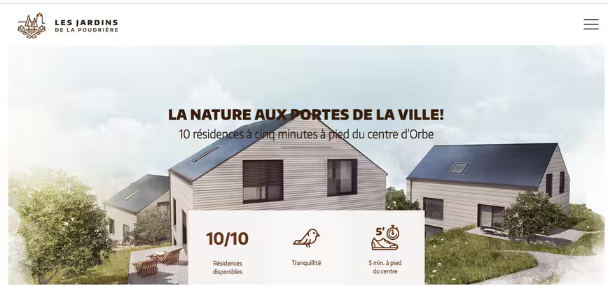
Source: Les Jardins de la Poudriére
SVGs use connected points and lines instead of pixels to create images. This means that the file accounts for differences in pixel resolution, as well as zooming in and out. To put it simply, SVGs can tell the difference between screen types and make the necessary adjustments, while raster graphics are always the same. To see vectors at their best, go to Les Jardins de la Poudriére above and play with the window size.
SVGs are the perfect “fix” not just for HD displays, but always responsive design. The only problem – and it’s a big problem – are photos and other previously existing images. Photos are always raster graphics because the image itself was created on a finite amount of pixels. In order to properly display photos, another method must be used.
2. HTML5, CSS3, and JavaScript Rendering
Traditionally, images are rendered in the browser, which is where some of these problems arise. If you render your images in HTML (width & height attributes), CSS (properties), or JavaScript (properties), however, you gain more control over how they’re viewed, and can sometimes avoid that unsightly blurriness.
The easiest solution is to set the image’s size to be half of what it actually is, so that when converted to HD, it’s displayed normally. For tips and tricks on the coding of this – including media queries to change the dimensions according to the device – Paula Borowska explains the details in this piece for DesignModo.
3. “Still” HD Video
With the growing popularity of HD video backgrounds, designers are looking for creative solutions to alleviating the loading strain. One of the most creative is simplifying not the quality of the video, but the content.
The fine compromise is to have HD video with little movement and/or composed of mostly static elements. The slight motion will still have a positive effect on the user experience, but will not overtask the loading of the video.
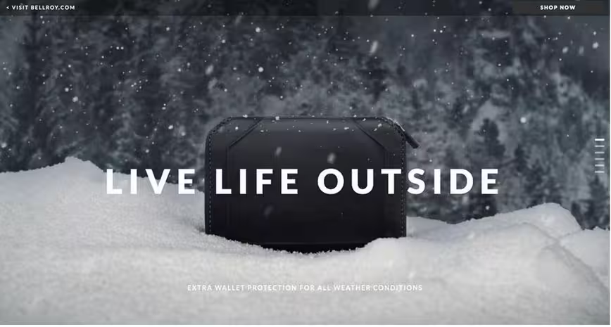
Photo credit: http://bellroy.com/live-life-outside
A good example of this is Bellroy, maker of wallet covers. Emphasizing their products durability and quality, they use a simple HD video to showcase it surviving unscathed in the harsh elements. Only the falling snow moves in the video, keeping the wall and fallen snow in the foreground closer to a still image than video. The falling snow gives an enchanting atmosphere, without burdening the server.
From a technical standpoint, we can see some smart decision-making at play. First, the entire background uses a fairly limited color palette, which naturally improves load times. Secondly, because the video renders in .mp4, the moving snowflakes have mostly soft edges while only the still wallet image has hard edges (again, improving load times).
The end result is a visual compromise that works just as well as it looks.
4. Unfocused Imagery
In the same vein of simplifying content instead of quality, more designers are appreciating the flexibility of the “unfocused” style of videography. Like the “Still” HD video, this adds some of the visual delight of HD video, without so many drawbacks. Users are still able to discern movement, which invigorates and enlivens the atmosphere, and the artistic style masks the more practical benefit of reducing load strain.
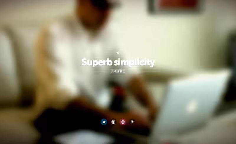
Photo credit: http://fernando.is/all-about/
Fernando Maclen’s site takes full advantage of the “superb simplicity” implicit in the unfocused video.
This strategy has a few other additional benefits, as well. Crisper elements, such as links, buttons, or text, attract more attention and therefore have more force behind them. This is an excellent way to emphasize certain elements over others.
The unfocused video can also act as a lure, promising the clear version conditionally. While Maclen’s site doesn’t do this, you can certainly reveal the actual video only after the user clicks a call-to-action, completes a signup, purchases a certain product, etc.
In this case, the unfocused video is only 640 pixels wide, but it looks fine on larger screens thanks to the blur effect. The crisp foreground text also grabs the user’s attention, making the background effect even more seamless.
5. Fewer Visuals
This is a bit of a last resort solution, but it will work in a pinch. Simply reduce the amount of your images, animations, and videos on the screen. You get the benefit of HD with some of your visuals, without the drawbacks on loading time, or having to buy too much HD content.
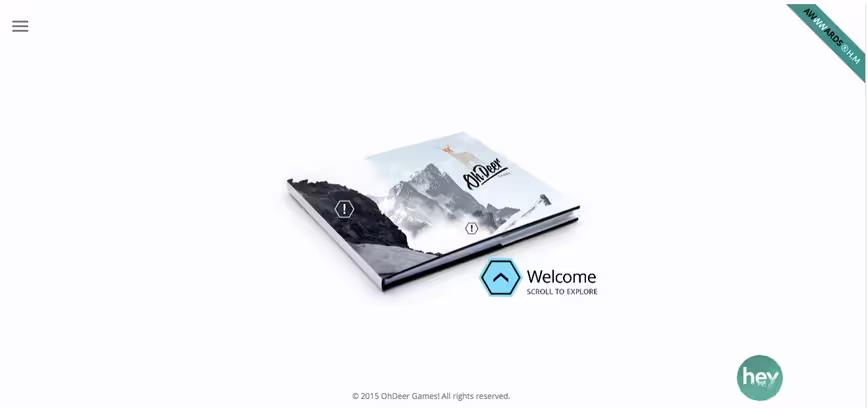
Source: Oh Deer Games
With minimalist design techniques gaining momentum (perhaps related to this very reason), the benefits of this strategy extend beyond just load times. Your site will feel more sophisticated and you’ll emphasize more of the existing content (which provides a smoother experience when executed properly).
Conclusion
No matter your feelings on Apple, you must admit they’ve changed the landscape of how we view the Internet – in this case, quite literally.
HD displays are obviously the future, so there’s no use pretending this is a fad that will pass in time. The sooner you learn to design with HD, the more footing you’ll have in the future. On the bright side, take solace in the fact that, in the future, Internet speed will likely also increase to alleviate some of the loading strain.
For more advice on HD Web design and 9 other Web design trends, check out the free e-book Web Design Trends 2015 & 2016. You’ll learn from the best with analysis of 166 examples from companies like Google, Apple, Reebok, BMW, Intercom, Adidas, Dropbox, and many more.
Read Next: How to design websites developers won’t hate
Image credit: Shutterstock
Get the TNW newsletter
Get the most important tech news in your inbox each week.