
For the best visual precision, every Web design project eventually requires fully-composed mockups for each page and interface. Informed by technical constraints, these mockups must act as collaborative visual design documents for regular discussions with developers – not just something you hand off as though the person on the other end is a WYSIWIG factory.
Source: “Peer Review.” AJC. Creative Commons.
Graphics, textures, typography, and other little tidbits all must be transferred from a simple graphic into a living interface. But just because you understand how to design great mockups doesn’t mean that you understand how to design them for developers. In this piece, we’ll provide tips for building mockups that transition as smoothly as possible to development.

The 💜 of EU tech
The latest rumblings from the EU tech scene, a story from our wise ol' founder Boris, and some questionable AI art. It's free, every week, in your inbox. Sign up now!
After all, if you want the project to move forward, you must always ensure that your works of digital art are clearly understood by developers who think in terms of frameworks and systems.
Plan for Limitations
As recommended in the free Designer’s Guide to Collaborating With Developers, the first step to proper implementation is predicting UI limitations that may (and usually will) arise during development.
In the design world, it seems like any beautiful idea should be possible to create in code. HTML5/CSS3 specs have certainly come a long way, but some ideas are still very difficult to build with full support.
When collaborating with developers in the wireframe/prototype stage, always keep in mind the limitations of HTML5, CSS3, or whatever your language of choice. That way, you’ll know what to design and how to design ideas visually so that developers can actually build the interface.
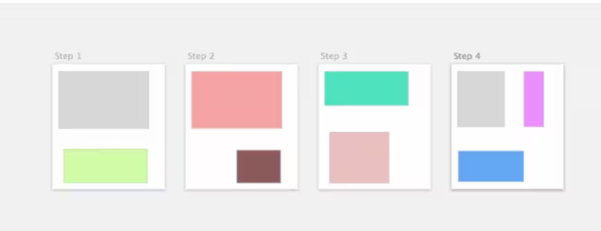
Photo credits: 10 Best Practices for Sketch
Keep a list near your desk (or in Google Docs) with a collection of hurdles, obstacles, and interface ideas to avoid. While It may be possible to add these features later, you should focus initially on prioritizing interface elements that are most feasible. As you progress in the design, review this list on a weekly basis with developers so that you don’t get lost in a high-fidelity design of something that’s actually a technical nightmare.
Now that you have a good starting point for design feasibility, let’s examine some other methods to keep in mind as you design.
Expand on Interactions
When it comes to exploring interactions, prototyping is the most efficient platform for discussing feasibility. Aside from actually coding your designs, prototypes are far more effective than simply describing or annotating flat wireframes and mockups.
Even rough low-fidelity prototypes (also known as interactive wireframes) can show developers the overall framework of content, and the dependencies between content as users click through the experience. While the visual details won’t be anywhere near polished, developers can still provide feedback on design infrastructure.
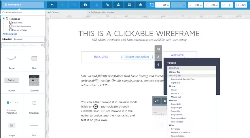
Photo credits: Interactive Wireframe
For example, you might be dead-set on an infinite scroll for a large blog design, but perhaps a cards UI pattern can still serve as an elegant compromise between usability and site load times. On a subtler level, developers can also provide you device-specific feedback. Your navigation header might work beautifully in the prototype, but it may be completely hidden by the address bar in certain browsers and devices.
You simply won’t uncover these technical setbacks (some of which may require a complete revamp) unless you let developers play with your prototype. In fact, part of the reason our app integrated with Photoshop and Sketch was to encourage more designers to cross over into the interactive design stage (even if they prefer to first add fidelity to the visual design).
2. Create Browser Fallbacks
The field of Web design is quite different compared to mobile app design.
Android and iOS apps run on a single OS with various screen resolutions. Websites, however, introduce far more variables – they must run on different screen resolutions and on different operating systems, in different browsers, also with different screen resolutions (and devices).
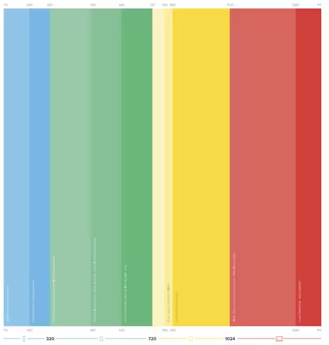
Photo credit: Responsive Design Cheatsheet
The process of designing a website interface feels similar to designing a mobile app interface. But development is vastly different between these two mediums. When designing a mockup, you’ll want to consider the potential pitfalls and drawbacks of each feature.
This is especially true of newer CSS3 techniques that are not supported in all browsers(ex: transforms, reflections, clip-path, and masking). While Photoshop and most other design programs let you insert notes next to your design, there is no substitute for a quick feasibility discussion with developers as you prepare for a major iteration.
Below, you’ll find some of our favorite free open source scripts to help with browser compatibility. These resources may not help you directly when designing, but they are certainly an important conversation point when collaborating with developers.
- Modernizr – In the world of Web standards Modernizr is a cherished asset for any project. It’s a customizable library for cross-browser HTML5/CSS3 support. Use the download page to customize your own features or just grab the whole library from GitHub.
- Fallback.js – This tiny JavaScript library is meant to control every possible fallback method and library. By centralizing all of your scripts it becomes easier to check which files aren’t working and provide alternate solutions.
- Selectivizr – Selectivizr is similar to Modernizr but it focuses more on CSS selectors. This JS library emulates CSS pseudo-classes and attribute selectors to improve support for older versions of Internet Explorer.
- Video.js – HTML5 video has taken the spotlight but Flash video is still a reliable fallback. Video.js makes it easy to embed any video format into an HTML5 player with a Flash fallback for older browsers.
- IE7.js – Older versions of Internet Explorer put up a tough fight against common web standards. IE7.js forces older browsers like IE6-IE8 to support typical rendering methods like transparent PNGs and RGBa() colors.
- Detect Mobile Browsers – This isn’t so much a library as a code generator for mobile detection. You’ll find snippets in all languages from ASP to jQuery for detecting a mobile browser. Developers can choose to execute(or not execute) code for mobile users based on these results.
Even if you don’t understand how these scripts work, you should still bring them up with your developers. In our experience, we’ve found that developers appreciate the proactive gesture and don’t mind spending some time explaining any compatibility issues. After all, it is in both of your best interests since late nights are usually a shared misery between designers and developers.
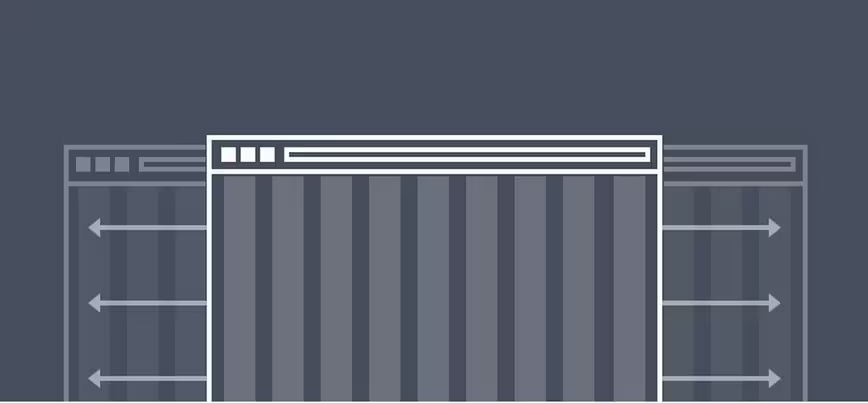
Dealing With Alternate Pages & Resources
While the homepage design may require the most effort since it’s a portal to the entire site, you also need to apply the same precision to the inner pages.
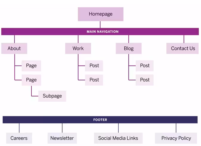
Photo credit: Interactive Site Maps
In some large companies, project managers demand full mockups for every single page due to strict internal processes. In other companies, some developers may have design experience, allowing them to build multiple similar pages from a single mockup (freeing up more time for you to work on unique pages). Adapt the level of mockup detail depending on your company protocol.
Now, let’s examine some of the development considerations for your mockup elements.
Inner Page Graphics
A keen sense of graphic design is required for great mockup design.
For example, even if two pages are distinguished only by differences in icons, the safest option is to still create two separate mockups to avoid any confusion. Most of the time, you’ll find it’s safer to create all inner pages and then export icons separately – that way, developers can access the individual icon images and the page designs as reference material.
Photo credit: Icon Set in UXPin
Before wrapping up your mockup design, follow along with this checklist to see if you missed anything. Here’s a quick list of some things to check for:
- Graphics should be sized exactly as they need to appear
- Illustrated different JavaScript interaction states (ex: dropdown menu open + closed states). Even if it’s demonstrated in the prototype, it never hurts to leave a paper trail.
- Logged in & logged out states
- Label form fields, buttons, and inputs as needed
- Error/success messages
- Include separate graphic files for all images including the favicon, animated loaders, 404 page photos, etc.
On larger projects, we’d recommend including a short document for developer notes. Just be sure to clarify the referenced mockup (and page sections) which pertain to the notes. If you’re working in UXPin, you can add a note to the design itself and while you’re in Preview mode, or you can also just upload a separate document into your project folder.
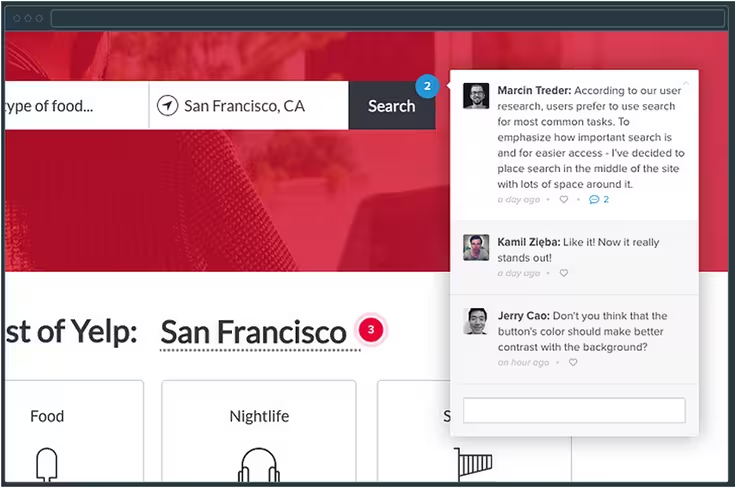
Photo credit: Collaboration via UXPin
2. Separate Responsive Mockups
While mobile app mockups must consider landscape and portrait view, websites must support any view at any dimension from smartphones to widescreen monitors.
If your design is meant to be responsive, then we recommend creating different mockups for each breakpoint to show developers how the layout adapts.
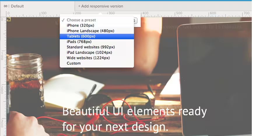
Photo credit: Responsive Prototyping
Consider a few of the following changes:
- Do logos, graphics, and/or icons change size or position?
- Should font size increase or decrease? What about line height?
- How does the main navigation adapt to smaller screens?
- Will sidebar columns drop below the main content or perhaps disappear entirely? What about footer content?
There are no right or wrong answers because each project needs to be handled individually.
When in doubt, the mobile-first approach championed by Luke Wroblewski is always a good starting point (once you’ve completed the initial user research). Design around the content for the smallest screen size, then scale it up as the screen size increases. By building upon the essentials first, you ensure a more enjoyable device-agnostic experience.
To prepare for the transition to development, make sure you label your responsive mockups properly. Filenames must include the responsive breakpoint in pixels along with any other important details(revision date, draft number, retina screen, etc.)
Your goal is to design for every possible situation so the developer doesn’t have to think.
As always, if you’re unsure about how to deliver something, just ask one of the developers what format they prefer. Keep the communication lines open to reduce problems and avoid confusion.
Design Tips to Make Development Easier
Digital design programs come in many forms from Adobe Photoshop to Fireworks and the popular newcomer SketchApp. Despite the differences in capabilities, the overall mockup design process remains relatively uniform across these different applications.
The following tips are geared toward designers who create mockup assets for developers. Some of these ideas are easy to overlook on the surface, but they make a world of difference when it comes time to write code.
Mockup Design Best Practices
Mastering any design program takes time and switching up your workflow can be daunting. But once you try incorporating these tips, they’ll feel like second nature. When you design with developers in mind, it makes everyone’s job a whole lot easier.
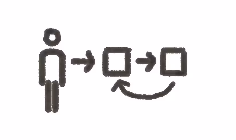
Photo credit: Peter Morville. Creative Commons.
Here’s a few best practices we’ve learned through the years:
- Organize and label your layers – Developers may not always need to open your PSD/Sketch files, but the contents should always be organized. Use layer groups to rank similar layers together. Also, assign every layer a clearly recognizable name since mockups are very detailed and usually require a lot of digging to find exactly what must be changed or extracted.
- Prepare a nice asset package – Remember that asset preparation saves everyone a lot of time and stress. Once the mockups are finished, export graphics, icons, photos, and other assets into separate files. Developers may not feel comfortable exporting PNG/JPEG/SVG files and it’s a lot easier if you hand off everything in one neat collection.
- Use in-app export tools – In Photoshop, you can export graphics using the slice tool or by manually creating new documents. Sketch includes its own export options designed specifically for interface graphics. Organizing your design files doesn’t take much work and your developers will love you for it.
- Show, don’t tell – If interactive elements require visualization, try converting your PSD/Sketch files into layered prototypes. In doing so, you’ll be able to actually show complex animations and interactions, leaving none of it to the risk of imagination.
For more practical tips, we recommend the Photoshop Etiquette site which includes advice for dozens of topics like effects, layer organization, and typography. To learn more about the anatomy and process of mockups, check out the free Guide to Mockups.
2. Version Control for Designers
Every developer should at least know about version control systems, which are like digital archives that store previous versions of a script, database, or an entire website. Aside from organizing files, version control is useful for rolling back changes or comparing differences between two(or more) files.
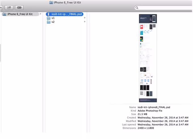
Photo credit: iOS 8 UI Kit
Although version control is mostly used in programming it has found small pockets in the design community. While design-based version control is still new, there are some great resources available. Pixelapse is an online storage application for managing design documents in the cloud. And while GitHub is primarily a code storage platform, they’ve recently added support for PSD files.
Now it’s possible for designers to use GitHub as their own version control system for PSDs. Granted, the site is open source and it may not be a great choice for private enterprise projects – but it is a good way to practice and learn about version control.
Here are some alternatives for design-centered version control:
- Cornerstone – The Cornerstone app is a Subversion client for Mac. This does require some initial setup but it can be great for localized work. Check out this stack answer for more info.
- PixelNovel – Adobe has released their own version control platform named PixelNovel. This also runs on Subversion but is much less technical to setup. It has a Photoshop plugin and even allows file sharing among multiple users.
- GitHub for PSDs – As mentioned earlier GitHub does support PSD diffing. While this can be a great method for learning Git, most GitHub repos are free and open to everyone. So this is great for practice but not for large enterprise projects.
- Kaleidoscope – This Mac OS X application doesn’t offer traditional version control, but instead can be used for file comparison. Kaleidoscope is great if you don’t need a full timeline archive and just need to compare the differences between files and/or folders.
- Pixelapse – The widely-known version control platform Pixelapse is great for any designer. They have free open source accounts and paid accounts that can support small freelancers and large teams. Pixelapse runs across all operating systems and even includes a project dashboard for team collaboration.
Helpful Plugins
Photoshop and Sketch both support a wide assortment of plugins for automating tasks and improving typical design workflows. Even though Sketch was built from the ground up for Web design, Photoshop has a larger selection of plugins simply because it’s been around longer and focuses on a broader spectrum of tasks (photo editing, print work, UI design, etc).
Photo credit: Pixabay. CC0 Public Domain.
We chose the following plugins specifically for UI designers who create interfaces from scratch. These plugins will help you achieve pixel-perfect mockups with less time and effort than traditional workflows.
Photoshop Plugins
- GuideGuide – Setup guides and grids based on columns and pixel values.
- Cut&Slice Me – Cut and export graphics to different devices like smartphones, tablets, and computers.
- PNG Hat – A faster way to slice & export Photoshop mockups.
- CSS Hat – Export any Photoshop layer into CSS code.
- Renamy – Dynamically rename your Photoshop layers in seconds.
Sketch Plugins
- Sketch Generator – Export all of your design assets with a single keystroke.
- Text Styles – Export Sketch text styles from a mockup into CSS code.
- Measure – Obtain the exact dimensions and coordinates of any graphic in your mockup.
- RenameIt – The best way to rename layers in Sketch.
Wrap-Up
Mockup and hi-fidelity prototype creation are the last major tasks for the design team before developers take over. To keep your design on track during the transition, offer as many resources as possible and clarify everything. As we’ve recommended before, it’s always better to over-clarify rather than under-clarify.

Photo credit: i a walsh. Creative Commons.
By designing mockups with developers in mind, you’ll be giving yourself a constant reality check. It can definitely be frustrating when you move from your own routine into a more developer-friendly process. But when you’re working on design projects as part of a larger team, it’s better to compromise on your process than it is to unnecessarily compromise on your design due to breakdowns in communication.
For more tips on collaborating with developers, check out the free Designer’s Guide to Collaborating With Developers. Across 70+ pages, you’ll get real-world advice for including developers in all different stages of design: planning features, wireframing, prototyping, mockups, and testing.
Read Next: 5 psychology secrets for great interaction design
Image credit: Shutterstock
Get the TNW newsletter
Get the most important tech news in your inbox each week.