It’s becoming more important every day for your designs to connect more with users and include a “human element.” Website and user experience design needs to feel real, from aesthetics to interactions to motion (perceived and real) to emotional connection.
The problem designers most often encounter when thinking about users is not thinking about them as actual people. It sounds a little crazy, right? But we are not talking about designing robots here. As described in Interaction Design Best Practices, humanistic design creates an engaging experience that users can connect with physically and emotionally.
Here are a few ways to do it.
-
Your Mantra: “Humans Come First”
The first step is saying it out loud: “Humans come first.”
Now repeat it until you hear this phrase echo in your head before and during the design and planning phases of every project. And the way to do that is to actually be more human. Be intentional in actions, interactions and design. Most of all, empathize with your users.
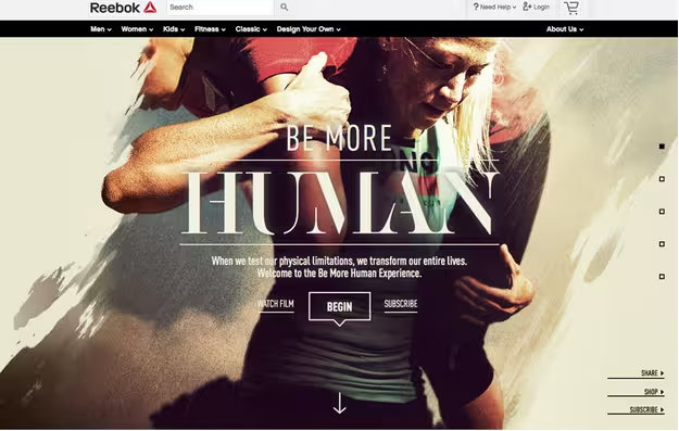
Photo credit: Reebok
One way to ensure that you’re designing for humans is to create a user persona. You can use fictional identities composed from researching your users. This will help eliminate you guessing about your users and will allow to design with their needs in mind.
For example, the persona process we follow at UXPin looks like this:
- Review usage data in our app, segmenting users based on overall engagement. For example, these segments might include people who started a trial but didn’t buy, people who started a trial and bought, etc. Once we’ve defined the segments, we look at behavior based on events created in KISSMetrics.
- For qualitative data, we interview ~30 users total from all segments to try to understand the “why” behind the data.
- Based on quantitative data and interviews, we can start plotting out patterns that eventually form our user personas.
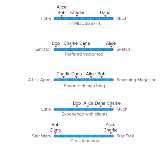
Photo credit: UXPin
You need to create things people want. Step back and evaluate every website or app you frequent. Do you feel like you are part of the design? Is it personal? It is intuitive and easy? That’s human.
2. Design for Comfort and Predictability
There are a few elements in the design process that you just can’t change, like device type and screen size. But you can affect how things render and how comfortable your designs are to use in different environments.
For a design to “feel right”, it must be comfortable to use.
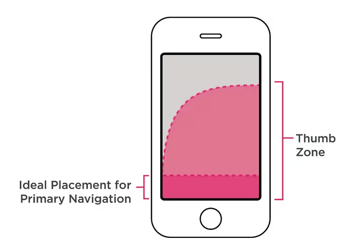
Photo Credit: Rosenfeld Media, Creative Commons 2.0
- Thumb patterns on mobile devices need to be reachable and accessible. Think about different phone, and hand, sizes when considering element such as buttons or swipe actions.
- Think about typeface size. Users should not squint to read the copy.
- Provide contrast that will stand up in varying conditions. While desktop users are most likely to view a website indoors, users might look at a screen in other lighting conditions with their various devices.
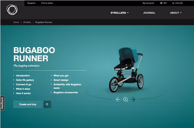
Photo Credit: Bugaboo Strollers
- Motions and movement should mirror real-life. (Look at the 360-degree rotation of the stroller above.) Think about the physics of a ball rolling. Now imagine that ball on a mobile phone screen: which way should it roll? (To the lowest point of gravity as the phone is moved because balls always roll downhill.) As outlined in Interaction Design Best Practices, perfecting these microinteractions go a long way towards creating a delightful experience.
The more comfortable users feel, the more likely they’ll continue to interact with your product.
3. Connect Emotionally
Focus on the one emotion your project should convey. Don’t get wrapped up in trying to create multiple emotional experiences. Do one exceptionally well.
The emotional connection is two-pronged:
- Your design should create a relationship between users and your product.
- Your design should create relationships between users.
There are a variety of ways to create an emotional connection with your users. As outlined in Web UI Design for the Human Eye, color is a good way to stir emotions in people. Contrast, complementary colors and vibrancy all tug at the heartstrings in different ways. Colors evoke different moods in people as well. For example:
- Red: Conjures up passion, and gets the blood pumping with excitement.
- Orange: Gives a whimsy lightheartedness to a design.
- Green: Promote prosperity, both physically and financially.
- Purple: Conveys the lap of luxury.
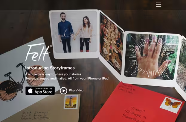
Photo credit: Felt App
But color is but one aspect that goes into nurturing an emotional bond. Copywriting and visuals also play a role. Felt App’s marketing site has light copy with a conversational tone. The photos are all moments that one might experience in life — mementos of the past. The colors are earth tone, mostly browns with a splash of red from the one envelope. All of these elements alone don’t add up to an emotion, but together these all craft the feeling of nostalgia.
Emotional connections are established in a variety of ways. Brand loyalty, for example, stems from emotional connection. The type of emotion is determined by the tone, message and design choices you make. For example, a photo of people crying can cause concern for users – why are the people in the photo upset and how can they be helped?
4. Design with Mental Triggers
Understanding a little human psychology goes a long way when it comes to design.
But you don’t have to enroll in college again to use those tools. Spencer Lanoue broke down “ Psychological Triggers That Make UX Design Persuasive” from an academic research standpoint for you.
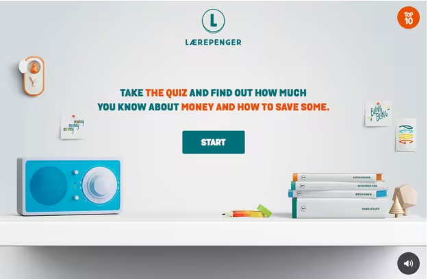
Photo credit: Laerepenger
Here’s what the concepts look like (and how they relate to design):
- Do something for other people. And they will return the favor. Look at the example above, take the quiz and you can save money.
- People look at the behavior of others. Especially when they are not sure how to act. Include a social stream in your design to make users feel like part of a bigger group.
- Users want what they can’t have. The scarcity principle is why limited-time deals work so effectively.
- Users tend to fall in the middle when it comes to making choices. Most people will be drawn to the center. As recommended by Hick’s Law, more choices leads to decision paralysis, so choose carefully.
- People are drawn to what is relevant to them right now. Consider beacons, notifications or check in tools to be in the moment.
- People remember elements that stand out. Use contrast to create focus.
- People require timely feedback. Know the “Power of 10” when it comes to interaction design. As Jakob Nielsen stated, users need feedback within 0.1 seconds to feel like they still control the experience. If it takes longer than 1 second for your interface to respond, the feeling of control quickly disintegrates. Whether the feedback is purely visual or text-based (like a modal window), make sure it’s clearly understood and uses a conversational tone.
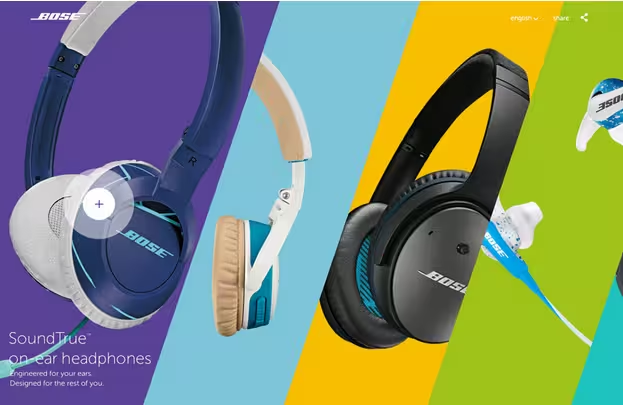
Photo credit: Bose
Bose is a good example. The site takes a few seconds to load, but the smooth loading animations makes the wait feel less tedious. As you hover over each product, the smoothly triggered animations makes the user feel like they’re playfully browsing through a rolodex. The interface also features contrasting bars of colors to capture the user’s attention, drawing them immediately to the products.
Take a look at the animated prototype we built below in UXPin. Notice how the menu loads immediately after tapping, but transitions a bit slower (so that it’s not jarring). Again, we use bright colors here to quickly grab the user’s attention.
Photo credit: UXPin
While it may feel manipulative, the use of psychological trigger allows you to further your ability to reach out to the human on the other end of the screen.
5. Design With Simplicity
A wise man once said, “the design is in the details.” Simplicity always strengthens the details.
Websites such as Facebook, Twitter and Instagram thrive on this human factor. People are sharing their lives with other people. The design and interface is simply the vehicle that gets them there. Now think about the designs of each of these websites. All of these platforms started with simple tools for sharing and while they have grown in complexity over the years, the core usability is still easy to learn.

Photo credit: The University of Sydney
Start with simple visual elements:
- Color: Stick to one or two colors that are high in contrast. Keep cultural considerations in mind, especially if your website is designed for an international audience.
- Typography: The first rule of typography is that it must be legible (letters are easy to discern) and readable (words and sentences are easy to understand). All main body copy should be set at a level that is comfortable for the eye. Start with a sans serif style and include plenty of space between lines. For the best visual comfort, consider size and the number of characters per line.
- Space: More space makes a design feel open and inviting. Cramped lettering or elements that are too close together feel chaotic and jarring. It’s a tricky balance though, because wide open spaces can sometimes create the feeling that something is missing. A good approach is to subtract elements from your design until it breaks, then working your way back over the threshold.
- Micro-interactions: Design interactions and notifications work in an almost invisible way. Like a simple hover animation, they add visual polish while giving users instant feedback. Follow the 12 principles of animation.
Prototyping your design is a good way to see if these visual elements work or not. While doing so, look for where you can trim because as the old adage goes, “less is more.”
Takeaways
Designs with a human touch just feel right. It might be intangible, but it’s undeniably powerful.
Think of interactions between people. Most communication happens using common languages, such as speech or even posture or gestures. It’s usable communication.
It’s the very same thing when it comes to designing a website or app. The most stripped-down purpose is to communicate something with users. Creating a simple, easy-to-understand method for this communication is always the quickest route to success.
If you found this post helpful, check out the free e-book Interaction Design Best Practices for 100+ pages of additional advice. Visual case studies are included from 30+ companies like Apple, Google, Etsy, and Behance.
Read Next: How to design a foolproof website with storytelling
Image credit: Shutterstock
Get the TNW newsletter
Get the most important tech news in your inbox each week.