
Every design tells a story. Every story has a design. It’s your job to connect the two.
It takes planning and thoughtful design every step along the way. Effective storytelling requires that you use visual and user interface design to create something that people want to interact with. In this piece, we’ll explain some key techniques illustrated with plenty of live examples. Here is our list of storytellyng website design tips:
Every brand has a story, what’s yours?
Start with a narrative. What is the story of your brand, company or even app? It needs to be unique and interesting. It needs to be something that people actually want to share, retell, or participate in.
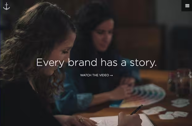
Photo credit: https://www.anchour.com/
Writer and designer Paul Jarvis explained his five common elements of good storytelling for Inc. Magazine. The elements almost seem too simple, but are really at the heart of why people love stories.
- Good stories are simple.
- Good stories are emotional.
- Good stories are truthful or believable.
- Good stories are real.
- Good stories are valid and work for almost any audience.
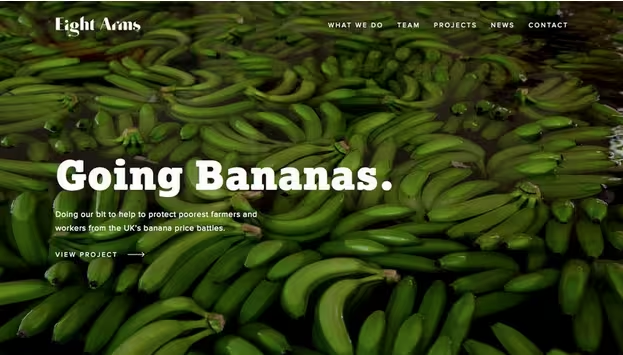
Photo credit: http://eightarms.co.uk/

Photo credit: http://petermanningconductor.com/
When thinking about the story, consider some elements that all stories have – characters, plot, action, emotion. Your story should contain these elements as well. The other thing that many stories have in common is a voice or narration. While at first you might think this means you need someone to tell the story audibly as part of the design, that’s not what it means. But someone does have to tell the story.
What’s amazing about user interfaces is that you can create this voice in a number of ways:
- Type of language used, including words and sentence structure
- Tempo and pace
- Feel – are you formal or casual?
- Visual connections to message
Look at the examples above from Eight Arms and Peter Manning. Each site immediately creates a different visual tone, which sets the scene for different stories. Even without knowing anything about these sites or what they represent, users will feel a certain way because of the visuals – from images to typefaces to color choices – and what those element say about the site. Like we first explained in Web UI Design for the Human Eye, the story starts with that first impression.
Storytelling is about stories, either big or small
Every story has a grand component and then smaller journeys that help you move along that path. These two types of stories – big and small – help users create a course of action as they interact with the design.
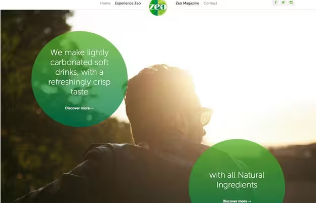
Photo credit: http://www.drinkzeo.com/
The big story provides a framework for the experience. It’s why you have a website or app in the first place. It should connect to users on a broad level and should be easy to tell or explain.
The small story provides an extra element along the way. Think of small stories as those “juicy fragments” that just can’t be ignored. The larger story can be comprised of many smaller tales. Think of it almost as a game or book, with every level (or chapter) having a smaller purpose within the grand design.
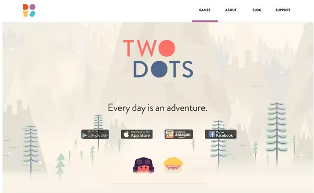
Photo credit: http://weplaydots.com/twodots.html
Games are a great example of both kinds of storytelling. Even the simple game Two Dots has big and small stories.
The big story is the full game itself. You want to move through all the maps to complete the journey. The smaller stories are in the levels themselves. Several rounds of play each happen in a specific environment. This construction does something that hooks users: it provides small victories in the game (completing each environment) so users continue to play for longer periods of time.
Design the Story
Designing a visual story is a lot like writing a book or play. So approach it that way. Create a story arc to help plan the story and related interactions along the way.
It starts with three parts (or acts): Setup and scene-setting, conflict and resolution. Every story includes these elements. The first and last acts are the shortest with the area of conflict as the most intriguing and longest-lasting part of the story.
Within the conflict part of the story, design for the emotion users should feel. Users should understand the reasoning behind the story and want to engage in some sort of decision-making or action in order to create resolution.
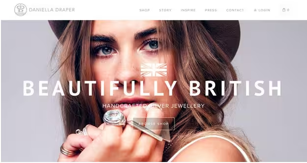
Photo credit: https://danielladraper.com/
This all sounds pretty dramatic, but it can work for almost any scale. Take the retail site Daniella Draper for example.
Act 1: Introduction to the retailer. Story cues are that the company will exemplify British style and focus on accessories. (Look at all the jewelry on the model.)
Act 2: Supporting facts that make this product cool. It’s work by model Kate Moss; it’s designed for summer and beauty; it’s prestigious and stylish. The entire story is created so you will desire the product.
Act 3: Click and buy. It’s simple to add items to the cart and checkout. A good mix of call to action and story resolution.
Connect the story elements with UX
After you have planned out the story, thought about big stories and small stories, designed visuals, emotion and interactions, then it’s time to pull it all together.
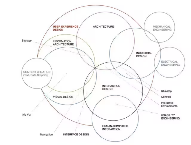
Photo credit: http://www.kickerstudio.com/2008/12/the-disciplines-of-user-experience/
Dan Saffer, author of “Designing for Interaction,” has the best explanation of the theory behind designing interactions available. At first glance his above diagram looks like a series of crazy lines, but when you really look, it’s easy to see how it brings together almost every facet of design. And where all these areas intersect is in the user experience.
Now that the theory makes sense, how do you actually take your story and connect it to these design elements?
This is where designing moments, micro interactions and ease of use really come in to play. Does your website/app/design work like you would expect it to? Do visuals and actions come together in an intuitive way? Do you have to think about how to use the design or follow the story?
You can bring it all together by connecting the design with smooth usability.
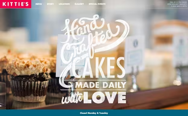
Photo credit: http://kittiescakes.com/
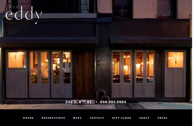
Photo credit: http://www.theeddynyc.com/
Let’s explore a few of these design techniques for creating rich stories:
UX Design Techniques
- Perfectly-timed surprises that visually engage and delight the user
- Emotional design for “stickier” experiences that users remember longer
- Gamification that incentivizes users into becoming the main character of your story
- Discoverables that unravel user actions and narrative elements at a natural pace
UI Design Techniques
- Color to create the right emotional bond
- Highly readable typography for ease of understanding
- Great photos, animations, video or other engaging imagery
- Plenty of negative space to distinguish elements and focus users on content
- Correct signifiers that communicate what actions users can take within your narrative
- Compelling copy and microcopy that conveys your site’s personality
Usability Techniques
- Intuitive information architecture so that users navigate seamlessly
- Simple navigation that allows users to easily move between the 3 acts of your story
- Jakob Nielsen’s guidelines for response times so your interface still helps users quickly accomplish goals
- Responsive and adaptive design so that you communicate the same story across any device
- Red routes so that key user tasks are woven seamlessly into the story
- Clear yet conversational feedback so users know when actions are successfully completed and what is still required of them
Takeaways
Telling a story with design comes down to one simple factor – cohesion. You need a story and a set of visuals and interactions that feel like they belong together. (Easier said than done, right?)
Planning a story with design comes to down to understanding your audience and a little bit of design theory. Every website or app has a story. It’s your job to make that story clear and engaging for users.
If you’d like more practical storytelling techniques, check out the free e-book The Visual Storyteller’s Guide to Web UI Design. Plenty of tips are provided through analyzing 29 examples from companies like Tesla, Fitbit, Microsoft, Squarespace, Foursquare, and others.
Read Next: Why long scrolling sites have become awesome
Image credit: Shutterstock
Get the TNW newsletter
Get the most important tech news in your inbox each week.


