
It happens to everyone at some point: You look back on a website design and realize that you made a mistake. And we’re not talking about a misplaced comma. You see a full-scale can’t-believe-you-did-that kind of design faux paus. While you can’t go back in time, you can make corrections so your design is flawless moving forward.
Here we’re going to take a look at a few common design mistakes and how to avoid or correct them in the design process. (As an added bonus, each mistake is paired with an example of how to do it right to help you move forward.)
Designing Without a Grid
You sketched it out on paper and then just plopped everything down without a plan for organization or scale. While the concept is solid, the lack of a grid can leave a website hanging on a shaky skeleton.
However, as explained in Web Design for the Human Eye by UXPin, visual consistency is important and allows your users to easily flow from the top to the bottom of your site.

The <3 of EU tech
The latest rumblings from the EU tech scene, a story from our wise ol' founder Boris, and some questionable AI art. It's free, every week, in your inbox. Sign up now!
The fix: Go back to some of your early designs and try to make small adjustments to get on a grid. This is a pretty labor intensive fix and might be best resolved with a complete redesign. The grid can impact everything from the size of text to spacing to image size.
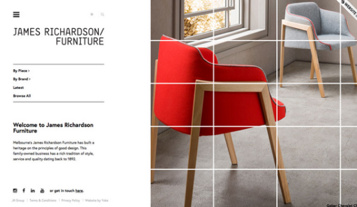
Photo credit: James Richardson Furniture
Doing it right: Designing with visible grids is trending and functional, and you can use a variety of design tools, such as UXPin or Adobe’s Creative Cloud to help you. James Richardson furniture uses a fun grid pattern over the images for visual interest and pixel-perfect alignment for other elements on the homepage.
Hover over the grid for even more blocks that animate out. The result is a design that is clean, organized and fun to play with.
2. Using a Theme without Customization
There’s nothing wrong with using a theme or pre-made website elements to get a website up and running. There are plenty of premium themes and free UI kits out there that can help you get launched quickly. But don’t just apply a theme and call it a day. You will end up with a website that likely looks like a hundred other sites out there.
The fix: Start with a premium theme or toolkit. For a small price, you’ll get a set of tools that can help you turn a “box” product into a custom website design. Look for tools that allow you to make changes to color and typography, as well as include an easy to manipulate set of building blocks. With these features, you can build and make changes as often as you need to keep your site looking fresh. If you want to have some fun, enter the domains of your favorite websites in What Theme is That? to see what common tools are being used.
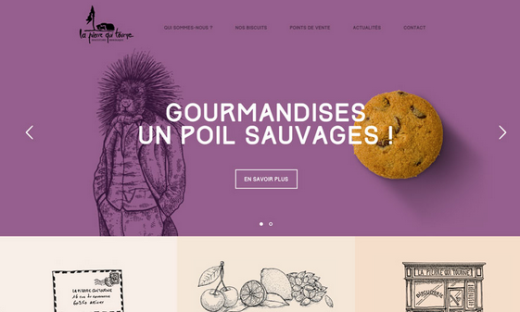
Photo credit: La Pierre Que Tourne
Doing it right: La Pierre Que Tourne is a nice website on a WordPress backbone that uses common widgets and plugins, but you would be hard-pressed to spot any of them. And that’s why it works. Widgets and plugins can do everything from help you incorporate social media into your website design to add a calendar or even outline the design itself. Even the homepage image slider is a widget-style element that comes as part of a design “package.”
3. Moving Forward with Poor Images
You used a bad image on your website. The resolution is lacking, the focus is off or the tone just does not match your brand. Any of these image issues can be a website killer.
The fix: A good website starts with a good image. If you are lacking quality images, there are a few options:
- Hire a photographer or illustrator to create an image deck
- Use stock images
- Create dominant “art” on your own using typography and color
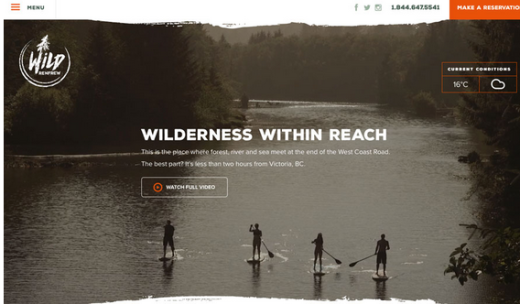
Photo credit: Wild Renfrew
Doing it right: There are tons of images and video on the Wild Renfrew site, and every single one is sharp, high-quality and engaging to look at. The images are what keep you scrolling down the page while begging for clicks. The site takes nice imagery another step too with a custom set of icons – that tie to the main logo – with a consistent look and feel to help you move through the design.
4. Not Using a Color or Typography Palette
Too often designers think they can get away with colors that “seem to match” or fonts that are “close.”
A website design project is just like any other when it comes to style and branding, and consistent color and typography palettes are vital. (It also helps to have a style guide so mistakes aren’t added to a site after launch, as pointed out in Web UI Best Practices.)
The fix: Thankfully this can be an easy fix even if your site has been live for a while. First, create a defined palette for color and type. Select one to three colors and fonts that you will use and define how they should be applied to the site design. Once the rules are outlined, you can replace styles in the CSS with the correct color and font associations for a site that will immediately appear more organized and professional.
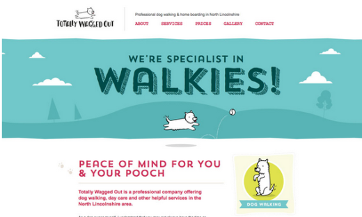
Photo credit: Totally Wagged Out
Doing it right: Totally Wagged Out is an example of creating simple and consistent color and typography palettes with a lot of personality. Too often, the reasoning for not using a palette is that it is too stiff or formal. But this fun site totally debunks that myth with a great set of color and type choices that contribute to a light atmosphere with a professional design.
5. Overcomplicated Navigation
One of the biggest debates in website design right now centers on the tiny hamburger menu icon and whether it is a good navigational tool. Regardless of where you fall in this argument, simple and streamlined navigation is a vital design element. Multiple options in drop downs and multiple levels is just too much work for today’s time-pressed user.
The fix: Rethink your menus. Not every page in your website framework has to be part of the navigational structure. Navigation should include clearly labeled primary pages with an obvious click pattern. If your site is content-rich, consider a second level of navigation or a sidebar for links and related pages in the secondary page structure.
You can prototype your new navigation, then test it out with users, seeing if it’s easier for them or if it just confuses them more.
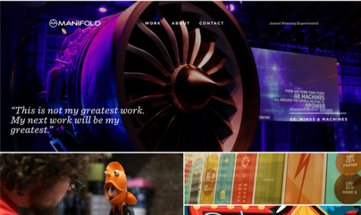
Photo credit: Manifold
Doing it right: The Manifold agency has a site packed with links and clickable elements, but you won’t find them in the main navigation (which contains just three items). And that’s perfectly fine. The site sets an engaging tone that begs for you to click around. The secret is that you aren’t actually looking for anything more in the navigation.
6. Site is Slow to Load
Slow sites are “no sites.” Users will be frustrated and leave your site without clicking or converting on any actions. This goes for your landing page and all interior pages. (You don’t think all visitors get to you via your home page, do you?)
The fix: This one can be tougher to fix depending on what is causing slow load times. While you are working on a solution, consider a nifty loading animation to entertain users while they wait for the page to load. (This will only work so many times, though.) Then start looking for the root of the problem. Make sure to optimize images and video, give the code a good, hard look.
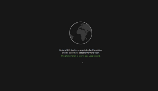
Photo credit: Leap Second
Doing it right: Sometimes a loading animation is so good that you don’t even catch that’s what it is. Leap Second uses a simple loading sequence to lead the user into the website with the start of a story. With a couple lines of text, Leap Second grabs the attention of the user as the rest of the site launches. This technique is a great option for sites that will be a little slower to load because of weighty content, such as video.
Takeaways
Instead of sulking over that mistake (or two) you might have made in that last website design project, think about how you can make changes for the better. To avoid future design issues, think about how you use websites and what frustrates you. Now plan for ways to eliminate those concerns for your projects.
Sometimes the fix to a website design mistake is rather simple, while others can require a full-scale redesign. If a redesign is the answer, consider small tweaks in the meantime or putting up a temporary page to help keep users from turning away.
For more advice on the right way to design web experiences, check out the free e-book Web UI Design Best Practices. Across 109 pages, you’ll find 33 design teardowns of top companies so you can learn from the best examples.
Read Next: Why micro-interactions are the secret to great design
Image credit: Shutterstock
Get the TNW newsletter
Get the most important tech news in your inbox each week.