Facebook’s design has been widely discussed among designers and users, and I’ve seen plenty of criticism:
- “Why is the design of Facebook’s desktop site so bad?”
- “Facebook has a deeper problem than just Vine/Twitter”
- “Do anyone else find Facebook to have an ugly design?”
Having reviewed some of the critiques, I decided to try giving it a facelift. What started as a fun side project eventually lead to the Facebook Flat Chrome extension.
In this piece, I’ll explain the merits of flat design, then dive into some issues with Facebook’s current interface and how I hoped to resolve them.
Why I Chose Flat Design
As described in the free e-book Web Design Trends 2015 & 2016, flat design is popular for many reasons. First, is its edge in performance. Pages with flat design are easier to load than pages containing complex graphic elements.
Besides that, flat design is very responsive-friendly, adjusting easily to screens of different devices. As mobile users outnumber desktop users on the Web, flat design is becoming much more attractive for creating a device-agnostic experience.
Finally, flat design conveys a very mature visual aesthetic while being very easy to use. Many designers and users appreciate the beauty of simplicity. In fact, research even shows that beautiful design works better. The greatest testament to the power of flat design is perhaps Apple’s choice to abandon its trademark skeuomorphic interface for a more flat-inspired look in their latest iOS 8.
Improving Facebook’s Design
When examining the main mistakes in Facebook’s design, I noticed some interesting UI issues. Below, I’ll dive into some of the most drastic changes I made aside from the overall aesthetic.
One of the critical problems of the current interface is that it’s not as stupidly simply as it could be, especially when it comes to accessing your own content.
It’s understandable – Facebook’s interface needs to support quite a bit of content (Timeline, photos, games, etc.). Of course, as your interface becomes more complex, the cognitive load increases and users need to think more. When it gets to an extreme, the user might not even enjoy what they’re doing anymore.
Creating the illusion of invisibility
When planning the new interface, you need to consider not only financial interests, but also the motivation of users.
A good interface design is one you don’t notice. Like an invisible hand, it simply guides the user towards completing their goals. It does not contain unnecessary elements (like five buttons with a proposal to advertise on the home page). Everything is concise, clear and understandable.
Next time you’re thinking about adding a new element to your interface, ask yourself : “Does the user really need it?”.
To focus users on the content (which is what they care about most), I removed the right-side stats listings like “Recent posts” and “Trending” since their secondary function doesn’t outweigh the distractive nature. As a result, the new interface makes it easier for users to sift through their feed to find what they care about.
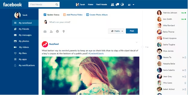
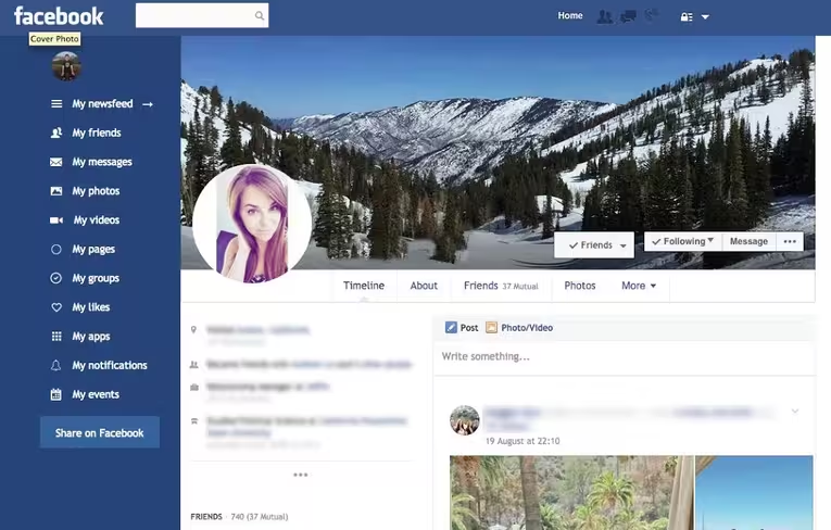
Current Facebook
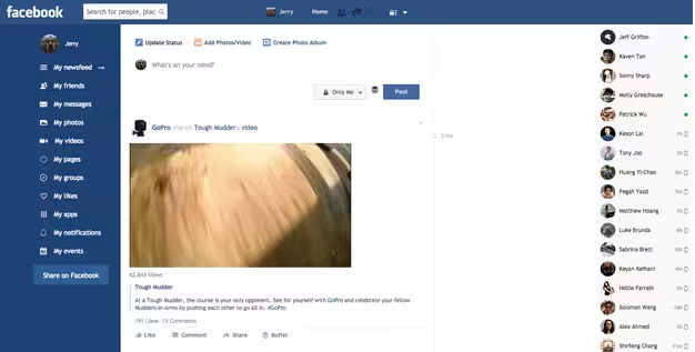
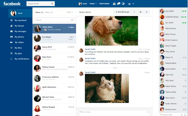
Facebook Flat
Improving Label Consistency
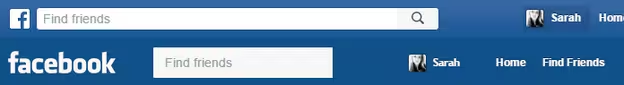
The most confusing thing to me in FB is left menu. I have no idea why the elements are placed so incomprehensibly. Just compare the UI in 2004 and 2015:
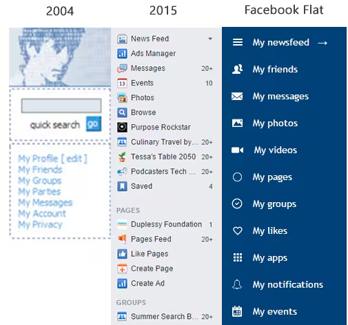
Which one is more predictable (and therefore understandable)? The original design is actually quicker to understand since it all follows a “My [Category]” taxonomy, so I created interface labels that were just as clear-cut and consistent.
Reducing page-to-page friction
In the current version of Facebook, if you want to go from the main page to any other page, the menu immediately disappears. This forces the user into extra clicks, which of course increases friction. To close the gap, the redesigned interface includes a “sticky” menu so that additional actions are always available.
Streamlining the typeface
When it comes to typography, form is function. This idea is described quite well in Web Design Trends 2015 & 2016:
“Flat typography encourages designers to think more carefully about every type selection. Even serif typefaces have evolved with simpler letterforms becoming the norm, allowing the content itself to shine through.”
Facebook’s current Helvetica typography is thin and unassuming, which makes sense considering how busy the interface already looks. You certainly don’t want too bold or fancy of a typeface to clash with all the other elements.
Once I simplified the interface, however, I realized that a more curved typeface was appropriate to help populate the space. I chose Trebuchet for my typeface because it’s legible but still friendly. Sure, it’s not as sleek or sexy as some of today’s more popular flat typefaces, but it doesn’t need to be. A social network typeface needs to be clear and inviting to users. As is the case with all design, it’s not about the best choice – it’s about the right choice.
Applying bold strokes of color
Colors are much more than just decoration – they create an instantly understood emotional language. Using CSS styles, I completely flattened the color palette to further simplify the visual experience. If we follow the philosophy of content-focused design, then less gradients leads to less visual noise (which makes elements like navigation and search easier to use).
In this case, I completely avoided bevels, shadows, and gradients. For the background and menu, bold and bright colors helped create natural contrast. This draws the viewer towards the content and navigation without the potential distraction of additional effects.
Embracing white space
White space is just as powerful a design element as colors and typefaces. Because white space improves comprehension, I increased the white space around every element: menus, buttons, blocks with posts, private messages etc. The content becomes easier to scan and read in-depth, which improves the core of the user experience.
But to keep up with increasing resolution (research shows that HD monitor adoption increases each year), you’ll notice that I also had to stretch each content “card” so the additional space didn’t appear awkward. Luckily, by removing the right-hand stats column, there was plenty of room to play around with.
Conclusion
The structure of Facebook’s design didn’t require improvement, only its presentation. Unlike some more radical redesigns (like this Windows-inspired reimagining), I didn’t want to alter the interface in such a way that users would need to relearn Facebook entirely. From a business standpoint, that would be a disaster regardless of how beautiful the new visual design might look.
As with any redesign, the new version must be usable but also familiar. Never underestimate the power of the MAYA principle (Most Advanced Yet Acceptable).
When working on what became the Facebook Flat chrome extension, my goal was to return Facebook to a more content-focused design by applying the time-tested usability principles of flat design. Aesthetic qualities like crisp typography, clear contrast, and a minimalist elements all lead to a more lightweight interface that loads faster and is easier to scan and click. When you consider the vast amount of content Facebook must support, the best design really is no design at all.
If you’d like to learn more about modern design techniques, I recommend checking out Web UI Design Trends 2015 & 2016. It’s a helpful reference guide describing 10 techniques (including flat design) illustrated with 166 examples.
Read Next: Facebook appears to be testing new profile pages for mobile users
Image credit: Shutterstock
Get the TNW newsletter
Get the most important tech news in your inbox each week.