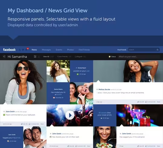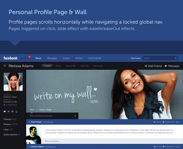
Facebook is making strides with the app editions of its service for Android and iOS, but the desktop look has fallen behind recent design trends. Rather than just sit around and complain, designer Fred Nerby took matters into his own hands with this gorgeous new look and concept redesign of the site that he posted to Behance.
Nerby describes the project as “a conceptional and systematic design approach for a new responsive desktop and iPad concept to the largest networking platform in the world, focusing on a more streamlined solution for its online space and created behaviour.”
Readers, how do you feel about this hypothetical version of Facebook? Do you “Like” this more than the social network’s current design?
We were curious to learn more about the designer’s process for reimagining the world’s largest social network, so we sent Nerby a few questions:
TNW: What made you want to attempt this new look concept?
FN: I’ve wanted to create a better understanding and relation between user and content and how such data can be displayed. Today, Facebook is not so much the necessary evil that people have to get used to anymore as much as it has become part of people’s behaviour on a daily basis. Such behaviour is systematic and that is creative in itself. That behaviour is a very powerful tool for both end users and companies around the world when “used correctly”, create your platform and tell a story about it. The visual impact is crucial today and how we’re displaying information is essential for any application’s success.
TNW: What were your guiding principles during the design process?
FN: To approach the platform from a user perspective and focus on targeted & personalized data while maintaining a visually appealing interface. Facebook has done a good job on this for a long time but we’re still not seeing the full extent of what’s possible within this platform. I believe the future of data, design & dev lies within personalised or targeted information online, because currently, we’re flooded with information online such as banners, ads and other media who have based their campaigns on a more narrative philosophy (which is “interrupting the user” [to get] you to think of a brand or product you hadn’t thought about). This concept draws upon a systematic theory and lets the user control what they want and don’t want to see, creating more of a personal environment online.
TNW: Are there any other sources you specifically looked to for inspiration?
FN: New design trends online or within applications is being introduced on a daily basis by solid creatives around the world. I’m not inspired by a specific application as such but more so the overall UX/UI experience of products and websites. I draw upon Apple’s way of executing an interface plus other Metric systems that are currently being introduced by other platforms. I don’t draw too much inspiration from one specific source it’s all about understanding the need for that application or platform that you’re working with and what the expectations are from the end user.
TNW: Would you license this to Facebook if they asked for it?
FN: FB and its current creative team has proven its talent. I’m sure we’ll come to an arrangement.
TNW: Would you design for Facebook if they offered you a job?
FN: My door is always open for discussion.
➤ Fred Nerby | Facebook | Behance
(hat tip Hacker News)
Image credit: Justin Sullivan / Getty Images
Get the TNW newsletter
Get the most important tech news in your inbox each week.


