
Humans like to fancy themselves logical beings, but anybody with some sense will tell you that most people are ruled by their emotions. Emotion drives sales, engenders trust, establishes arguments, makes points, captures attention and builds the bridge between disparate factions with vastly different goals.
In essence, any objective you’d like to reach through design will require an emotional investment on the part of the user. Interactions happen consciously and subconsciously. As soon as someone sees your site, an emotional reaction occurs subconsciously – that in itself is an interaction. Likewise, users also need to consciously decide how and where to click on your site.
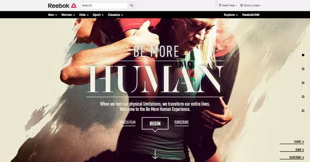
Photo credit: Reebok via awwwards

The 💜 of EU tech
The latest rumblings from the EU tech scene, a story from our wise ol' founder Boris, and some questionable AI art. It's free, every week, in your inbox. Sign up now!
Competent designers do their damnedest to draw an emotional response from users. Specifically, they try to initially capture attention, then capitalize on that attentive energy, eventually building to an emotional crescendo that feeds into a conversion of some sort. Whether it’s giving contact information, buying a product, or sharing a link, all user actions require an emotional connection.
As described in the free e-book Web UI Best Practices by UXPin, you must make your users feel something. This necessitates active involvement. You can subtly coerce an interaction which will evolve into a rapport—a sort of “call and response” between design and viewer. And because there’s often commerce involved, the science surrounding the methods used to achieve this effect has grown very precise.
How To Create Emotional Investment
Convincing anyone to become emotionally involved in your work can seem daunting, (even arrogant). The truth, however, is you are trying to align your goals with theirs. You want to provide a positive UX in order to prompt a bit of gratitude. From gratitude will proceed reciprocation, and from there the desired outcome for users and the business.
Understanding User Goals
Assuming you’ve done your due diligence in regards to SEO, most users on your site will know what they want when they arrive. Unfortunately, this doesn’t let you off the hook. Quite the opposite, you’re now expected to facilitate user ambitions.
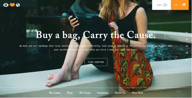
Photo credit: Eye Heart World via awwards
You need to understand why they’ve arrived in the first place.
That means creating “user personas,”or fictional representations of your users, based upon as much detailed data as you can gather. Take surveys, gather information about your user base, and then use that information to create detailed identities with names, jobs, ages, genders, and preferred browsing devices. Build these personas on your target audiences and the data available on their online behavior. Once you’ve created the imaginary people, go ahead imagine their motivations. Next, ask yourself the following questions:
- What value are you providing that’s drawn them in? Think about what’s attracted each persona to your website. Are they there by referral, in search of content, looking for a product? Think of what you’re offering that they would seek. These are called user goals, and they’re usually caused by triggering events. Include this in your thinking when you’re designing scenarios for your user personas.
- How can you emphasize that value, making it obvious and immediate? Clear content hierarchies as well as intuitive navigation patterns can make things easier for your user, increasing their gratitude at the positive UX you’re providing.This can be handled nicely in the testing phase. First, make a list of those motivations you found earlier and the associated tasks designed to satisfy a user’s goals. Then survey your target market to see which tasks/motivations are most important to them. See which tasks the user’s choose and record the numbers.This way you can quantify your user’s priorities mathematically.
- How can your goals be met concurrently with those of your visitors?
Take, for instance, Amazon.com. It’s a ubiquitous example in that brand recognition is near universal. Everyone knows exactly why they’re going to Amazon: to shop. Even so, Amazon’s interface is an effective example of aligning to user goals.
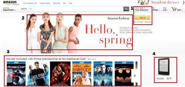
Notice the main elements that Amazon highlights above the fold.
- The account sign in via popup
- A seasonal sale advertisement
- An offer associated with Amazon Prime membership
- And a Kindle reader with price listed
Amazon is well aware of customer concerns. First, they know that membership is a highly valued asset for their interests as well as those of the user. The site is simply much easier for a visitor to navigate, and is far more personalized, if they have an account with their preferences and a browsing history saved.
Likewise, clothes are a gigantic seller on Amazon. Providing a seasonally appropriate advertisement, complete with high quality image and eye catching copy, hits that impulsive buyer instinct right off the bat. Finally, Amazon uses the remaining page space to advertise its slightly lesser known, yet still immensely popular entertainment/media services.
The end result?
Intuitive navigation patterns (as shown in the free ebook Web UI Patterns) encourage familiarity (and the consequent brand loyalty), the desire to shop, and the desire to be entertained.
Amazon clearly understands the value they provide and it has a layout optimized for what their users expect upon arriving to a familiar destination.
Directing Attention to Achieve Focus
In order to focus the user on what’s most helpful (and presumably valuable to the business), you must guide their eyes and emotions at the same time.
A user has a set amount of energy they’re willing to expend in order to achieve their goal. That’s why it’s urgent your design achieve two goals as soon as a user has landed on the page:
- Excitement
- Direction
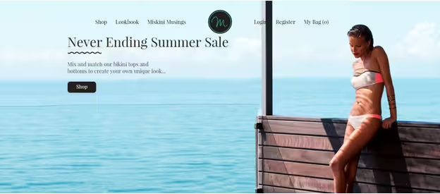
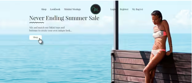
The image above from Australian bikini company, Miskini.com, highlights a common tactic to achieve the first objective, sex appeal. Never underestimate the power of a beautiful person to grab the attention of everyone in the room, or at the other end of the internet connection, as the case may be.
This picture immediately and intentionally puts the user on full alert. You want your designs to do the same. A website visitor needs to be fully energized in order to travel to the end of a given user flow. You’re aiming for emotional arousal. The more excited they are, the greater the likelihood that they’ll achieve their (and your) goals.
Next, you’ll want to provide an outlet for all of that emotional energy your design has elicited. That’s why intuitive navigation patterns are so important. You’ve built up some pressure, now you need to provide release.
In addition to the attractive visuals described in Web Design for the Human Eye, a few common methods of arousing and directing user emotion (and therefore, attention and focus) are as follows:
- Minimalism– Keeping a simple, elegant, and uncrowded layout serves to remove distractions and highlight navigation pathways. Cluttered and crowded UI serve only to confuse, overwhelm, and frustrate user attention. By eliminating the unnecessary, you’re able to provide a clear path forward through your website.
- Interactive elements– Buttons or tabs that react to mouse hovering, dropdown menus, and animations of all types provide immediate feedback for users. These build excitement, reduce stress, and denote another easily recognizable user flow. They also create microinteractions which reward the user for engaging with your site’s content. Finally, these elements add a sense of aesthetics and soothe the user’s mind with something pleasant to look at as they explore your site.
Take a look at the below animated prototype created with a free trial of the UXPin design platform. The bright colored background creates immediate vibrance, while the animation smoothly transitions the user into the navigation menu. Our eyes are drawn to movement, and motion always creates emotion.
Navigation cues– helping users achieve a goal of successfully navigating through your site will improve the rapport you’re trying to build.
Harnessing attention and guiding focus requires interaction between user and design. These interactions can be initiated by either party. In the case of interactive elements, such as an animated button (pictured below), the effect is often very subtle. Observe how the button has changed color in response to the mouse hover, informing the user that the button is, in fact, a link.
This leads to the next point. Whereas the color-changing button is an example of user-led interaction, the design itself is also capable of stimulating user emotion, and demanding a response in kind.
Call and Response
Much like the rhythmic field singing which eventually evolved into the blues, Web designers use on-page elements for the classic call and response.
The previous examples have all shown shades of this concept. The sexy lady in the Miskini example calls out for attention and the user travels deeper into the website in response. Likewise, the popup menu on the Amazon homepage calls to users so that they’ll sign-in as a response.
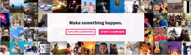
Perhaps the most obvious example of call and response in Web design is the ever popular Call To Action. CTAs are big, bright, flashy, and attention hungry. They’re designed to entice the click. In the image above, taken from the popular crowdfunding website, Indiegogo, you get a good view of this concept in action.
There are two separate, juxtaposed CTAs, set atop a bit of semi-transparent whitespace, amidst a colorful montage of the faces of your friends in need. This is a visual feast that’s all but impossible to ignore. Combined with the charitable impetus this exerts upon user emotion, you can’t help but feel the urge to click and make a difference.
Take note of how the color contrast and engaging imagery tug on the heartstrings, then the simple action-oriented copy provides the “release” for users.
Common Design Elements That Soothe Or Arouse Emotion
UI design must be anal-retentive. It’s just the nature of the beast. Every decision has to be pored over and over again. Because you’re designing an emotional experience, there can be no bumps in the road that will disrupt the intended feeling you’re trying to convey. This means precision, forethought, and a lot of testing.
If you want to be successful, you have to micromanage every aspect of your page, because each element has its own effect on user’s attention span and emotions. If it doesn’t serve a purpose, then it’s simply in the way.
Understanding this, it’s possible to examine some common elements of Web design in a new, emotionally evocative light.
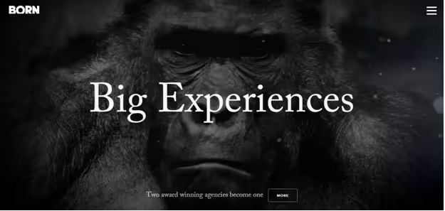
A picture is worth a thousand words and video is worth at least ten thousand.. Imagery is the ultimate tool in a designer’s kit to evoke an emotional response. People respond to proximity, eye contact, and facial expression. That’s why the image above, taken from digital design/development firm, Born Group’s website, is so intense.
They put you face to face with an 800 lbs. silverback. Assumably, this is to illustrate the scale of professionalism with which you’re dealing. Compare this imposing image with the ensuing levity pictured below.
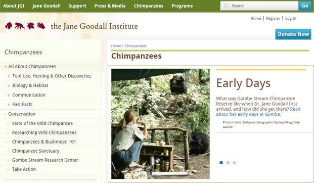
This classic image from the Jane Goodall Institute’s website illustrates the difference between a close up and a wide angle. There’s more going on, and more subjects of interest in this second image, but it doesn’t carry the visceral oomph of Born Group’s hero image. Why is that?
It’s because this image has given the viewer some breathing room, and there’s no direct eye contact with the photo’s subjects. While still somewhat emotionally intriguing based on the subject matter, the second photograph, due to its decreased size and increased distance, isn’t as likely to produce emotional arousal from a viewer.
Typography
Typography perhaps isn’t the first thing that comes to mind when considering emotionally engaging elements, but you can’t deny the expressive qualities of lettering.
In the below example, web design firm BigDrop Inc. uses the quirky typeface, Pacifico, to illustrate the distinctiveness with which their brand has come to be known.
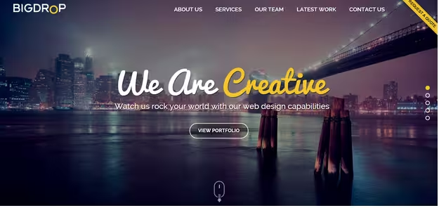
The letters have a playful quality that, combined with contrasting colors, encourages an openness from website visitors. A sort of disarming and straightforward invitation to enjoy creative freedom, while still maintaining legibility.
Legibility along with its close cousins: scannability and readability, are inextricably tied to user attention and frustration. Users need to be able to quickly ascertain the overall gist of any block of text. Margin spacing, line height, and a number of other factors directly affect the reader’s ability to grasp textual meaning.
Tightly packed, tiny typefaces stuffed into large blocks of text, or even big bold typefaces with poorly designed kerning, are both highly illegible and downright frustrating to users. You may want to achieve emotional arousal, but angering a user who can’t read your text is not the preferred route.
Comic Sans that looks like it was poured out of a cereal box. Awful. Just plain awful. At this point, it’s probably best to move on to something a bit brighter.
Color
Color psychology is a well-trodden subject in Web design. The largely subjective connection between emotion and color has been explored exhaustively by some of the biggest companies in the world. And while there are individual differences in the ways human beings react to certain hues, there are generally far more consistencies.
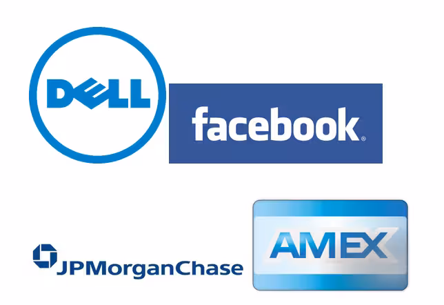
For example, the color blue has long been held as symbolic of trust, confidence, and peace. This is manifest in its ubiquity among corporate branding:
Whereas blue provides a sense of serenity, the color red often is interpreted as piquing the appetites and inducing a state of impulsiveness.
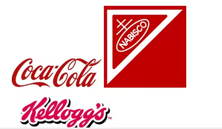
As you can tell from the widespread usage and subsequent success in corporate branding, the two colors are fairly effective at reducing anxiety and increasing arousal, respectively. The theories behind this are an interesting study in themselves. The prevailing notion is that societal reactions to colors mix with individual experiences.
For example, people generally associate blue with peace and tranquility because of the sky and the sea being relatively peaceful most of the time. Whereas red is the color of fire and blood and is therefore considered more aggressive and impulsive. Yet either of these perceptions are likely to be trumped on the individual level, as someone might be averse to the color blue since they nearly drowned at one time. Or they could associate red with the warm glow of a sunny afternoon, and therefore find it the more serene of the two colors.
The obvious takeaway here is to carefully consider the emotions you want your designs to convey, and match your color choices to the ideal emotional state of your users. You can learn more about the emotions created by specific colors in the e-book Web UI Design for the Human Eye.
Juxtaposition
More commonly referred to as contrast, juxtaposition is a concept built upon comparison. Two similar, yet unlike things set side by side can make a user consider an item or element from multiple points of view. The tactic is invaluable if you’re trying to emotionally prepare them to consider something complex.
Effective juxtaposition can be accomplished with color (using colors opposite one another on a color wheel), or with direction (stacking elements vertically, or sticking them side by side), size, and even shape can also be leveraged to create contrast. Both brightness and darkness of on-page elements can also be used to achieve a contrasting effect. Regardless of method, the intent is to highlight certain elements at the expense of a supporting element, creating a bit of subconscious tension in the user’s mind.
To soothe said tension, a user will work harder to understand what they’re seeing. Not only that, but they’ll pay more attention to the positively juxtaposed element.
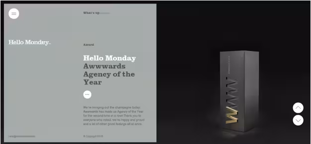
This sample from HelloMonday.com shows an excellent bit of juxtaposition in brightness, as well as content. Light and dark, text and imagery, the user’s interest is piqued and a state of emotional arousal drives them to read the content and examine the image closely.
Personality And Design
Applying personality traits to a brand helps users connect to the brand emotionally, thereby achieving brand loyalty. Design comes into play by displaying your chosen personality traits. This is a fairly simple concept, but the question is: how do you show your personality?
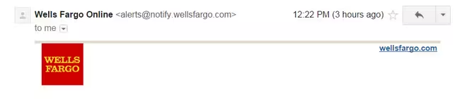
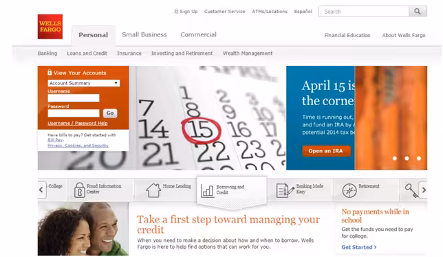
Consistency= Trust
Ex 1) email header:
Ex 2) website:
Ex 3) Twitter feed
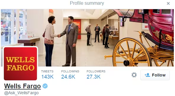
Uniform branding throughout your website and marketing materials conveys proficiency and reliability in your field. Frequently changing or inconsistent branding makes you seem flighty and undependable. That’s why Wells Fargo is adamant about including a uniform logo and plenty of negative space throughout all of their various points of customer contact.
Usability= Customer care
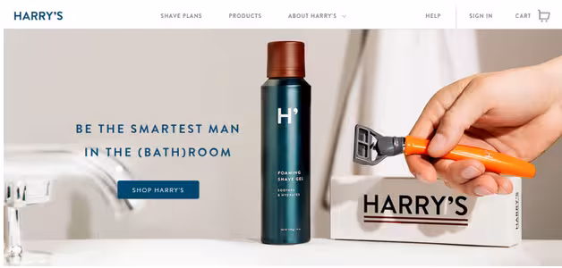
Intuitive and usable designs tell users that you care about their experience. Harry’s, an ecommerce store dedicated to men’s shaving implements, offers smooth navigation and intuitive user flows to express their care for their customers.
Aesthetics= Professionalism
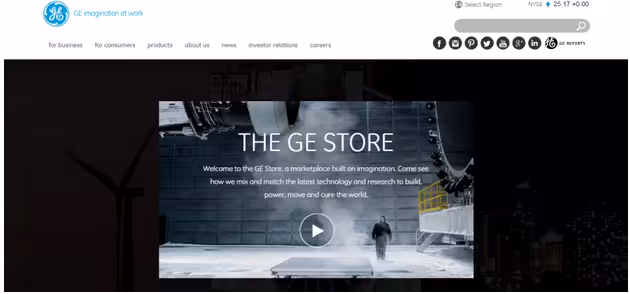
A certain amount of pizazz is expected from a professional site or service. Ultra professional corporate giant, GE, manages this effect with a big header and immediate video content.
Simplicity= Relaxation
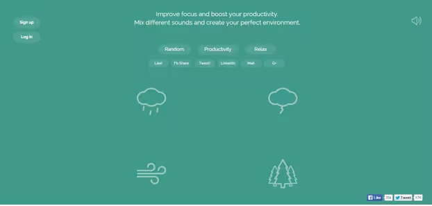
Minimalism is extremely popular for a reason, a crowded display distracts and distresses user attention, whereas an uncluttered interface is pleasing to the eye and soothing to the soul. This is exemplified perfectly on the Noisli homepage, which allows users to create their ideal ambient background noise to boost productivity during their workday.
Next Steps
Provoking a user’s emotions may sound malicious, but so long as your goal is to produce mutually beneficial results, it’s actually noble. You’re almost guiding them to a conclusion that they may not know is beneficial for them.
You have to make your way in the world by providing something of value, but plenty of value goes completely unnoticed unless it’s properly packaged. The packaging is where the mad science of emotional design plays a part. When science and art combine, you create a holistic approach to capture user attention and bring about that ultimate goal: design that changes how people feel.
To learn more about designing for emotion, check out the two free e-books: Interaction Design Best Practices: Words, Visuals, Space and Time, Responsiveness, Behaviour. Across over 200 pages, the authors boil down complex topics like psychology and design principles into simple tips for better design.
Read Next: Why long scrolling sites have become awesome
Image credit: Shutterstock
Get the TNW newsletter
Get the most important tech news in your inbox each week.