
The days of “above the fold” are over.
Long scrolling, single-page sites, and infinitely scrolling sites are becoming more and more common lately, and it’s no mere trend or coincidence. Web design in general has been moving in this direction for years now, and the recent popularity of long scrolling is the decisive result of current functionality issues and user tastes. Now is the right time for long scrolling, and for good reason.
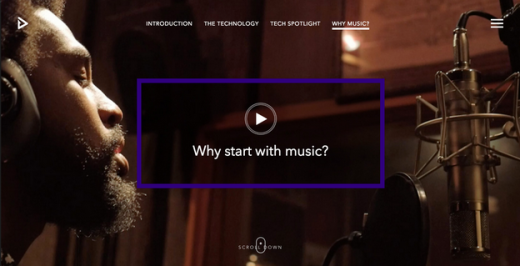
Photo credit: Feed via awwwards
This article explains the evolution of long scrolling and all the factors in its new prosperity.
We’ll cover the characteristics of the technique that make it ideal for modern web design, as well as how it will likely change in the near future. But before we understand where it is now and where it’s going, let’s look at where it came from.
Roots in Printing
In the infancy of the Internet, scrolling was considered taboo. The myth that users didn’t like scrolling was perhaps a vestigial relic from the print industry’s “above the fold” mandate: newspapers needed to get their reader’s attention from only above the front page’s halfway fold.
This made enough sense for websites, too — whatever’s on the first screen will be what influences the user’s first impression.
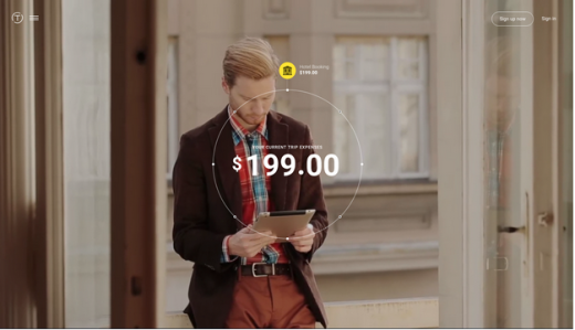
Photo credit: Trippeo via awwwards
Moreover, like print, old websites were mostly text, which is the hardest type of content to keep interesting with long scrolling.
However, when advances in Javascript and CSS opened up more options and sites like Facebook and Twitter broke the ice with single-page sites, designers found that users actually do scroll. In fact, studies have been conducted to back this up: they found 66 percent of user’s attention on a normal media page was spent “below the fold.”
Now, with high speed Internet available in more places than ever before and social media sites setting the bar (scrolling is the best way to display their expansive user-generated content), scrolling just seems right. As described in the free e-book Web Design Trends 2015 & 2016, long scrolling can act as the centerpiece that ties everything together.
Impact of Screen Size
The smaller the screen, the longer the scroll.
The popularization of mobile browsing is another timely, and significant, supporter of long scrolling. The small screens of mobile devices limit the amount of information that can fit above the fold, forcing designers to choose between scrolling, sacrificing elements, or shrinking everything to fit.
Furthermore, the gesture controls of mobile devices make scrolling intuitive and fun. Swiping a finger allows users to browse scrolling sites with more control, accuracy, and immediate gratification than tapping through page-by-page navigations.
Long scrolling’s success is even paying back the mobile industry by enabling smaller screens than ever before.
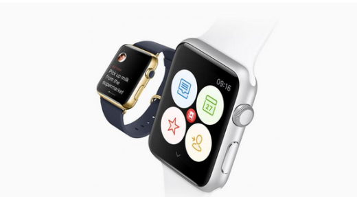
Photo credit: https://www.wunderlist.com/blog/
The ambitious Apple Watch — regardless of its success or failure — depends on scrolling, as seen by the built-in crown for that purpose. The Apple Watch Developer Library guidelines themselves state: “Keep the total number of pages as small as possible to simplify navigation.”
At UXPin, it was an interesting challenge to design UI kits for the Apple Watch. We had to adopt an extremely minimalist approach, stripping away anything except for the most essential content. Otherwise, we found that the screen became too cluttered and the scroll would lengthen.
Even on non-mobile devices, screens are shrinking — just look at new MacBook’s 12-inch Retina display. The trend for laptops is leading towards smaller and lighter, so when you consider they are now incorporating gesture controls, you see how long-scrolling benefits most users in general.
Storytelling
Another relevant, but slightly less impactful, boost for long scrolling is the modern shift towards storytelling.
Long scrolling offers unique opportunities for storytelling that page-by-page navigation just can’t match. The techniques gives the user more control over pacing and the continual immersion avoids the detrimental lag between pages. That’s why Hoa Loranger of the Nielsen Norman Group claims the tactic suits open-ended sites geared towards discoverability, rather than goal-driven sites like e-commerce.
On top of that, long scrolling enables creative elements like parallax scrolling and scroll-activated animations. These effects imbue a site with a more playful feel, almost gamelike.
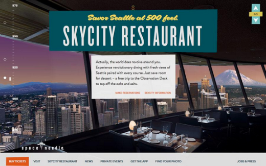
Photo credit: http://www.spaceneedle.com/home/
Long-scrolling sites, such as Seattle’s Spaceneedle above, create a linear step-by-step format that matches storytelling. The pattern of new and familiar features builds a rhythm that gets the user wondering “what will happen next.” When done right, this can be an engrossing experience that the user won’t want to leave.
Alternatively, you can also make the foreground scroll while the background remains static. If you scroll halfway down the tour page on the UXPin website (above), you’ll notice that scrolling affects the on-screen content but doesn’t move you further down the page. This pattern helps deliver plenty of content without stretching the page too far.
The Future of Scrolling
As long as small screens remain popular, then long scrolling will continue to evolve and expand in what it can offer. Considering that mobile users recently surpassed desktop users, it’s safe to say that long scroll is on its way to becoming a timeless technique.
Long scroll will continue to adopt more advanced effects as mobile devices evolve towards improved functionality and load times. While parallax is mainly a desktop effect now, in the future it will surely become more mobile-friendly. Ajax and other auto-loading strategies will clear the path for these advances in mobile.

Photo credit: http://www.vox.com/ (mobile)
Digital Telepathy is calling pageless design the future of the Web, and we’re inclined to agree. Rethinking what a site should be, designers are starting to realize that a page-by-page structure is not really necessary.
Similarly, interaction design is starting to finally get the credit it deserves. As IxD is granted more power, so too will long-scrolling styles. The technique delivers a smooth visual narrative that makes users forget about the vast amount of content consumed in such a short time period.
As it grows in popularity, long scrolling will also incorporate other trends. While not typically associated with minimalism, giving a minimalistic site a scrolling navigation could increase the amount of user interaction, which makes the layout feel just as clean without being too sparse.
Long scrolling sites are incredibly adaptable, allowing modifications to include a wide range of attributes — even video, like the Beaterate Band site below.

Photo credit: http://www.beatrate.org/
People visit sites for content first, with everything else secondary. Long scrolling provides a linear platform for narrative design, so it will continue to be reinvented over and over to fulfill new needs.
Takeaway
Long scrolling opens a lot of new doors to designers. However, this style is not without its drawbacks. Consider your site’s goals, limitations, and overall structure before diving in; otherwise, adopting long scrolling for the sake of trendiness may actually do more harm than good.
For more advice on long-scroll as a Web design technique — as well as nine other current Web design trends — check out the free ebook Web Design Book of Trends 2015-2016. You’ll find 166 hand-picked examples from companies like Adidas, Intercom, Apple, Google, Versace, and others. To help speed up the design process, there’s also a curated list of 100 free, online resources.
Read Next: The future of typography in Web design
Image credit: Shutterstock
Get the TNW newsletter
Get the most important tech news in your inbox each week.


