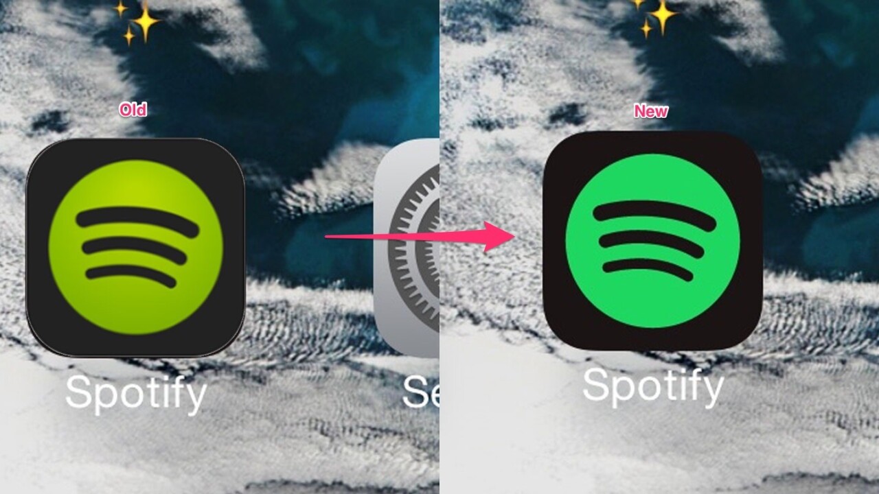
Spotify quietly changed the tone of its green last month and it drove people insane, wondering if they were imagining it or if something was wrong with their phones.
The company’s lead designer, Tobias van Schneider, wrote in his personal email newsletter today what happened when the company changed the color and how it didn’t realize what had gone wrong at first.
The color of the Spotify icon gives me anxiety
THEY DONT LOOK ANYTHING ALIKE pic.twitter.com/VpUMHyp9ds— Victoria Marie ?? (@vmaddoashong) June 15, 2015
Schneider wrote:
What sounds like a small change ended up in a relatively huge tweet storm with thousands of people sharing their hate on the new color which then got picked up by press and the emotional rollercoaster started.
He says that Spotify was working on a “huge brand refresh” with a New York agency to help move its image away from being a tech company to a music company.
Nobody inside the company had ever raised an issue with the green. “Everyone absolutely loved it and I can’t remember any one ever raising the slightest concerns” said Schneider.
“This is important to know because most of the negative reactions towards the green hit me completely by surprise.”

When it rolled the green out, the internet reacted incredibly negatively.
Schneider believes “it’s not so much a discussion of the right or wrong color, it’s simply about change or no change” and that it went viral “because COLOR in itself is something that we all understand and something everyone have strong opinions on.”
Spotify’s change, according to Schneider, went a little something like this:
Essentially we see the new Spotify green, we don’t understand why it changed (rightfully so), and we write a quick tweet containing “The new Spotify green sucks”. All of this happens within minutes and is a pure emotional reaction to change. It’s not important what color it is, the fact that it changed without notice, is the problem.
Now here is where you or me come in. The moment we read a tweet that says “The new Spotify green sucks” we don’t think for ourselves anymore. All we do is read the tweet, agree with it (because fuck yeah) and re-tweet it. Our decision has been made within seconds, the new Spotify green sucks, even though we have literally not thought about it for a minute and it’s not even our own carefully formed opinion.
This “F*ck yeah, you are right” moment has a name: It’s called negativity bias.
You might be thinking the same as I was when I read this — “no way, I really thought it wasn’t great” — and Schneider admits that it’s a “bit of a generalization and not a solution […] but helps [designers] protect [themselves] from unnecessary emotions when these situations occur.”

What Spotify learnt, is that “people care, A LOT.”
Schneider still doesn’t think it was about the specific green or the fact that the company changed color, but more that it “didn’t [communicate] it clearly” and “hit many by surprise.”
Yup, a lot of people even thought their phones were broken.
The company realized that it had changed the app icon without mentioning it or even explaining the difference in the release notes.
is it me or did i wake up to a different shade of spotify icon
— bby pap smear (@lil_merm) June 15, 2015
Schneider says that Spotify had “changed the color because we knew the bigger picture of our brand refresh, but most of our users did not.”
“For us, the change made perfect sense, and while working with the new green for many months we became blind to the fact that we even changed it. “The new green” wasn’t a big topic internally, it was one of the smaller changes we made during the brand refresh, nothing big.”
It sounds like Spotify learnt from the experience, though, even if it thinks that the green isn’t problematic.
Schneider says that he’s “100% confident that clear communication can at least minimize the effect of hypercriticism in the future” and “involving the community in the design process” allows them to understand why changes have been made.
Read next: The designer behind Firefox and Mailchimp’s logo joined Opera
Get the TNW newsletter
Get the most important tech news in your inbox each week.


