The wheel of progress is changing what we think of as “new” or “old,” and users can easily scorn the sites and apps they loved only a few months ago. But for every door that technology closes, a new one is opened.
Below we’ve collected some of the modern IxD techniques that users are flocking to. Some are genuinely new, while others are just new takes on old ideas. Either way, they’ll help you stay ahead of the curve…and the crushing wheel of progress.
1. Animation & Transitions
When it comes to interaction design, one of the most popular concepts is animation and animated effects. Animation can include anything from a cool hover state effect to a full-screen cartoon that plays in the background.
Animations may not be new to interaction design, but their popularity is really only possible thanks to developments in HTML5, Javascript, and CSS. While they were once considered an aesthetic luxury (“Wow, the icon bounces!”) during the age of Flash, they are now becoming a functional necessity (“Ugh, the icon doesn’t do anything except bounce?!”).
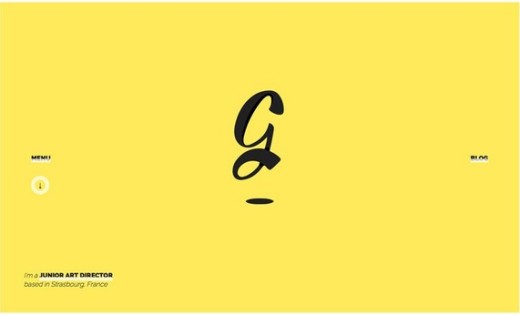
Photo credit: http://gaetanpautler.com/
Aside from the visual appeal, animations more importantly transition users between states of content. Transitions are the glue holding together all animated effects. How does the user get from one state to the next? What does each different state ask or tell the user to do? A smooth transition allows the animation to unravel in a way that communicates both points effortlessly.
When used well, animation provides context for the design by helping users know how to interact with it. (Remember, when it comes to interaction, some newer technologies and interaction patterns may feel uncomfortable, unfamiliar or evolve over time.) Animations are also a smart tactic for delightfully distracting users during longer load times, keeping them engaged in what would otherwise be a frustrating experience.
Animation and animated transitions can be an obvious solution for some design frameworks. As described in Interaction Design Best Practices, the five primary functions of animation include:
- Animated notifications
- Revealing information
- Highlighting content
- Collapsing forms and menus
- Scrolling, especially for one-page websites
When it comes to transitions, seamless film-like animation is the key to illusion.
Users are accustomed to television-style, high definition and pixel-perfect design. Disney animators Frank Thomas and Ollie Johnston’s outline of the 12 principles of animation still hold true today and should be the basis for designing all animation techniques and transitions well into the future.
2. Interactive Narrative (“Webgraphics”)
While social media sharing made the popularity of infographics skyrocket as a visual information medium, “webgraphics” are the interactive design equivalent. Even though the webgraphic format isn’t seen on every corner of the web, we’ve learned plenty of interaction design lessons from the medium.
While both graphic formats follow the same idea, webgraphics use tools such as HTML5, CSS3 and jQuery to deliver an interactive experience through color, type and slick animations.
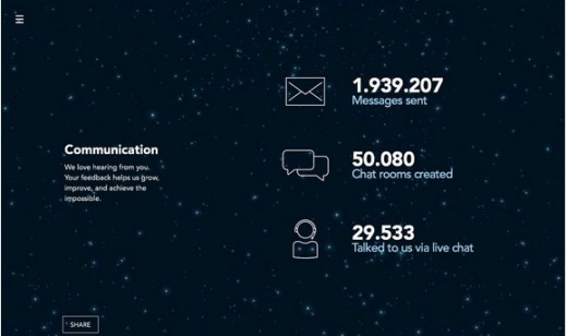
Photo credit: http://www.psd2html.com/10-years-in-review/
Webgraphics, a term that Venture Beat coined in 2013, typically asks users to perform an action en route to getting access to the full story. This action can be as simple as a click or more involving requests such as typing in words or touching an image on the screen.
The real power of webgraphics lies in their effortless integration into the user path. Unlike an infographic, you can design the webgraphic to create a “site within a site” experience that has completely immerses the user and serves up relevant links and forms along the way for more persuasive conversion.
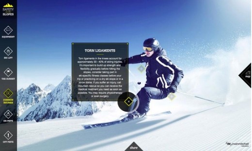
Photo credit: http://www.irwinmitchell.com/safety-on-the-slopes.html
For example, Safety on the Slopes (above), is just what an interactive webgraphic should be. The website combines information, mapping, video, facts and numbers to help users understand the dangers of winter sports in a way that might otherwise feel like a boring lecture.
Granted, there’s no calls to action or subtle hints for additional actions, but that could certainly be implemented. For example, imagine if an outdoor sport retailer created this site as part of a seasonal campaign – you could embed a few relevant products for potential hazards or link out to product categories.
We understand that not everyone has the resources to build a standalone interactive infographic (whether in their site or as a standalone URL), but you certainly apply some of its techniques to make any website feel more immersive.
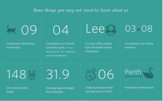
Photo credit: http://humaan.com/about/
For example, scroll-triggered animations are common in interactive infographics but are also used on sites like Humaan (above) to reveal facts about its team in a fun and unimposing manner.
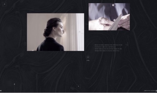
House of Borel (above), a luxury fashion brand, certainly feels more like an interactive story than a traditional website. You can see elements of interactive infographics at play here: videos triggered by scroll, an experience that “unfolds” and guides you through different chapters, and a much heavier focus on visual narrative over hierarchical navigation. The treatment certainly makes sense for an elegant brand that wants you to feel the lifestyle first before revealing its products.
3. Micro Interactions
A micro interaction is a momentary event that completes a single task, such as the ding of an alarm in an iPhone to notify users. Logging in to your online banking portal and even liking content on a site like Facebook are just some of the micro interactions that define the details of experience design.
As a website and app user, you probably take part in hundreds of daily micro interactions, all of which add up to one cohesive user experience. Arguably the smallest interactive elements of a design, micro interactions are some of the most vital (in fact, FastCo Design even calls it the future of design).
Consider, for instance, how quickly you would abandon a website if you could not set a username and password in only a few clicks or if the push notifications from your favorite news site appeared too frequently.
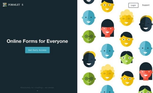
Photo credit: https://www.formlets.com/
Photo credit: http://surpris.es/#url
Whether for a blog or a global e-commerce site, these small interactions serve a variety of core functions to almost every website:
- Accomplish a task – This includes simple action such as logging in, adding a status update or setting an alarm.
- Connecting elements – Syncing two points creates a micro interaction between two devices or websites, whether that’s from multiplayer games/apps that sync from device to device or simple Bluetooth earbuds for your smartphone.
- Making an adjustment – Any change to a website setting (such as muting the volume on an app or turning down the volume on a music player) and the corresponding visual (and audio) feedback constitutes a micro action. Some of these are so small users perform many of the actions without any thought, which is why micro interactions must be carefully designed to provide just enough feedback without feeling intrusive.
- Change in state – Turning a website, or function therein, off or on changes the state and completes a small action.
- Unique data interaction – This refers to getting an in-time bit of data, such as checking the weather or traffic in your area, as result of a direct action such as opening an app or checking a website with location tools.
An action initiates every one of the actions above; the user does something in a website or app to start the process (even if it continues after the initial step). This follows a pattern of call-to-action from a user, rules for engagement as determined by the interface (what will happen and how), feedback from the user (did it work or not) and patterns or loops (does the action happen once or repeat on a schedule).
Every one of these tiny pieces is part of the design plan when it comes to interaction. To learn more about micro interactions, we highly recommend checking out the site of Dan Saffer who coined the term.
4. Layering Effects
Creating an engaging interactive experience is not about adding a single effect to your website design. It is a planned effort that requires layered design techniques and careful thought for user flow and habits.
By combining effects like parallax, long scroll, background video, etc., your design is both visually intriguing and inviting to users. The trick is not to go overboard – and there is a fine line between a careful hierarchy of user interactions and a chaotic mess.
Below, we’ll examine three sites that do a great job of layering effects to create an immersive interactive experience.
i. AIGA 100 Years of Design
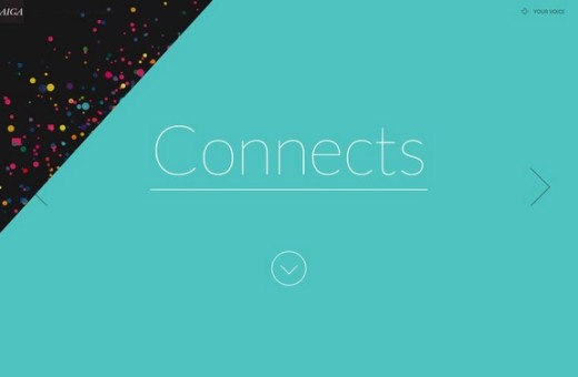
The 100 Years of Design website, designed to celebrate the history of design as an art form, uses a variety of techniques and trends, from scrolling actions to a hamburger menu to user-submitted visuals. Each new screen includes information (scroll down), animation to support the concepts, and cues for moving to the next element (whether through navigation or using on-screen cues).
Photo credit: http://celebratedesign.org/
ii. Eventbrite Seat Designer
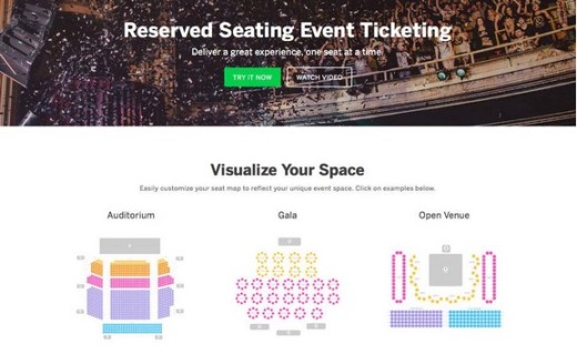
Used by event planners everywhere for ticket sales, the Eventbrite interface offers phenomenal tools for users to create custom seating charts for specific venues or events, something that was once unique to large venues. With a few clicks on the template, users can easily create a custom arrangement.
The interface uses an almost-flat design style with bright colors, easy menus and smooth-loading transitions.
Photo credit: https://www.eventbrite.com/l/reserved-seating/
iii. Sonoran’s Valley
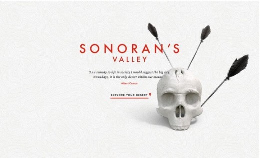
The site features a game-like experience where users input specific information to take part in a digital journey. The site is layered with phenomenal animation and video effects while using a standard hamburger style navigation. The main screen starts with a minimal-style aesthetic but opens into a wide-screen video experience. (You could play with this site for hours on end.)
Photo credit: http://sonorans-valley.com/
Thinking Beyond the Present
These may be the cutting edge practices of today, but how long before these same groundbreaking techniques makes users roll their eyes?
One of the best ways to stay ahead is to think ahead. Looking at how user needs are evolving, we can confidently – but not assuredly – predict what will be popular in the future.
Many people consider wearables as the next “Wild West” of interaction design. When it comes to wearable interaction, the design will probably shift to more subtle tactile patterns that might be less visual. Vibrations from a watch might be the preferred method of notification, rather than a large image or sound on the screen.
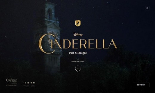
Photo credit: http://cinderellapastmidnight.tumblr.com/
Across all mediums, interaction will likely become more television-like as storytelling remains a core aspect of digital design.
While you always want to ensure the design helps users accomplish their goals, it’s very likely that the user choices will be presented as part of a larger narrative on the site. It’s not a tactic that’s appropriate for every site (e.g., ecommerce, banking), but it will definitely play a more prominent role in the content flow for highly visual sites. We’ve seen this already with the emergence of video backgrounds as a common web design technique. As a visual medium, the line between screen devices – TVs, computers and phones – will blur even more.
Interaction design, while primarily visual when we think about websites, will continue to combine visuals with environmental factors. Vibrations, sounds and forced actions will become more common, especially for user-controlled elements such as websites or apps designed for mobile or wearable devices.
While a lot of future-planning is merely guesswork, the fundamentals of our users will, more-or-less stay the same. Users will, predictably, always enjoy interactivity and engagement – the only thing that changes is the avenues available to offer this to them.
To learn more on mastering the art of modern interaction design, check out the free Book 1 and Book 2 of Interaction Design Best Practices. Almost 200 pages of practical advice are included along with dozens of analyzed examples from today’s top companies.
Read Next: The future of interaction design
Image credit: Shutterstock
Get the TNW newsletter
Get the most important tech news in your inbox each week.
