Jerry Cao is a UX content strategist at UXPin — the wireframing and prototyping app. To learn how to master the art of modern interaction design, check out the free e-book Interaction Design Best Practices. The book teaches with 30+ examples from companies like AirBnB, Google, Apple, Etsy, and others.
As a practice of designing for the intangible, interaction design has always been one of the most difficult UX disciplines. Gone are the days when users were impressed by simple interactions like a bit of unexpected animation – now animations are almost required, along with plenty of microinteractions that can’t be taken for granted.
New interaction design patterns continue to arise to support new technologies, but the fundamentals remain timeless. In this piece, we’ll quickly explore how interaction design has evolved in recent years, and where it may be headed in the near future.
The Nature of Interaction Remains the Same
Interaction design is more than an anecdotal collection of best practices. In fact, Researchers at Penn State University recently found that users are more likely to be persuaded by messages on websites with interactive features.
“Modality interactivity persuades people because they are having more fun browsing the website, which absorbs them, and creates more positive attitudes toward the message as well,” says Jeeyun Oh, assistant professor of communications at Robert Morris University. “Interactivity persuades people by making users think more deeply about the message.”
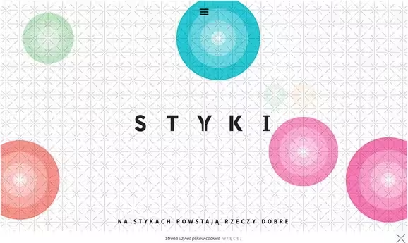
Photo credit: http://styki.org.pl/#1
Photo credit: http://dubaiairportsreview.com/
The nature of interaction design is engagement. This remains the same no matter what decade you’re designing in – the difference is the methods available to engage your users. Interaction design patterns evolve right alongside new functionalities supported by the expansion of HTML5, CSS, Javascript, and jQuery. Interactive websites used to be defined by plenty of internal links or a photo gallery – while those are still popular features, you’ll need to be much more clever and creative in the execution.
Regardless of technology, the five pillars of interaction design still stand strong. Driven by human connection and emotion, these can be aided by technology, but not changed by it:
- Goal-driven design – Focus on personas, user scenarios and experience maps so that every interaction moves users closer to completing their goal.
- Usability – Function must be intuitive and reliable before it can be fun for users. Provide only as many features as users truly need, then hone in on reducing the friction and cognitive load of each feature.
- Affordances and signifiers – Form must reflect function since vision is our dominant sense.
- Learnability – Interfaces that are consistent with existing designs and across all internal assets are more predictable, which means that they are easier to learn. Learnable interfaces, then, naturally feel more usable since less friction is involved.
- Feedback and response time – Interfaces must respond promptly to users in a human (and humane) way so that the experience feels like a real conversation. You must approach interaction design as if it were human-to-human conversation, not as a machine that simply responds to what users do or say.
Photo credit: http://utmanareredo.se/#
Photo credit: http://www.frankdigital.com.au/
Whether in the past, present, or future, these five principles will always determine how interaction design evolves and what it becomes in any new environment.
Modern Interaction Design Techniques
New functionalities deliver new methods of interaction – which is to say, new ways to entertain users as well. Today, users have grown accustomed to the delightful designs made possible through responsive and adaptive systems, which creates a self-perpetuating cycle where more designers are incorporating such designs to satisfy their users, who grow more accustomed…
For example, the following handful of design techniques aren’t just standalone trends – they are all part of a much larger push for interactivity in this age of responsive and adaptive design:
- Parallax scrolling and effects
- Card-style layouts
- Video and animation as described in Interaction Design Best Practices
- Design elements that require physical actions such as swipes or clicks
- Micro interactions, which are distinct moments that happen while using a website or app (think of an alarm bell or deleting an email)
- Push notifications and reminders from websites or apps
- Personalization and location tools so that every app or website feels like it was designed specifically for that user, creating memorable contextual experiences (for example, Waze automatically asks if you’re driving home at 6PM based on your usage patterns).
- Quickly show or hide content with clicks or swipes
- Hover effects and actions for secondary content
- Transitions and loop functions between elements
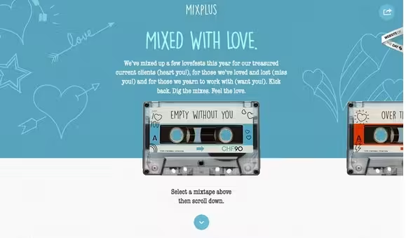
Photo credit: http://mixpl.us/withoutyou
Let’s examine MixPlus, designed by Net+, as a clever example of the art of interaction design.
The website is a series of mixtapes created for users. Click to choose a style, then scroll for a playlist and to start the tracks. The animation is fun and life-like and helps guide the user from the top of the screen to bottom. In the footer, users can continue for an even longer playlist or to go back to the Net+ site. And with multiple tapes to choose from, users are encouraged to interact and go back to start over with a new option.
The interaction on the page is actually quite limited, but the execution is smooth. First, you rotate through the tapes in a familiar left-right scroll motion. Then, as you scroll down the page to learn about the songs, the interface provides visual feedback of impending action by trailing the tape behind. Through tasteful skeuomorphism, the site communicates function without needing to explain.
Alternatively, the designer could have decided to present each song as a card design that transforms to a play button upon hover, but the effect wouldn’t be nearly as delightful and captivating.
A New Perspective on Usability
Mobile considerations force us to rethink the entire web experience – not just how it plays out on specific devices.
It was not long ago that the design community was focused on “above the scroll.” That idea has changed dramatically with small screen design and the reemergence of the scroll as a dominant and important design tool. In fact, the Apple Watch’s Digital Crown is further reshaping navigation interaction by making it a winding (rather than pinching or vertically swiping) motion.
Photo credit: http://vaalentin.github.io/2015/
The idea that scrolling kills engagement is one of the biggest UX myths, and it can be a difficult one to overcome. But we can reassure ourselves with some of the data presented by the excellent site UX Myths:
- Chartbeat, a data analytics provider, analyzed data from two billion visits and found that “66 percent of attention on a normal media page is spent below the fold.”
- Usability expert Jakob Nielsen’s eye-tracking studies show that while attention is focused above the fold, people do scroll down, especially if the page is designed to encourage scrolling.
Look at the responsive site above: the on-screen “Hello” is the only above-the-scroll message, but the arrow at the bottom of the screen instantly encourages users to move deeper into the site. The scrolling action is accomplished through a physical scroll tool by clicking the mouse to showcase a series of neat animations that guide users through the content.
Photo credit: http://vaalentin.github.io/2015/
Even though the site is certainly influenced by the mobile-first philosophy, you find that it’s still quite a pleasant experience even on desktop.
When it comes to scrolling as an interaction, we’ve found that long scrolls aren’t really a usability issue provided that each content section (and overall narrative) remains compelling. The abundance of single-page site designs proves that interaction design can take a chapter from literature (quite literally) to present memorable experiences in a linear format.
One of the great frontiers of interaction design, mobile design is full of fresh patterns that redefine the relationship between users and technology.
Consider the tap on mobile devices versus the click of websites. As little as two years ago, users fumbled to navigate mobile websites because a great number of sites still required an almost click-style action or use of website tools such as scroll bars. Now, common actions include swiping, tapping and zooming to get greater access to information on the small screen (all thanks to interaction design).
Given the rise of responsive and adaptive design, every website must not only work perfectly on a desktop resolution, but also feel like an app-like website on a smaller devices (including wearables). Each of these devices requires a different set of interactions that impact how, and if, users visit a website.
Users access websites through multiple device entry points. A bad experience at any time can turn a user away permanently, making interaction design the key discipline to ensuring a consistent device-agnostic experience.
Think of interface design and interaction design as the right and left hand for designing adaptive and responsive experiences. As we revisit how content must be prioritized (and repositioned) on the screen from a mobile-first perspective, we also must be willing to redefine how users actually engage with that content.
Thinking Beyond the Now
Changes in technology continue to expand the capabilities of interaction design. After all, much of what we have seen and are designing for is mandated by the need to make unfamiliar devices feel instantly familiar.
Photo credit: http://project360.mammut.ch/#home
You can certainly argue that wearables are the “next big thing” on the horizon for interaction design. Whether that’s a watch or necklace or chip in a shoe, interactions between humans and devices that touch the skin will grow in importance and every little detail will matter, from how the device works to how it feels on the skin for users (remember the Fitbit recall because the device irritated some users’ skin).
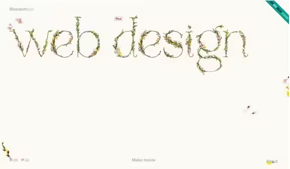
Photo credit: http://blossomtype.com/#
Personalization will continue to be a goal in interaction design. Geolocation tools already help create better contextual experiences, but more sites, such as Blossom Type, are gaining popularity since they allow users to input specific information to create a unique, shareable experience. (Blossom Type creates a movie based on the information entered by the user.)
Interaction design is changing almost daily with technology and user access to new tools. While we can’t predict the “next big thing,” we can prepare for it by keeping a keen eye on what’s happening, what devices and tools are selling – think wearables in the recent future – and how users want digital information delivered and how they want it to work.
The subjectivity of human interactions makes it that much more fun to imagine and design.
To learn more on mastering the art of modern interaction design, check out the free Book 1 and Book 2 of Interaction Design Best Practices (described below).
10 Additional Free IxD Tools & Resources
You’re not alone in this brave new world. Below are ten of our favorite resources and tools to help you navigate the changing terrain of interaction design.
- Interaction Design Basics – Usability.gov outlines questions and considerations for interaction design that are a good springboard on the path to UI/UX design.
- “How Do You Design Interaction?” – A refreshing approach that teaches you how to design interactions as conversations.
- “Smart Transitions in User Experience Design” by Smashing Magazine – A look at a variety of simple and effective animations that help guide users through website designs.
- Interaction Design Best Practices: Mastering Words, Visual and Space – The basics of interaction design are rooted in basic design theory; this free 115-page guide teaches you how to master the tangible elements of IxD.
- Interaction Design Best Practices: Mastering Time, Responsiveness and Behavior – The free 106-page guide helps you master the trickier intangible elements of IxD.
- Origins of Famous Micro Interactions – Everything from the “You’ve got mail!” announcement to the Facebook like is a micro interaction. Learn more about how they came to be.
- Interaction Design Experiments – How do different interactions work? Take a look at a variety of options to help pick the best interaction patterns for your projects.
- “Making and Breaking UX Best Practices” by UX Booth – The rules for user experience design are changing constantly; this guide helps you understand the roots of common practices and tools.
- iOS Human Interface Guidelines – Apple’s guide outlines how developers and designers should create for the mobile web.
- 2015 IxD Awards – The winning projects and finalists create an inspiring set of best practices and examples of how to create different and interesting projects.
Read Next: The 5 pillars of visual hierarchy in Web design
Image credit: Shutterstock
Get the TNW newsletter
Get the most important tech news in your inbox each week.
