Nishith Sharma is the co-founder of frrole, a social intelligence startup.
Raw data is boring and it’s difficult to make sense of it in its natural form. Add visualization to it and you get something that everybody can easily digest. Not only you can make sense of it faster, but you can also observe interesting patterns that wouldn’t be apparent from looking only at stats.
To make the tedious task of making beautiful charts and maps easier, I’ve made the list of best data visualization tools available for the job. I’ve divided the list into two parts; first covers the tools that require coding and are meant for developers, while the second list contains data visualization software products that don’t require any coding.
Let’s get started!
For Developers

The 💜 of EU tech
The latest rumblings from the EU tech scene, a story from our wise ol' founder Boris, and some questionable AI art. It's free, every week, in your inbox. Sign up now!
D3.js
D3.js, short for ‘Data Driven Documents’, is the first name that comes to mind when we think of a Data Visualization Software. It uses HTML, CSS, and SVG to render some amazing charts and diagrams. If you can imagine any visualization, you can do it with D3. It is feature packed, interactivity rich and extremely beautiful. Most of all it’s free and open-source.
It doesn’t ship with pre-built charts out of the box, but has a nice gallery which showcases what’s possible with D3. There are two major concerns with D3.js: it has a steep learning curve and it is compatible only with modern browsers (IE 9+). So pick it up only when you have enough time in hand and are not concerned about displaying your charts on older browsers.
FusionCharts
FusionCharts has probably the most exhaustive collection of charts and maps. With over 90+ chart types and 965 maps, you’ll find everything that you need right out of the box. It not only supports modern browsers, but also older browsers starting from IE 6.
FusionCharts supports both JSON and XML data formats, and you can export charts in PNG, JPEG, SVG or PDF. They have a nice collection of business dashboards and live demos for inspiration.
Their charts and maps work across all devices and platforms, are highly customizable and have beautiful interactions. One thing to keep in mind about FusionCharts is that it’s slightly expensive. But you can always get started with their unrestricted free trial and then buy if you like it.
Chart.js
Chart.js is a tiny open source library that supports just six chart types: line, bar, radar, polar, pie and doughnut. But the reason I like it is that sometimes that’s all the charts one needs for a project. If the application is big and complex, then libraries like Google Charts and FusionCharts makes sense, otherwise for small hobby projects Chart.js is the perfect solution.
It uses HTML5 canvas element for rendering charts. All the charts are responsive and use flat design. It is one of the most popular open-source charting libraries to emerge recently. Check out the documentation for live examples of all six chart types.
Google Charts
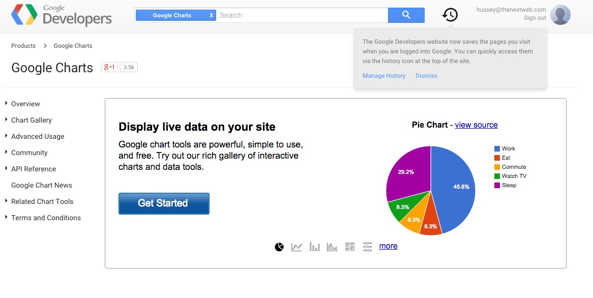
Google Charts renders charts in HTML5/SVG to provide cross-browser compatibility and cross-platform portability to iPhones and Android. It also includes VML for supporting older IE versions.
It offers a decent number of charts which covers the most commonly used chart types like bar, area, pie and gauges. It is flexible and user friendly (because Google!). You can view this gallery to get an idea of various charts and the type of interactions to expect.
Highcharts
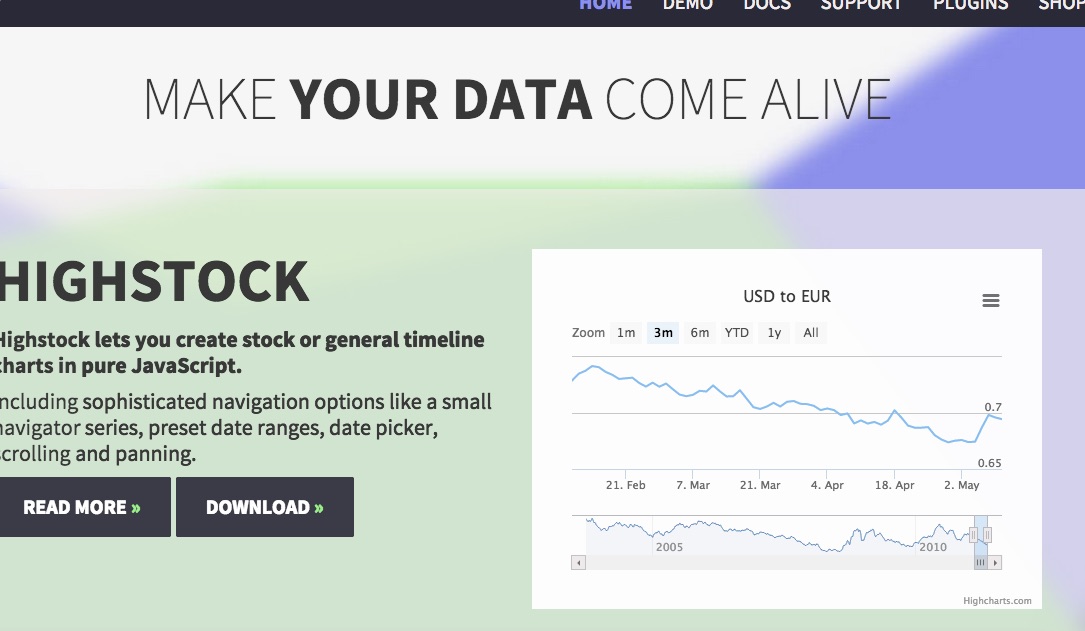
Highcharts is another big player in the charting space. Like FusionCharts, it also offers a diverse range of charts and maps right out of the box. Other than normal charts, it also offers a different package for stock charts called Highstock which is also feature rich.
It allows exporting charts in PNG, JPG, SVG and PDF. You can view the various chart types it offers in the demo section. Highcharts is free for non-commercial and personal use, but you will have to buy a licence for deploying it in commercial applications.
Leaflet
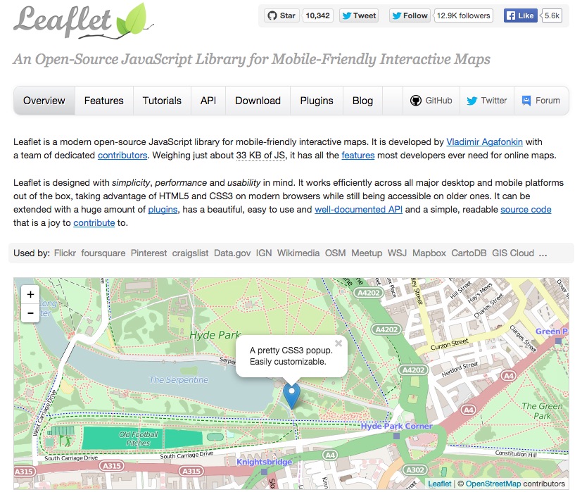
Leaflet is an open-source library developed by Vladimir Agafonkin for mobile-friendly interactive maps. It is extremely light (at just 33kb) and has lots of features for making any kind of maps. It uses HTML5 and CSS3 for rendering maps, and works across all major desktop and mobile platforms. In the words of author:
Leaflet is designed with simplicity, performance and usability in mind.
There is a wide range of plugins available for adding features like animated markers, heatmaps etc. that extend the core functionality. If you are thinking of developing an application that involves maps, you should give Leaflet a try.
dygraphs
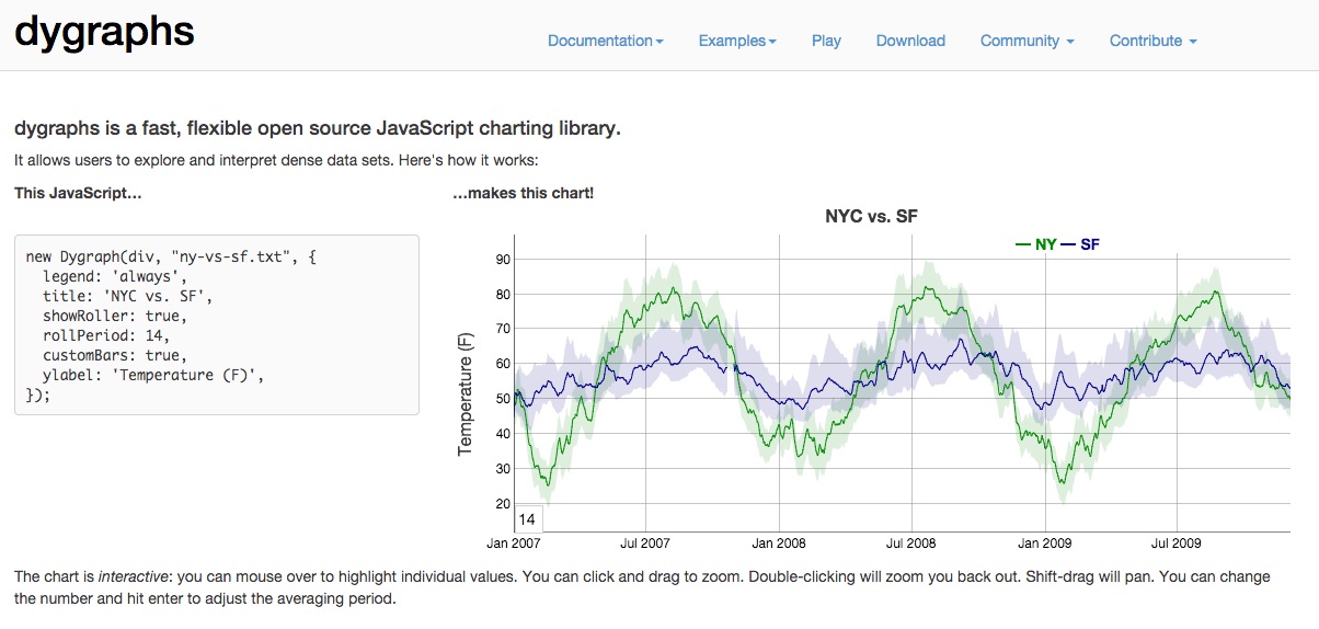
dygraphs is an open-source JavaScript charting library for handling huge data sets. It’s fast, flexible and highly customizable. It works in all major browsers (including IE8) and has an active community.
dygraphs has defined a niche use-case for itself and won’t be the perfect solution for all your needs. But it will work for you more often than not whenever you are handling large datasets. To explore what is possible, check out this nicely designed demo gallery.
Non-Developers
Datawrapper
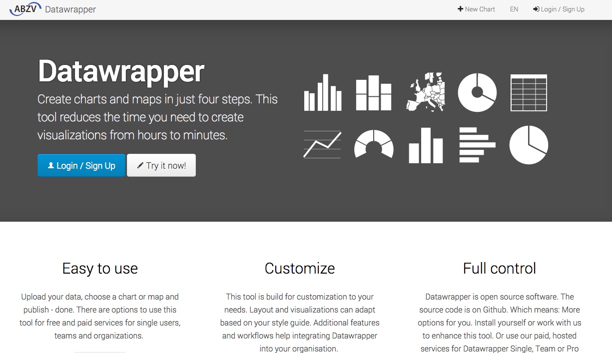
Datawrapper is an online tool for making interactive charts. Once you upload the data from CSV file or paste it directly into the field, Datawrapper will generate a bar, line or any other related visualization. Many reporters and news organizations use Datawrapper to embed live charts into their articles. It is very easy to use and produces effective graphics. If you are looking to get started, here is a nice tutorial to make your task easier.
Tableau

Tableau Public is perhaps the most popular visualization tool which supports a wide variety of charts, graphs, maps and other graphics. It is a completely free tool and the charts you make with it can be easily embedded in any web page. They have a nice gallery which displays visualizations created via Tableau.
Although it offers charts and graphics that are much better than other similar tools, I don’t ‘love’ to use its free version because of the big footer it comes with. If it’s not as big a turn-off for you as it is for me, then you should definitely give it a try. Or if you can afford it, you can go for a paid version.
Raw
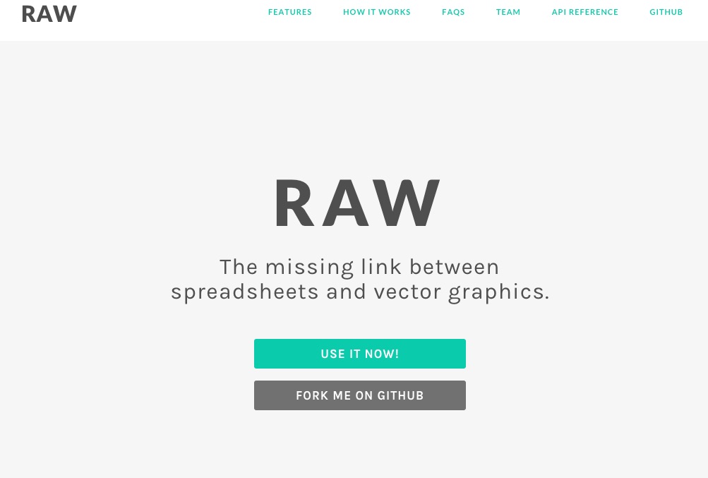
Raw defines itself as ‘the missing link between spreadsheets and vector graphics’. It is built on top of D3.js and is extremely well designed. It has such an intuitive interface that you’ll feel like you’ve used it before. It is open-source and doesn’t require any registration.
It has a library of 16 chart types to choose from and all the processing is done in browser. So your data is safe. RAW is highly customizable and extensible, and can even accept new custom layouts.
Timeline JS
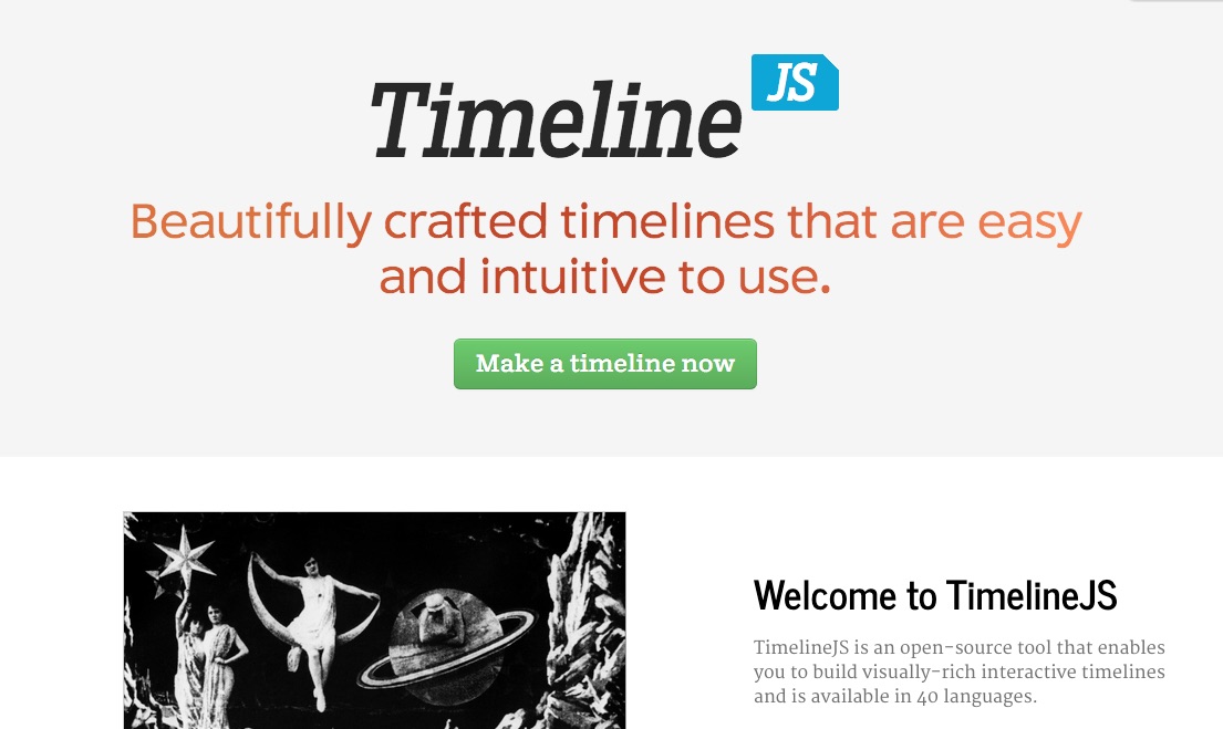
As the name suggests, Timeline JS helps you create beautiful timelines without writing any code. It is a free, open-source tool which is used by some of the most popular websites like Time and Radiolab.
It’s a very easy to follow four-step process to create your timeline which is explained here. Best part? It can pull in media from a variety of sources and has built-in support for Twitter, Flickr, Google Maps, YouTube, Vimeo, Vine, Dailymotion, Wikipedia, SoundCloud and other similar sites.
Infogram
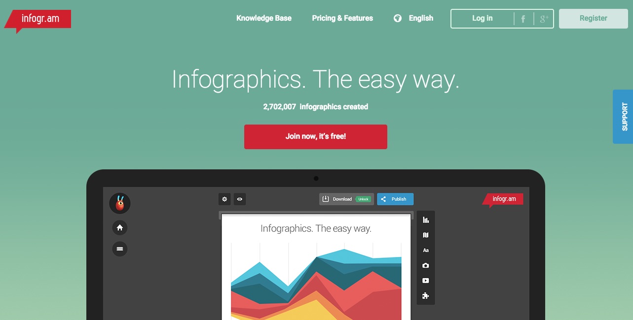
Infogram enables you to create both charts and infographics online. It has a restricted free version and two paid options which include features like 200+ maps, private sharing and icons library etc.
It comes with an easy to use interface and its basic charts are well designed. One feature that I didn’t like is the huge logo that you get when you try to embed interactive charts into your webpage (in free version). It will be better if they can make it like the little text that Datawrapper uses.
Plotly
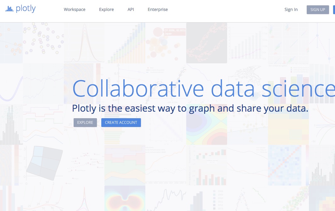
Plotly is a web based data analysis and graphing tool. It supports a good collection of chart types with built in social sharing features. The charts and graph types available have a professional look and feel. Creating a chart is just a matter of loading in your information and customizing the layout, axes, notes and legend. If you are looking to get started, you can find some inspiration here.
ChartBlocks
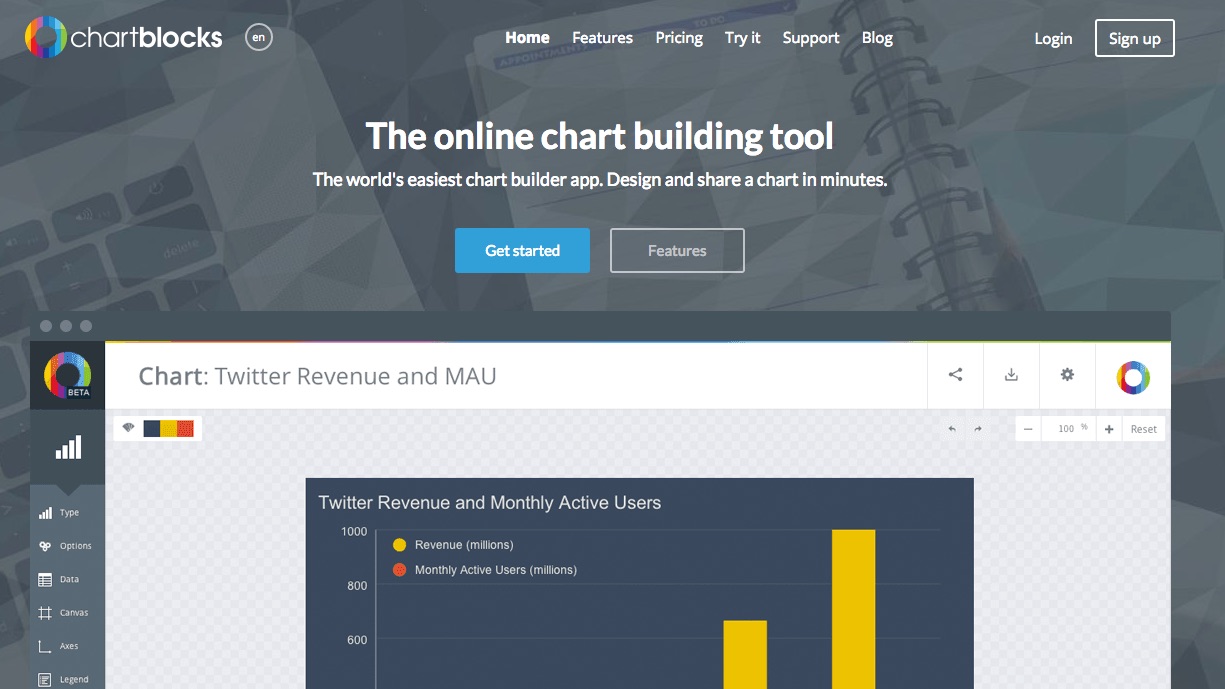
ChartBlocks is another online chart builder that is well designed and allows you to build basic charts very quickly. It has a limited number of chart types, but that will not be a problem as most common chart types are covered.
It allows you to pull in data from multiple external sources like spreadsheets and databases. After you have made the chart, you can either export it via SVG or PNG, embed it in your website or share it on social media.
Data Visualization is a vast space with lots of players. I have tried to include the best tools here irrespective of whether you can code or not. I’m sure I must have missed out some of your favorite tools, so why not talk about them in the comments section below?
Read Next: Why designers should never use fake text
Photocredit: Shutterstock
Get the TNW newsletter
Get the most important tech news in your inbox each week.