December is always a great time to look back on the year that was and the new year that is soon to come. There are many exciting things that 2014 has in store for us who live, work, and produce the World Wide Web we love and cherish.
Last year, we looked at the 10 Web design trends for 2013. Many of the trends that were spotted last year are still around today and will undoubtedly take off into 2014. After all, that’s why they are called trends and not fads, as trends tend to stick around for a few years while fads are only hot for a very short time.
So while 2014 is knocking on the door, let’s look ahead and see what kind of new(ish) Web design trends we can look for and be inspired by come the new year.
1. Non-boring typography
A typography-lover myself, it’s great to see more designers experimenting with different types of type. One trend with type we can expect to see in 2014 is fonts with personality.

The 💜 of EU tech
The latest rumblings from the EU tech scene, a story from our wise ol' founder Boris, and some questionable AI art. It's free, every week, in your inbox. Sign up now!
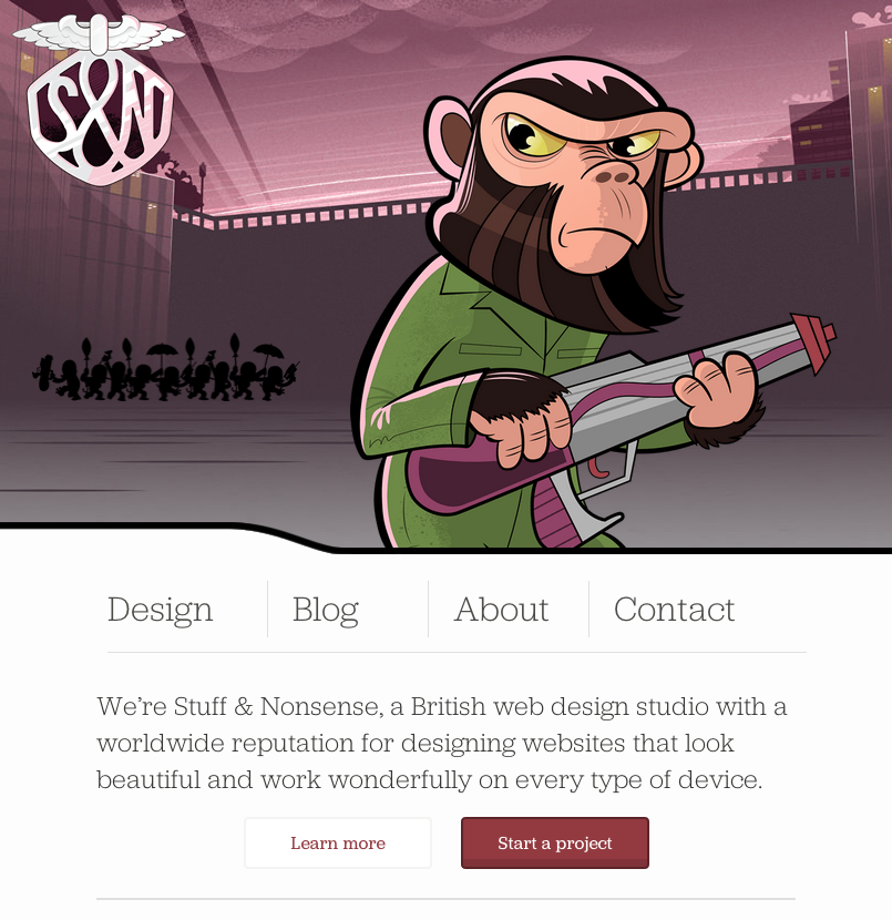
“Fonts with personality” are fonts that feel like they can stand on their own. They are not your standard serif or san-serif font (ahem, Helvetica). Designers are starting to find different fonts to add to their arsenal that add a little personality and uniqueness to their designs.
For instance, check out Stuff and Nonsense’s new website design above. They could have used any old serif font, but they picked a beautiful serif font that keeps it professional but with a side of personality. We expect to see many more websites in 2014 getting away from very simple and overused typefaces and finding some with personality.
2. Flat design
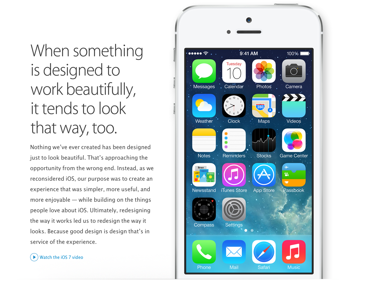
Oh Apple, how we love thee. Last year we said that more than likely, Apple was going to shake its Skeuomorphism, and boy did they ever. With the release of iOS7 came the design aesthetic most commonly known as “flat design.” While dropping drop shadows and gradients often seems like a good idea in some cases to give a more updated look to things, Apple took it to a whole other level by dropping pretty much any design element it could.
Apple has for a long time been a trendsetter, and what Apple does, the rest of the world seems to follow. iOS7 has been out for a while and already there are a flood of sites coming online every day with new “flat” designs. We don’t anticipate this trend ending in 2014.
3. Large hero areas quickly killing sliders
If you asked us what is the number 1 trend in Web design today, this would be it.
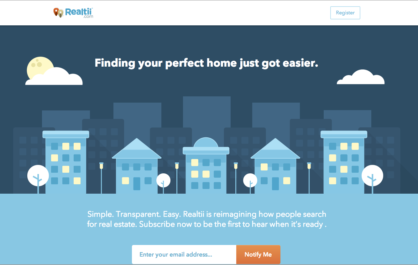
Large hero areas (the “intro” area, often an image with a little amount of text, at the top of a website – a borrowed term from print design) on website home pages are running rampant (for example, most of the sites featured in Line25’s “Sites of the Week” weekly posts) – and it is a trend we don’t see going away either in 2014. They are quickly taking over real estate on websites where sliders used to reside (until proven that they don’t work).
Either it be a simple blurred photo in the background with a heading centered in the middle, or a more elaborate one such as the illustrated hero area in the Realtii.com site above, hero areas are quickly replacing sliders as the new attention-grabbers, and they are becoming increasingly creative and elaborate.
4. Heavier focus on mobile
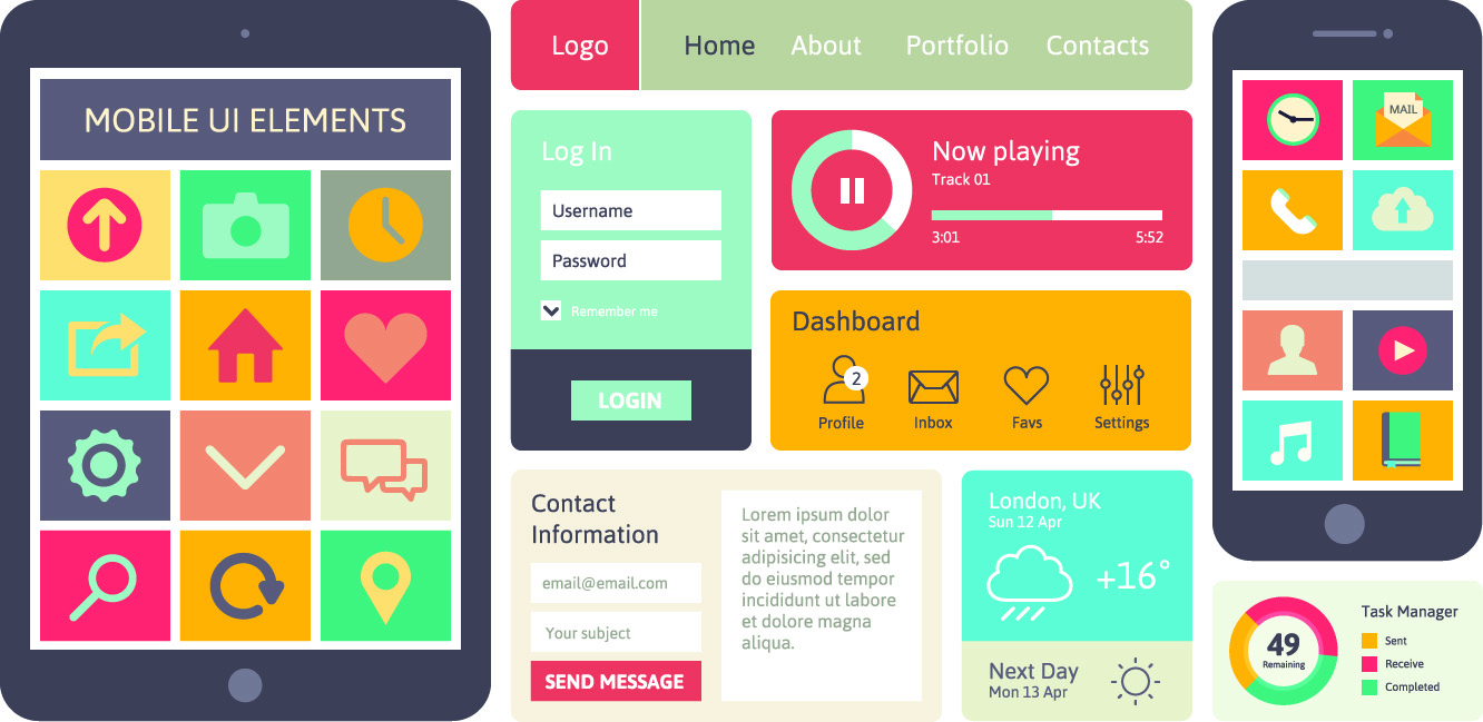
Now that responsive Web design is becoming more common place, we are starting to see websites dig deeper into our mobile lifestyles. Designers are increasingly working on keeping their sites functioning on mobile devices, but developers are taking it a step further to help along with the fact that so many more devices are accessing the Web, and so many more users are using their phones to browse the Web.
Wondering what some things are being done? Integration with social media, asking for email subscriptions, long scrolling sites (see below), and fast loading sites all help make the mobile Web a more friendlier place.
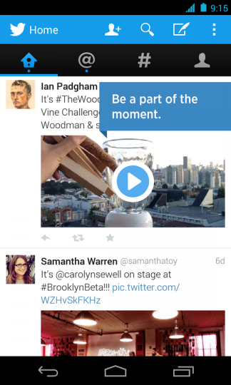
5. Videos in place of text
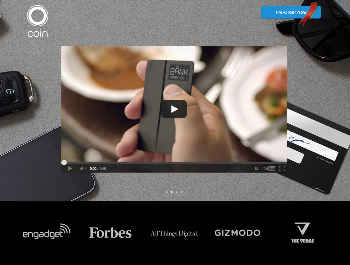
Why read about it when you can watch it? Something else you will start seeing all over the Web (especially in hero areas) are videos. Even Coin, the popular new device, is even utilizing a video in its hero area (see above).
Videos are becoming easier to produce, and easier to share not on your website, but on social media as well. While some may argue that videos don’t belong on a website home page due to the large amount of data they take to load and run (especially on mobile devices and internet with data caps), videos are an effective way to communicate something technical or new when words just don’t cut it.
Plus, many video services such as YouTube allow you to track how many views it got, allowing you to better plan your content for your website.
6. Long scrolling sites
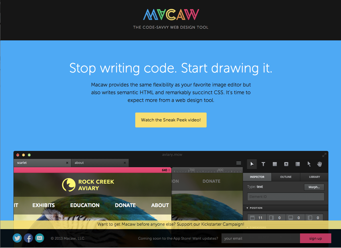
We’ve become comfortable with scrolling through a website to read and find information, and now with websites using more design techniques such as increased white space and responsive Web design, long scrolling sites are starting to appear again.
Several years ago, it was common to have long scrolling sites that where slammed with content. Well, now we are seeing long scrolling websites but the content is more organized and in a much easier format to digest.
Take for instance Macaw’s website (above). Its site organizes content well, and in turn they have a long scrolling site. It doesn’t seem boring because the layout changes up throughout, and for most users, they don’t realize how far they are actually scrolling.
7. Simple color schemes
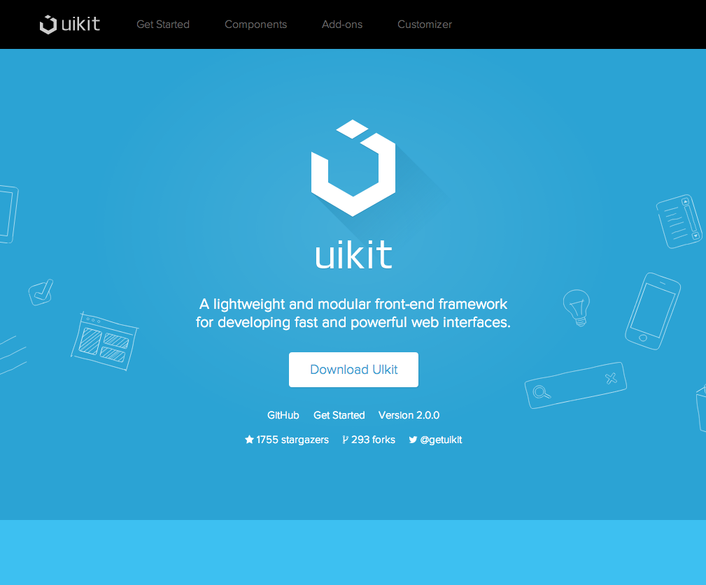
We can’t have a post on design trends without talking about color. In 2014, we will see a lot more website with very simple color schemes. And by simple, we mean really only one or two colors.
Take for instance the UIKit site above. That site has only one hue: blue (in design and art, white and black aren’t considered colors, but neutrals). The use of a more simple color scheme seems to come with flat design (discussed above), but not always. The site above uses blue predominately throughout the design, but it is the only color you see.
Some websites being launched now are using very little color, or even forgoing color all together. White, black, and everything in between are popular color schemes now, and adding just a hit of another color, such as red, adds drama and impact – all things that garnish attention when used in the right way.
8. Simplified content
We’ve kind of hit on this throughout this post, but while 2013 seemed to be the year of King Content, 2014 will keep the king humble and down to earth. Simpler content will dominate 2014 and beyond as we design our websites.
Simplified content means short bursts of content, a la Twitter style. Over the years as a population, our attention spans have become shorter, so designers have compensated for that by putting content in short bursts instead of long narratives.
Not many areas on websites these days (except blog posts) have more than about 250 characters. It is because it is easier and faster to read for users who like to scan the page.
9. Dropping the sidebar
This is more for blog or magazine-type sites, but many of these sites are experimenting with dropping the sidebar all together. This allows for a more visual impact with content (and easier responsive Web development).
Imagine this: you reading an article without things flashing, crowding, or otherwise buying for your attention. Designers understand this and are working to make your reading experience more pleasant by getting rid of these distractions and expanding the content of the article to take over the page. Not sure about you, but this is a welcome change and a trend that we hope is here to stay.
10. Manipulated imagery

While it is easy to just throw any old photo on your site, it is a little more difficult to manipulate it into something different. In 2014, we will see more images that have things such as color overlays, blurred images, or even images that are reminiscent of Instagram images with filters.
For instance, the Seattle Cider Co. uses a large image in their hero area (see hero discussion above), but not just any photo. They’ve manipulated the image to give an antique and rustic feel to match with the rest of the site.
11. Bonus: Crazy, sexy, cool stuff

This will be the trend that we hope never ever dies. As the Web grows and becomes more involved, and as more things are developed, designers and Web developers are going to get their hands on them. If you thought parallax scrolling techniques were cool, just you wait.
Expect to see many more things hit the Web in 2014, such as the use of HTML5 to animate different parts of a site. For example, Tobi’s Story’s website (image above) is a great use of really cool things done in a great way. The subtle scrolling timed in tune with animation is the cool stuff we want to see.
We love the cool things, and we love it even more when we get to use it. Just, do us all a favor, don’t go overboard.
Get the TNW newsletter
Get the most important tech news in your inbox each week.