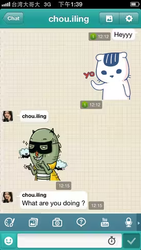
Stickers, or large-scale emoticons, have become a phenomenon in the age of the smart device. Originating in Asia, where some sticker sets have helped companies reel in sizeable revenues and stake out space in the cultural zeitgeist, they’re now spreading to messaging apps and social platforms like Facebook, Path, Viber, and Kik, just to name a few.
The concept of stickers is not new at all – many can surely remember a time of flash-animated banner ads promoting googly-eyed smiley faces for AOL Instant Messenger.
So why then are stickers now seeing success in the mobile era?
Short answer: good design.

The 💜 of EU tech
The latest rumblings from the EU tech scene, a story from our wise ol' founder Boris, and some questionable AI art. It's free, every week, in your inbox. Sign up now!
Social media platforms have embraced the branding opportunities opened by introducing character sets, and have produced images that can be used as shorthand to convey emotion, or just as fun graphics to liven up an otherwise mundane conversation.
To get a better understanding of the process behind sticker creation, TNW spoke with the graphic designers behind the stickers on some of the most popular chat apps.
Cubie: Winnie Hsieh and Yi Hsuan Hsiao
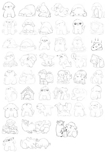
Taiwan-based Cubie takes a collaborative and research-oriented approach to sticker design. The in-house design team meets regularly with the rest of the staff to brainstorm emotions, then draws up sketches. Potential stickers often get tested with Facebook fans, active users, or even with office mates.
Genie, shown below, is one of the flagship characters on Cubie and is heavily featured in its sticker sets.
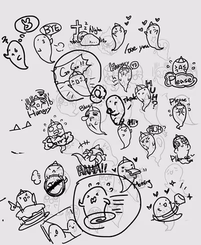
During an initial design phase, the Cubie team decided that it wanted to design a sticker that conveyed the emotion behind act of saying “Please.”
This led to an exploration of what it means to say “Please.” Sometimes it’s an act of frustration, like when you ask your significant other to please stop doing that annoying habit. Other times it’s playful – think of a kid begging his parent, “pretty please…”
The Cubie design team drew up a few sketches that played around with different depictions of “Please.”
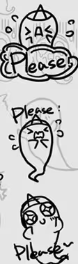
Ultimately, the team decided they wanted to go with a more lighthearted depiction rather than a frustrated one, so they chose the third one.

Cubie is known for its deep engagement with its userbase. It offers more diverse and ‘extreme’ sticker sets than other messaging apps, and James Hill, Cubie’s International Messenger, attributes this to the team’s unique position in the market.
I think the main difference with Cubie’s stickers is because we are a small team rather than a large corporation we can afford to be a bit more daring, offering tongue in cheek stickers such as rage faces, emojis of poo and other ‘niche’ stickers. We also took a risk with photo stickers that paid off. So yeah, we can experiment more.
We’re also open to suggestions from our users, and they appreciate when those ideas get turned into reality. We had one guy in Belfast request a Rastafarian sticker, and a Mexican user request Mexican wrestlers (luchadores) – these will be available soon for example.
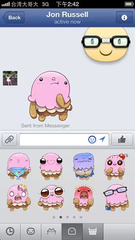
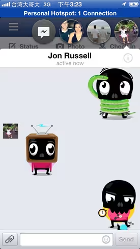
Facebook: David Lanham (Meep, Hatch, Bun, Beast, Napoli, Baach)
Facebook, a relative latecomer to stickers, began its sticker project by first conducting research with Pixar animators on emotions and facial expressions. They then shared the results of the study with their third-party designers.
When David Lanham was approached by Facebook to develop the platform’s default smiley set, titled Meep, he drew inspiration from the Japanese-cutesy “kawaii” style that’s already common among stickers on other chat apps.
The smileys are pretty heavily influenced by anime and manga-type faces. The eyes are kind of wider apart, or larger in general. And as you get more towards an infant proportion in the face, it kind of becomes cuter. You can’t overdo it. There’s a kind of weird boundary to it, but if you get it just right, it ends up looking like a child or a baby.

It was my own personal decision [to seek inspiration from Japanese design], not Facebook’s. [Japanese artists] have really mastered paring down an emotion to its most basic features and exaggerating it.

After completing the Meep set, Lanham went on to design other stickers for Facebook. His Napoli character originated as a bluish-green monster-like figure, but he felt it was too fantastical, so he made a key color change that eventually lent the creature its name.
I was playing around with a stacking-type shape which was really fun, because we could make each layer a different color. And then either one of my friends or someone else on the project suggested making it look like neopolitan ice cream. So I thought that would be fun, because I was trying all these bright green-blue tones that made it look a lot more like a monster, and it started to get too far away from the relatable real world examples. So the ice cream colors kind of instantly snapped that back.
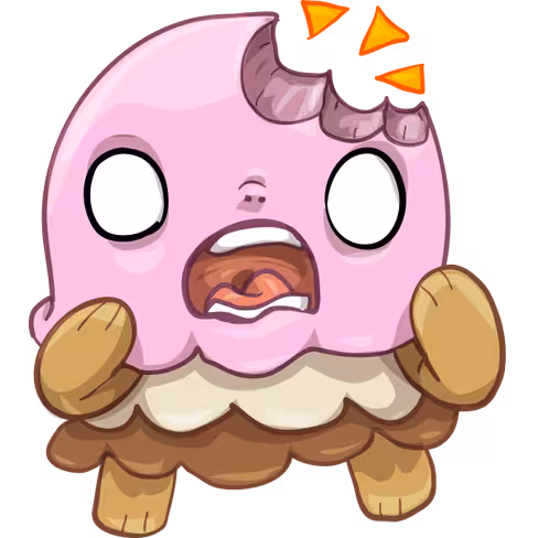
It’s all about triggering a nostalgic response in the brain to something you might have seen before. In that case most people have seen neopolitan ice cream before, ice cream is good, the character is cute… a lot of subtle things tie together.
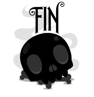
Facebook: Jared Nickerson (Skullington)
Designer Jared Nickerson was approached by Facebook after four of their sticker sets were already close to completion. After seeing what other designers had done, he felt there was an opportunity to contribute a character with a different sensibility to the roster.
I thought, ‘There are a lot of cutesy sorts of characters…’ and there was nothing that was a little darker, a little rougher with some edge. And a lot of the design work I do is catered towards teenagers and young adults that have that sense of humor. After tossing around a few ideas we landed on Skullington.
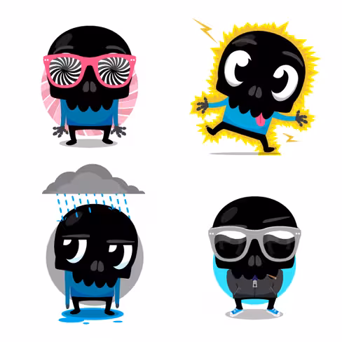
Skullington was given a black face partly because it would contrast well against Facebook’s white background, and partly because it brought a new twist on the skull as a commonly-recognized icon.
Doing the black skull just came from a desire to do something a little different. Most of the time when you see a skull you see a white skull, or a beige skull, and I wanted to do something that would stand out from the other skeletons out there. Skeletons have become a little cliche but they’re still a huge part of the design culture, and almost every culture out there. So I wanted to take a slightly different stab at it.
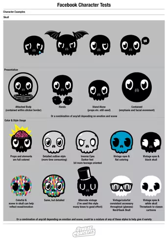
Since Skullington doesn’t have a mouth or a lower jaw, Nickerson says that one of the challenges was conveying enough emotion just through the characters eyes and other facial features. An increased emphasis on scenario and props emerged as a side effect.
It wasn’t “I need an angry character” or “I need a sad character,” it was more “What sort of things can this character be interacting with, what sort of situations could he be in, and then how would his emotion be reflected through that.” So there a sticker with a python wrapped around him… if you have a python wrapped around you then what emotion are you gonna have? Well, he’s in shock, or he’s scared or fearful. It all fell into place.
KakaoTalk: Hye-ji Yoon (Molang)
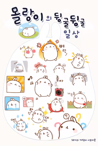
KakaoTalk is the leading messaging app in SouthKorea, where it’s said to be installed on 90 percent of all smartphones. Like its rival in Asia, Line, the characters in its sticker sets have permeated pop culture.
With regard to design aesthetic, Yoon prefers to lay the emphasis on the emotion first and foremost.
I try to focus on the meticulous details of Molang’s facial expressions and body gestures, instead of including other props or items in the stickers. I try to design my emoticons to express the most commonly used emotions in real life. The emoticons should be intuitive and be very clear in terms of what it is trying to express. I also keep note of verbal expressions that my friends and I use often in our conversations and chat rooms, and develop emoticons that deliver these messages.
The Molang character on Kakao talk has become so popular that it has made its way outside of the virtual chatroom and into the real world of smartphone cases, plush toys, and other accessories.
I began to promote my character ‘Molang’ in the very early days, when people just began to decorate their smartphones with cute character contents. At the time, it wasn’t common for artists to offer their character content for free. Naturally, Molang gained popularity between younger teenage girls who had relatively low purchasing power. It became a popular character for decorating mobile phones. It was then, that KakaoTalk opened an items store that offered emoticons and themes to users. Molang was one of the first characters to be featured in the items store.
Stickers – a path to brand loyalty?
Given their thoughtful design and the popularity of chat apps, it shouldn’t come as a surprise that some characters that originated as stickers have grown popular enough to warrant their own TV shows and products.
But even with merchandising and licensing opportunities aside, the jury is still out on whether stickers can be a driving force behind a platform’s financial success, or if they’re just extra additions to an app’s more vital core function. It’s certainly unlikely that companies aim to make the bulk of their profits off of a set of universally recognized mascots, but stickers can nevertheless serve as branded content that might be worth a buck or two to someone if it brings a few smiles.
Path is an example of a company that’s bullish on stickers, as it recently introduced a premium subscription tier that includes increased access to stickers (among other perks for $14.99). Its blog, meanwhile, promotes its sticker sets heavily.
Stickers, like emoticons of old, aren’t for everyone. For some folks, when sending messages to friends, good old text will do just fine. Regardless, there’s enough diversity in the stickers that are out there that there’s room to appreciate them as standalone works of art.
Top image credit: Shutterstock
Get the TNW newsletter
Get the most important tech news in your inbox each week.
http://thenextweb.com/dd/2013/09/04/jumpstarters-dev-focused-toolkit-is-now-in-private-beta-and-weve-got-100-invites-for-you/8217;%20lives%20simpler%20and%20easier%20