Color, one of the seven elements of art, is an important aspect of every design. It is so impactful that designers often neglect other elements, such as form and value, to the detriment of their work.
Since color has a massive impact on your viewers, it is important know your theory and even a little psychology. Warm colors give off a fiery message, while cool colors have a calming affect. Analogous color schemes, often found in nature, are pleasing to the eye, while complementary color schemes have a more energetic feel.
No matter what color palette you decide on, it should reflect your intentions, and capture the perfect feeling you’re going for. Check out this list of 9 resources to inspire your next color palette:
Wear Palettes
 Looking outside your area of expertise helps you discover different ways of tackling the same problem. Although Wear Palettes focuses on fashion, it is a great way to find an atypical color palette for web design. And besides, fashion designers are still designers, so check out this daily inspiration of color palettes from street outfits.
Sunsets and Color Palettes
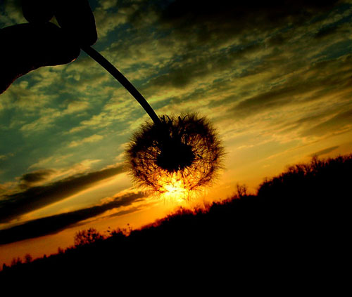 This piece by Noupe, a design blog, suggests designers look to photography and nature, specifically pictures of sunsets, to discover vibrant color schemes. The post contains over 35 results paired with original photographs.
Clearly, looking to nature is a good idea, and learning about color from experienced photographers isn’t half-bad either!
Kuler
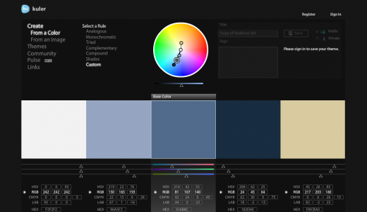 If you’re not sure where to start, Kuler (by Adobe) is a well known resource for exploring and creating different color palettes. It’s also an awesome way to learn color theory hands on, as it allows designers to play with different, logical color combinations on the color wheel.
You can also use Kuler if you’ve decided on a photograph, but don’t know what colors to pair with it.
➤ Kuler
Color Scheme Designer
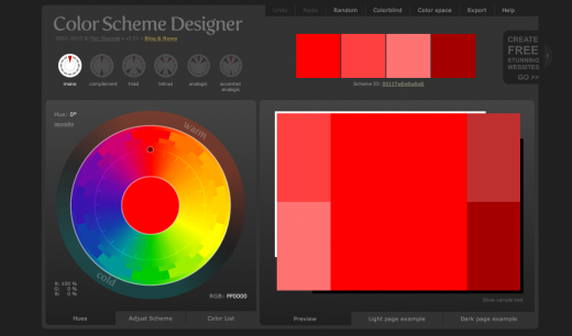 Like Kuler, Color Scheme Designer generates palettes, and allows you to choose different combination types and base hues. This generator doesn’t create schemes based on photographs, but it’s still worth a try if Kuler ever feels too complicated.
➤ Color Scheme Designer
Colour Lovers
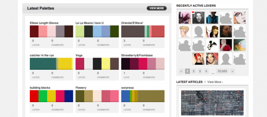 Colour Lovers is a creative community for creating and sharing colors, palettes and patterns. The site serves this niche quite well, and continues to be one of the best sources for design inspiration.
The Perfect Palette
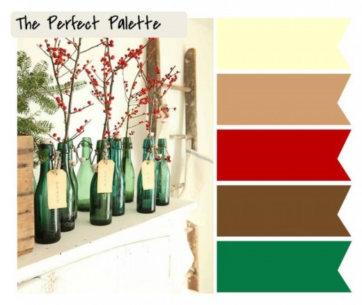 Although this may seen like a peculiar deviation, looking beyond your typical methods of inspiration can help bring new ideas to light. The Perfect Palette is a blog for wedding color palettes, and is an interesting place to find inspiration. I particularly like the way you can search by color (e.g.: cranberry, peach, sage and copper).
Color Collective
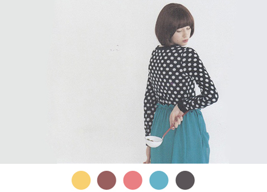 Color Collective pulls palettes from the work of various designers, artists, and photographers. The results are unique, and new palettes are uploaded often.
Edible Color Palette
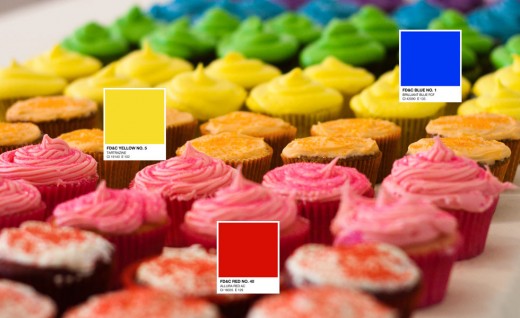 IDSGN’s edible color palette is a comprehensive piece on how color influences our minds and health. Not only does it show how important color is, it also explains the colors of products we consume every day. It’s as inspirational as it is haunting.
ColRD
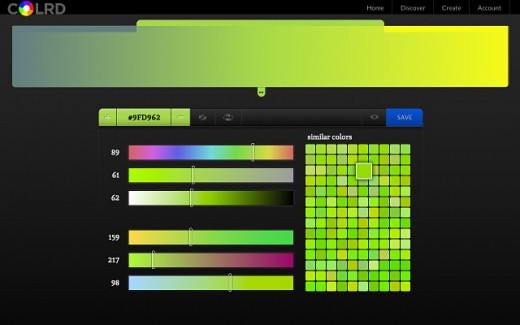 We’ve already covered ColRD, a CSS3 gradient creator, as one of the must-have Chrome extensions for designers. It opens up the possibilities of color gradients for inexperienced coders, and can provide awesome, unexpected affects when used in moderation.
➤ ColRD
As you can see, the way colors are combined is a very popular subject and deserves the attention of every designer. With this in mind, however, I still believe that inexperienced designers should begin most of their projects in black and white, only because it allows the mind to pay attention to form, shape, texture, line, space and value. What do you think?
Do you have any resources to share? Let us know your favorites and we’ll add the best ones to this post!
Get the TNW newsletter
Get the most important tech news in your inbox each week.


