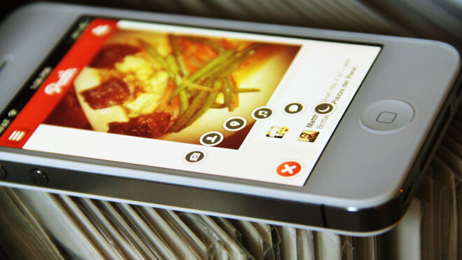
If you’ve used the new Path app for iOS or Android, then you’re probably aware that the interface design of the app is second to none. It’s friendly, interactive and emotive without being twitchy and flashy and it invites use with its clever animated ‘share’ button.
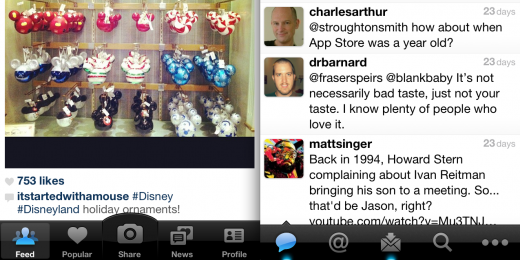
The Path sharing UI is nothing like the bottom-dwelling tab bar that is persistent across many, many app UI designs. This can be found in a huge array of apps (especially on iOS) like Twitter and Instagram and can make one-handed operation a bit more difficult than it needs to be. It’s also pretty fidgety when it comes to accuracy, it’s not unusual to hit a wrong tab first, before stabbing the right one.

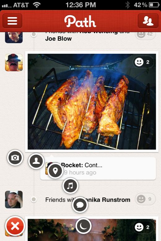
The Path sharing UI is a different beast. The button hovers in the lower left corner of the screen, with the universal ‘+’ symbol indicating that it can be used to add things. What you can add is a mystery until you tap the button, at which a nicely tuned animation rotates it to an ‘x’ (which indicates the ability to close it or make it go away).
Round sharing buttons, which are just enough smaller than the main button to indicate that they are children, fly out, rotating a quarter turn counter-clockwise. This gives them a floating appearance, enhanced by a slight bounce as they reach the constraint.
Once the buttons are out, they’re a natural thumb’s reach from the corner of the device and, at least in my experience using the app, seem to lead to a lot fewer mistaken touches.
On the way back in, these buttons bounce back outwards, spinning at a higher frequency and traveling faster, giving it a snappier feel.
When a new, flashy and obviously effective sharing UI pops up, it tends to get passed around, analyzed and deconstructed by the design community, but the speed at which this is happening with the Path UI is pretty astounding. Designer Jon Gold pointed out that some of the examples are very smooth already.
Whether created using native CoreAnimation, CSS and web technologies, designers are getting excited about it. Some have posted their source code for others to refine and play with. The design-sharing site Dribbble is always a good place to take the pulse of trends like this and there are a half-dozen examples of people playing with it on there already.
This doesn’t mean that the tab UI is on the outs completely yet, and, as Gold points out, it could just be people riffing, but the Path UI is definitely making its mark. “I love it,” says Gold, adding, “hopefully people won’t rip it off too much and rather use it as a kick to be more experimental in their work.”
It would be a shame to see an exact clone of the Path UI suddenly pop up in dozens of apps, although I’m not writing that off as a possibility, but it would be a joy to see it become an inspiration for those looking to move beyond the tab bar in their own apps.
And, who knows, maybe you’ll see the UI in use on your favorite social network if Path ends up as another Facebook acquisition on the way to improving its mobile fortunes.
Get the TNW newsletter
Get the most important tech news in your inbox each week.


