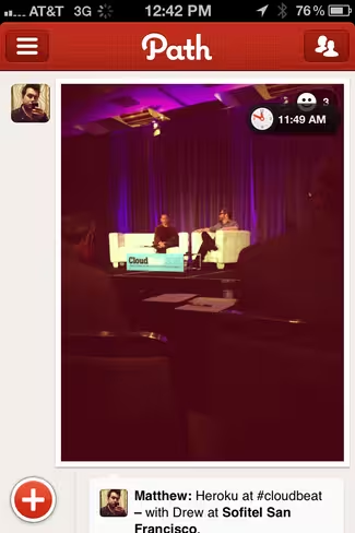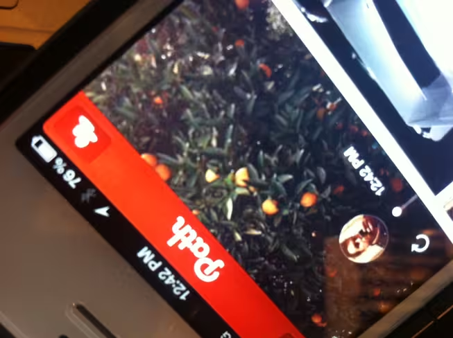
Last night, Path announced version 2.0 of its photo sharing app, expanding its reach to exist as more of an ‘everything’ sharing app. It’s a version of the app that feels like a really well done pitch for a new Facebook interface.
The new version of Path allows you to share not just photos and videos, but also “thoughts, the music you’re listening to, where you are, who you’re with, and even when you wake and when you sleep.”
If this feature set sounds a bit familiar, then you might be a Facebook user. Since its launch, people have been comparing and contrasting the more focused sharing scope of Path (currently limited to 150 friends) versus the open ‘share anything to all’ model of Facebook’s Open Graph.
Unlike Facebook, however, Path has managed to deliver an experience that feels fresh — though not without its quirks — and manages to codify the act of sharing into terms that make sense on a mobile device.
Facebook has had some serious problems getting its mobile experience to feel right on mobile devices. The iPhone app has been notoriously buggy since its launch and recent updates haven’t seemed to help enough. The iPad app feels more than inspired by the Twitter app, originally built by Loren Brichter.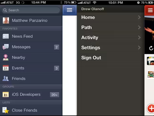
Path 2, on the other hand, feels like a leaner and meaner version of Facebook that works very well within the context of a mobile device. It’s also easily one of the best looking apps for the Android platform.
The interface of Path is decidedly un-Apple, yet still rewards use with clever details like a spring-out arc-style arrangement for sharing options and crisp typography.
It also feels like a miniaturized version of Facebook’s new Timeline interface. The various shares are connected with a slight embossed throughline that follows the feed backwards as you scroll. There’s even a pop-out element that features a tiny traveling clock.
It’s almost comical how much Path 2 feels like the ‘Facebook app that Facebook should have made.”
It’s not perfect, there are some frustrations in the signup process and the slide-over interface seems pretty derivative at this point. The preponderance of emoticons makes it sometimes feel as if a text-drunk tween has vomited all over the feed. But it’s still light-years beyond Facebook’s current mobile experiences.
And Facebook sorely needs to punch up it’s approach to its mobile business. As Dan Frommer cleverly put it at SplatF “when’s the last time Facebook really wowed you with something in mobile?”
That’s not to say that Facebook isn’t doing really well in the mobile space. It says it has 350 million mobile users, 97.7 million of which are on the iPhone and 81.5 million via the Android app.
Path, on the other hand, doesn’t seem to be doing nearly as well. While the app offers you your contact list and email invites — as well as a few recommendations based on some criteria — the main way that most people will find users to follow on Path is the Facebook connect feature.
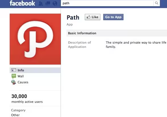
Doing a little digging in Facebook — using the same method as the one used to retrieve the Facebook for iPhone and Android numbers above — leads you to this entry for the Path app on Facebook. Currently all external applications that use the Facebook platform have to have a complimentary app on the service.
Path’s app shows 30,000 active users per month. That is not a lot. Obviously these numbers don’t correlate 1 for 1 as Path users are not required to use Facebook. Still, it seems likely that they are indicative of adoption levels to at least some degree.
Even if they’re only accurate to +- 50,000, it means that use of Path has been lower than many of us suspected. It also means that this redesign was a necessity. As Path CEO Dave Morin put it after looking at how people were using the app, “ultimately we realized that we had to completely re-imagine Path.”
So Path went back to the drawing board and came up with a prettier and more focused Facebook experience on the iPhone and Android. An experience that feels ripe for acquisition by the social giant.
If the adoption numbers are as low as they are, it just doesn’t seem to make sense for Path to double-down on user adoption. Instead, it can present a clear and defined vision for how Facebook should work outside of the full platform.
Yes, that side panel is missing a few sections, but how hard would those be to shoehorn in? In the end, users would benefit, and so would Facebook. From what we hear, acquisition is off the table for at least the next few months, but after that? We’ll see.
As Dave Wiskus, Chief Creative Officer of Black Pixel, put it “It’ll all make sense in six months when Facebook buys @path.”
Get the TNW newsletter
Get the most important tech news in your inbox each week.
