One way imaging apps differentiate themselves is how they segment and target their audience. Steller, which is releasing a major update to its iOS app today, views its users as mobile storytellers specializing in short, multi-page artistic tales that make primary use of images, video and text.
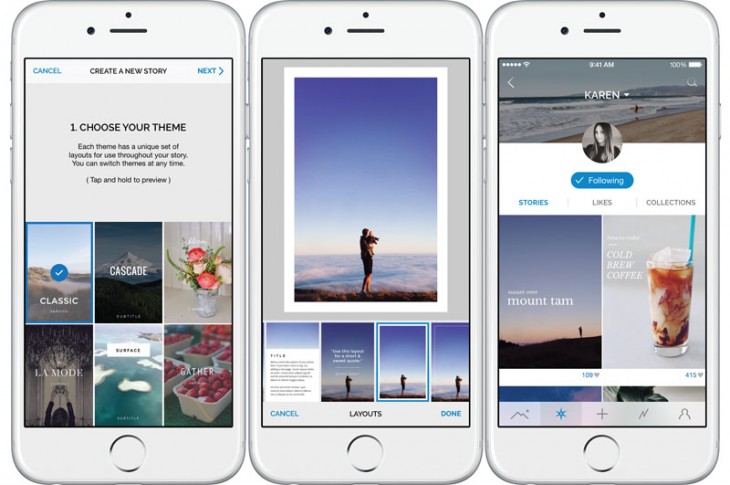
With Steller, the emphasis is on elegant design but with an ease of use derived from new tools and enhanced browsing. It looks significantly different than the app that debuted last year — lighter and friendlier. It’s an easy app without being too simple — you can figure it out with a few taps.
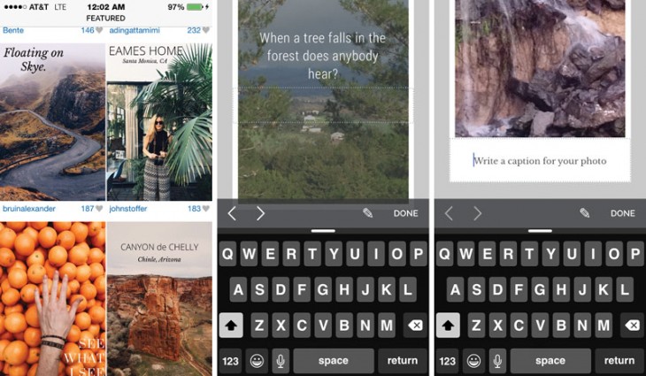
Steller’s intro page showcases some beautiful examples of the genre with its featured stories that offer a bit of familiar Instagram-like sensibility in listing the name of the artist, the number of likes, and a heart icon.
“We believe everyone has a story to tell and everyone should be able to tell their stories in their own unique way,” Jay Wilder, cofounder of Steller, told TNW. “Each story on Steller has a unique look and feel, whether it be a weekend travel adventure, a DIY project, or a favorite recipe. We don’t believe in a one-size-fits-all approach to design. Steller aims to be the easiest-to-use visual storytelling app and also the most expressive and creative.”
The Create tab is the heart of the app, and by the time you tap that middle button at the bottom of the screen, you already have a pretty good idea of the quality of work you want to go into your piece. That’s because you’ve likely tapped through Steller’s main tab, where others have published their work or the Explore tab that lets you browse topics by category like Food + Drink or Animal Kingdom.
This version’s enhanced selection of page layouts are organized into new themes that let users easily choose an overall design for their story. There’s only six themes to choose from, but they’re accompanied by multiple layout variations, and as you tap and hold each one, you can preview each theme with your own images and text in mind.
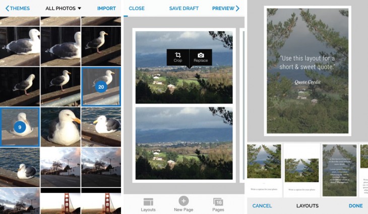
Updated layouts are coordinated with matching fonts, colors and graphics to aid in designing your story and encouraging personalization. You can import all photos and videos at once and compose your story by applying page layouts to media, entering text, cropping photos and videos and arranging pages.
You can reconsider each entry with the Layouts, New Page and Pages tabs. Layouts gives you all the possible layouts within the theme you chose so you can try it out with the current image. Some layouts give ample room for text, others are mostly visual.
But you can also change your mind if your concept is not working. In fact, you can just choose a few images to start and dip back into your Camera Roll later for the rest. You can also save a draft to work on later.
Aside from their regular users, Steller also has attracted a number of brands such as Urban Outfitters, DIYs by Free People and athlete profiles from Lululemon. There’s no transaction associated with the brands, according to the company. They are members of the community and showcasing their work just like everyone else. “We’ve been excited to see how brands are using Steller to share stories that are educational, inspiring and entertaining,” Wilder said.
➤ Steller [iOS]
Get the TNW newsletter
Get the most important tech news in your inbox each week.
