Samsung has a huge marketing budget, but its branding and track record for product design is underwhelming. In comparison to Apple, its closest smartphone rival in the US, Samsung struggles to play in the same league.
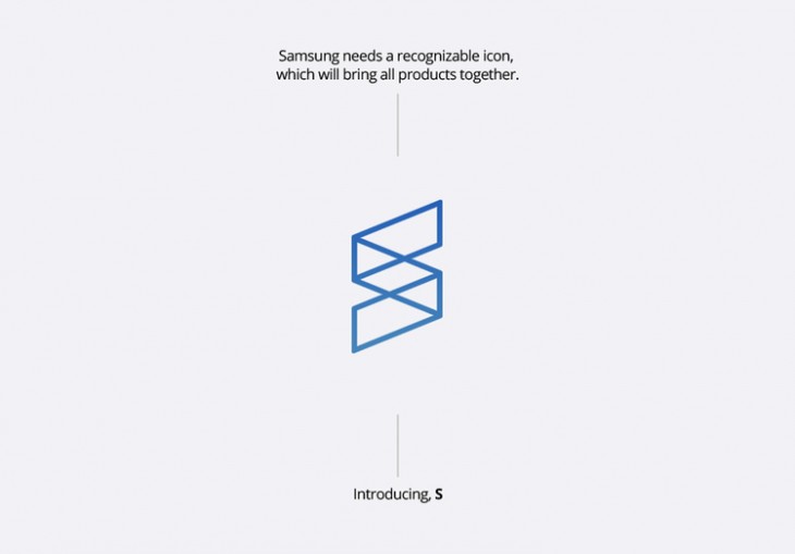
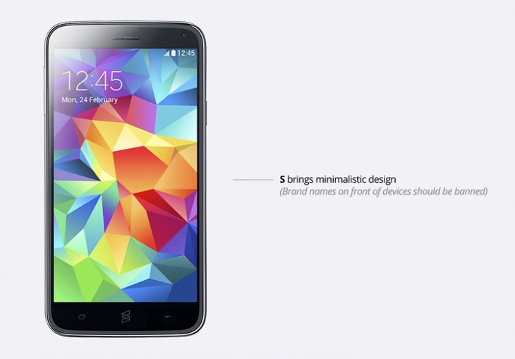
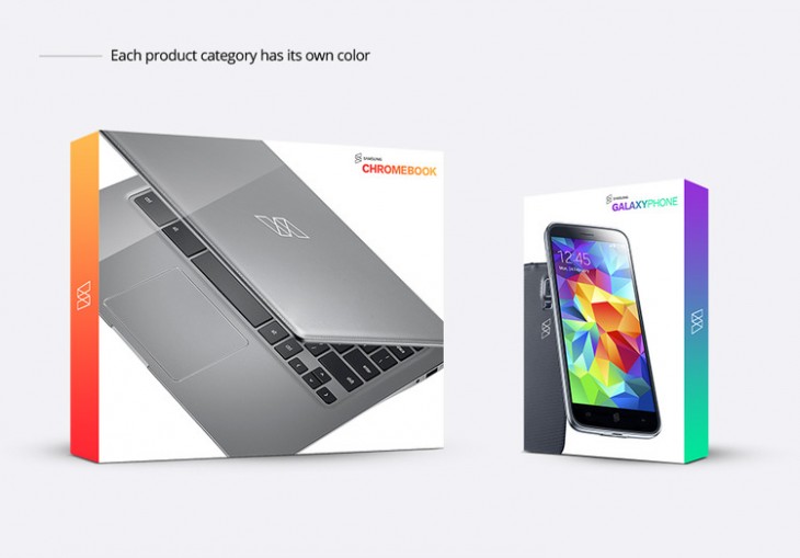
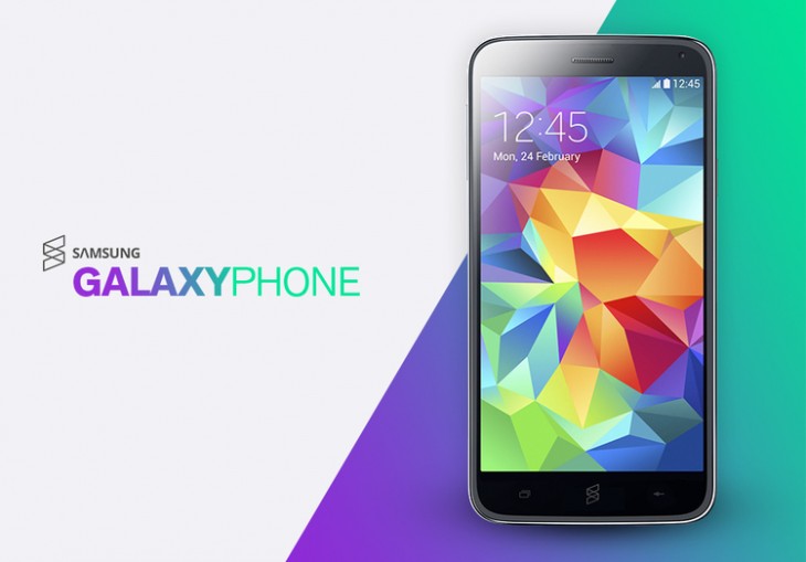
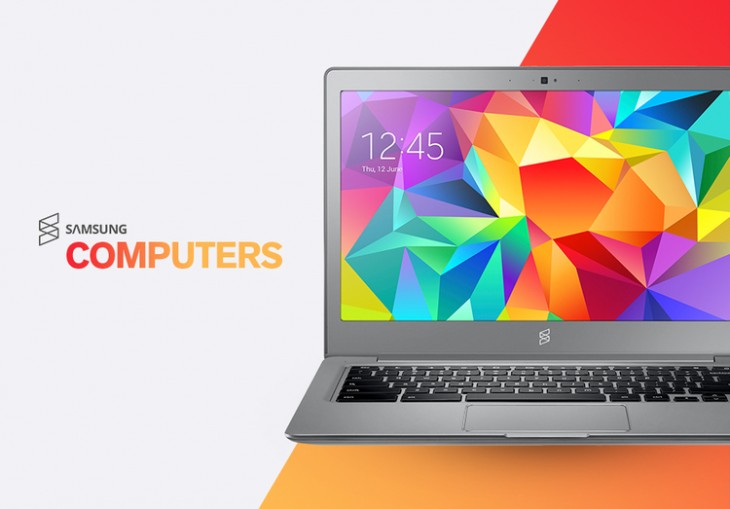
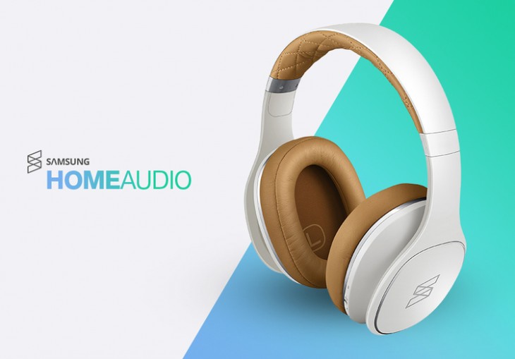
Tech-lover and coffee addict Aziz Firat thinks it’s about time Samsung gave its core branding a complete overhaul. Over on his blog, the visual designer has posted a series of images and mock-ups showing how a new logo, featuring a new emblem and typeface, could radically change Samsung’s image.
While the physical design of Samsung’s consumer electronics remain largely unchanged, it’s surprising just how impactful this change could be.
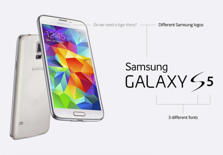
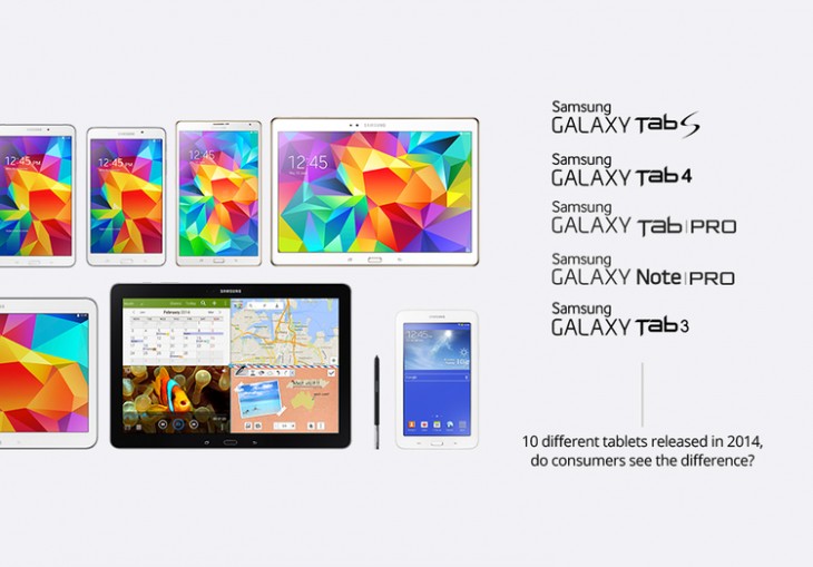
The Problem
The Solution: “S”
The new lineup
To see the full set of images, be sure to head over to the Aziz Firat’s site. You can also catch him on Dribbble, where he posts regular “shots” of his work.
Don’t miss: 4 things recruiters look for in a design portfolio
(Note: All images were published with Aziz Firat’s permission.)
Get the TNW newsletter
Get the most important tech news in your inbox each week.


