
This post was originally published on the Shutterstock blog and has been reprinted with permission.
Competition among digital creatives is fierce, and landing a job or a new client starts with a great portfolio. To get the inside track on what companies and recruiters look for in a design portfolio, we sat down with Jennifer Pugh of The Hired Guns, a New York talent agency representing digital creatives.
Pugh heads up recruiting for a range of design roles, including visual and graphic design, UX, interactive design, and creative and art directors. Her insight can help you take your portfolio to the next level and stay ahead of the game in a crowded industry. Here are four things she recommends that every applicant should keep in mind.
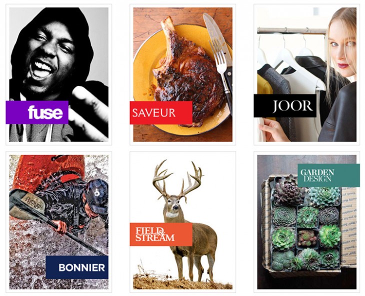
Simplicity
“No one visiting a portfolio — at least from the recruiting end — has time to view every sample. If things aren’t organized clearly, I tend to bail pretty quickly,” Pugh says. She stresses that digital creatives need a clean portfolio that efficiently showcases their capabilities with minimal effort from the user. Make sure your portfolio is neat, filterable, accessible and free of unnecessary distractions. “I still occasionally run across a portfolio that automatically plays music, and it’s horrifying,” Pugh says. “Every. Time.”
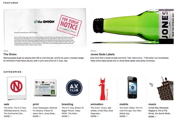
Versatility
“I think it’s most effective when portfolios don’t cater to one skill set, but instead show a little of everything the designer is capable of,” says Pugh. Your wheelhouse may be interaction design, but if you’ve also created marketing collateral or designed icons for an app, be sure to include that. Demonstrating the number of design-related hats you’ve worn will make you more marketable.
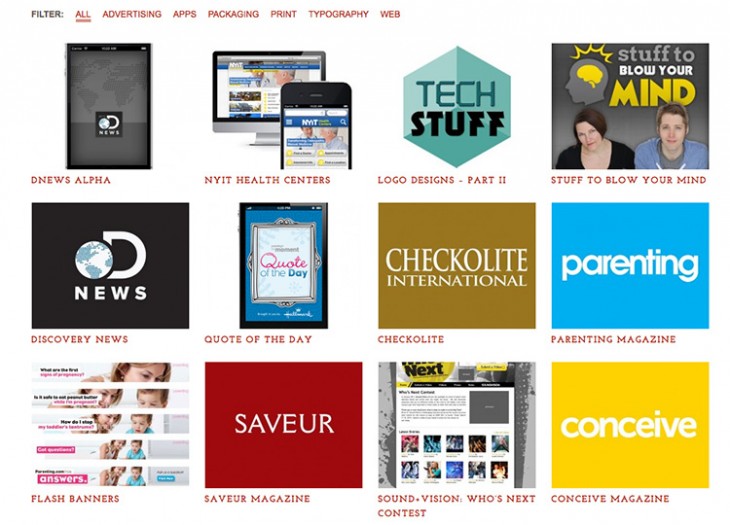
Relevance
Versatility is critical, but it doesn’t mean packing your portfolio with everything you’ve ever done. Keep your portfolio focused on work that’s relevant to the kind of job or clients you’re trying to attract. If, say, you’re a UX designer, including some samples of visual and graphic design work is great for showing versatility, but resist the temptation to add non-design related information. “Don’t link to your artisanal cheese-making business if you want a design job,” says Pugh.
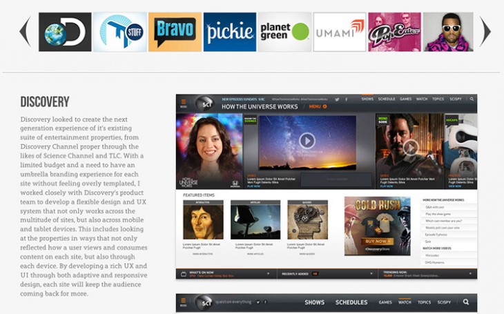
Context
“I see a lot of portfolios that don’t include explanations of what the designer was responsible for on each project,” Pugh says. “And that’s never a good thing.” No project is ever completed single-handedly, and it’s important to clarify your contributions when you’re part of a team. Define your role in each project, as well as the problem your design was solving, and how your work contributed to the project’s overall success.
“The final samples are just the last part of the story,” Pugh explains. “Giving visitors context around your work puts you in a much more powerful position, and lets people see how much thought went into each project.”
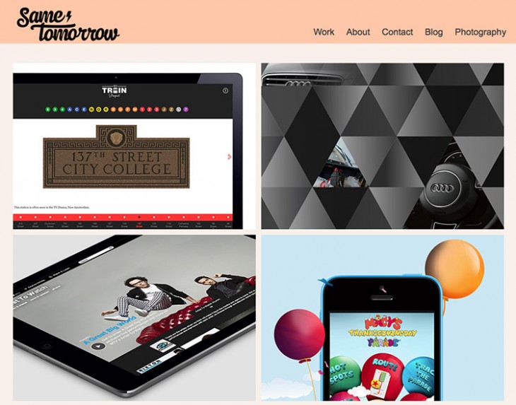
To make building your portfolio easier, Pugh recommends using sites like Behance, Krop, and Squarespace. “Everyone and their mother is using Squarespace right now,” she said. “Their templates are universally perfect, user-experience wise. But I never find people with Tumblr or Facebook.”
Top image: Workspace illustration by Laralova
Get the TNW newsletter
Get the most important tech news in your inbox each week.


