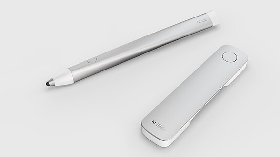
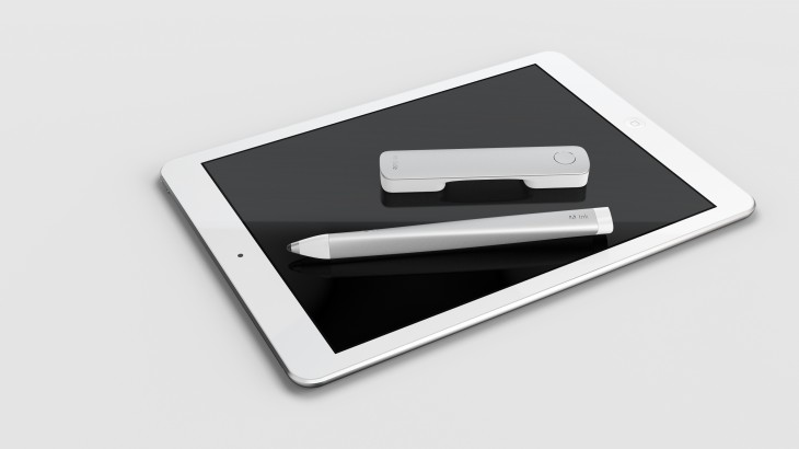
From its packaging and color to its design and presentation, Adobe’s new Ink & Slide cloud connected pen and ruler set fits hand-in-glove into Apple’s ecosystem.
These new hardware tools, offered as part of Adobe’s yearly upgrade of its Creative Cloud suite, target and challenge Adobe’s artist constituency, resurrecting hand-eye coordinated drawing as a really cool thing you can still do.
Adobe Line and Adobe Sketch, two free iPad apps for conceptual freehand drawing and drafting, also represent a rare breed — software developed as companion apps for hardware.
Line is a new approach to drawing and drafting that specializes in straight lines, geometric shapes, and perspective views. Sketch, a freehand drawing tool, facilitates the recording of quick ideas using drawing pencils and markers modeled on traditional artist tools.
Adobe loaned The Next Web a pre-production Ink & Slide unit along with Adobe Line and Adobe Sketch, and I have lived to tell the tale.
Artist ritual re-imagined
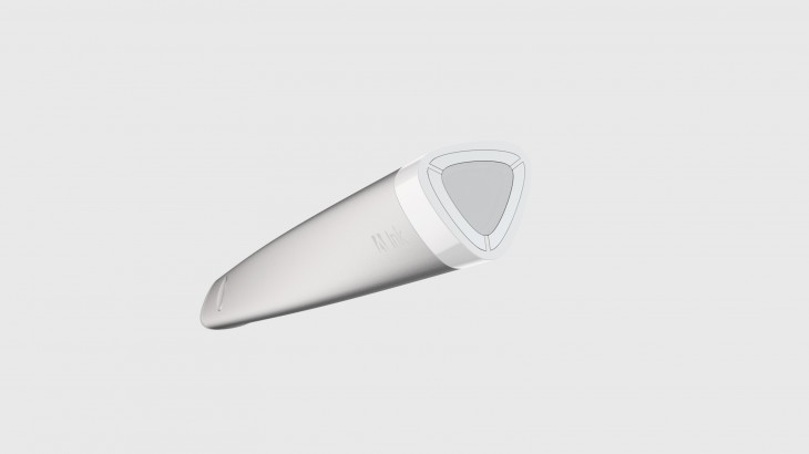
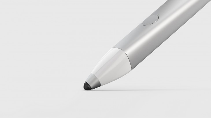
Adobe Ink, a Bluetooth connected pen, is a featherweight wonder. Adobe Slide, a non-connected mechanical instrument that interacts solely with the capacitive surface of the iPad, ensures that no artist can ever again use the excuse that they can’t draw a straight line. Straight lines — as well as shapes and other objects — are Slide’s raison d’etre.
Like all creative processes, there’s a ritual in using physical tools, and that’s part of the idea behind Ink & Slide — to help creatives get past the toughest obstacle — the blank page.
With these new tools, Adobe acknowledges that creation is not only about pixels and digital files, but that art has a tactile quality that’s essential to the conceptual process and hard for creative people to let go of.
Ink & Slide addresses the reality that artists and designers still long for their rulers and T-squares and triangles for the ritual of handling them that unleashes and augments creative thinking.
Charge it up
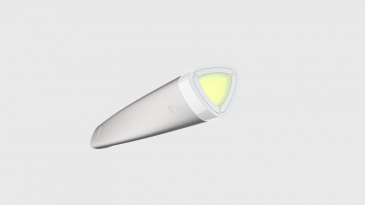
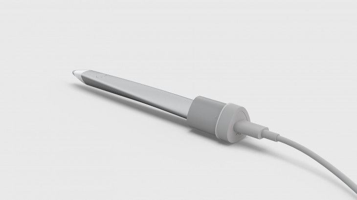
The first part of using Ink is to charge it. Place the pen in its holder where a three-pin magnet top attaches to it. If you connect the top charger to a USB power source, you’ll see a familiar red glow at the tip until the unit is fully charged.
If you leave the pen in its top, you’ll see rainbow colors glow and fade to blue, purple, orange, green, and yellow. Detail-obsessed, Apple-reminiscent touches like that, say Adobe developers, may be enough to kick off ideas, or at the very least, bring on a smile.
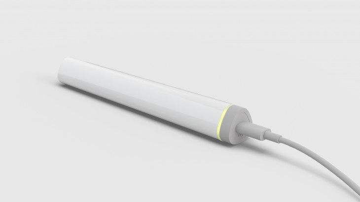
Adobe says a one-hour charge gives you eight hours of use, and my experience with the pen bears out that claim. Use is defined as continuous, not simply time-based, and counted only when you’re actually drawing with the pen.
To switch on the pen, you press the only existing button, on the pen’s side, until you see the rainbow colors cycle at the bottom. Then you connect to Creative Cloud via the companion app on your iPad.
Pen 2.0
Just as the first iteration of tablet pens for the iPhone and iPad often tended to be somewhat weighty, sporting quietly pleasing rubberized tips, Adobe Ink is an evolution of the genre. Ink is almost like holding air.
Part of this aesthetic is the Ink’s unusual triangular shape — which looks like it would be kind of clunky — but in fact feels totally natural. The shape puts the friction into the pen’s polished hydro-form aluminum exterior, precisely so that it does not rely on heft in order to balance in your hand. My hand did not tire one bit no matter how long I used Ink.
Many tablet pens try to be unobtrusive with silent, rubberized tips that may drag a little on the tablet surface and have a marker-like feel. Ink goes the other way, emitting a perky sound as the tip touches the iPad glass, adding to the product’s overall tactile quality. I’m pretty sensitive to sound, and the Ink’s clickety-clack doesn’t bother me, but I can imagine it might frustrate some sensitive artists, especially if a drawing is not going well.
While the click happens only on contact, the pen’s pressure sensitivity make your lines darker as you apply pressure to the tool, and that effect is more obvious when using the thinnest pencils.
When you’re done using your pen, just press and hold the button until the LED glows red and switches off. The prototype I used had zippy performance for the most part, though every so often there was a bit of a delay.
Controlling from above
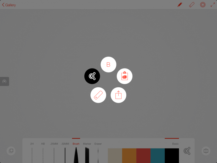
In addition to simply drawing on the surface, you can also control the pen commands by hovering the pen above the tablet. With pen in hand and held slightly above the screen, a click on the pen’s button brings up a five-point menu containing all of the screen controls.
It gives you the pen setting you chose, access to Adobe’s online Kuler color utility, the clipboard for saving drawings and ideas, an option to choose Slide for placing pre-built shapes into the drawing, and a sharing component that offers options like getting feedback, copying images to Creative Cloud, sending the image to Photoshop or Illustrator, and sharing the drawing to via AirDrop, email, or saving and printing it.
Slide is the new ruler
As a device, Slide requires no power; you just place it on the glass, move it around, and use its button to serve up different shapes or straight lines that you can easily trace.
Line and Sketch: Developed for hardware
Launching Adobe Sketch and Adobe Line is a basic and minimalist experience, and on first examination, they look similar with overlapping features. The most prominent thing you see in both, though, is a blank white canvas that gives you the space to draw. Not much gets in the way of pen and tablet.
You can use both apps independently of both the hardware and Creative Cloud. While you actually can use Ink with other non-Adobe drawing apps, Slide is not useful outside of Line and Sketch. However, users who don’t have the hardware can access the Touch Slide digital version of Slide that calls up a software line and shape generator directly from the fee app.
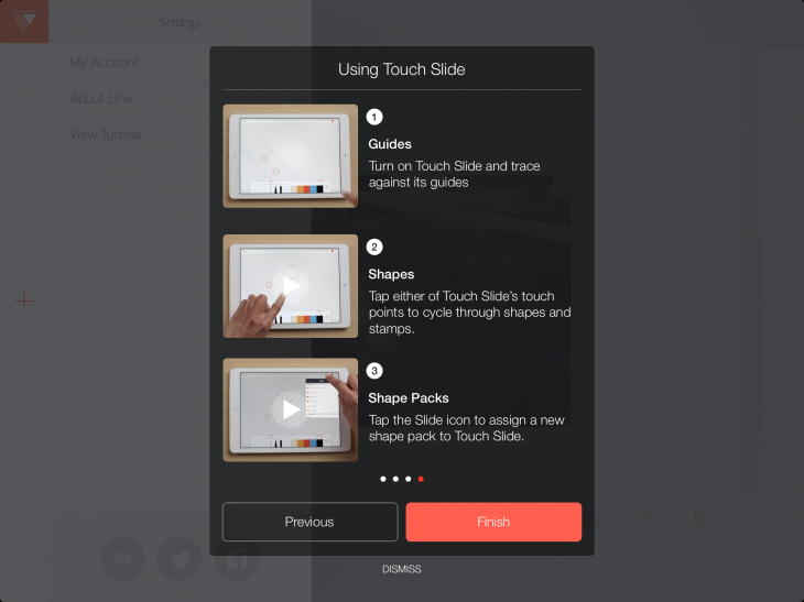
With all the concentration on the new tools, it’s easy to forget about the main thing the iPad is famous for: gestures. To use Ink & Slide effectively though, it’s best to turn off the iPad’s built-in multitasking gestures and use Adobe’s special formulas for the new tools.
Adobe Line
With Adobe Line, you place the new Slide ruler on the surface of the iPad, where by default it gives you two straight guidelines that you can position, move and rotate in any way you want to draw them.
If you leave slide on the surface of the iPad for awhile, the guidelines disappear from view, but they’re still there. As long as slide sits on the glass, you can draw straight lines with your pen wherever you want on the canvas. A small button at the top of the device lets you place shapes on the screen.
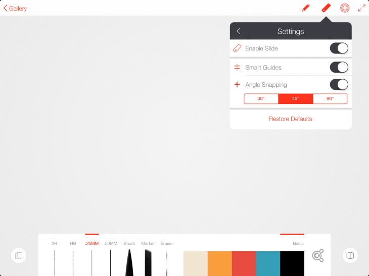
But that’s not the only way to summon Slide. Touching your fingertip to the red circle at the top right hand side of the canvas brings up a diagram of the Slide’s connection points in a digital version of the hardware ruler called Touch Slide.
Using your fingers or the pen, you can tap the connector points to serve up the shapes and stickers available from Slide. French Curves, Ellipses, Triangles, Polygons, and all the familiar drawing tools are available with a tap. When you have the one you want you can pinch to resize it and then double-tap to save. If you have Slide on the glass while you do that, you can easily reposition the shape or line. But it was frustrating not to be able to select, move, rotate or enlarge an object after it was placed.
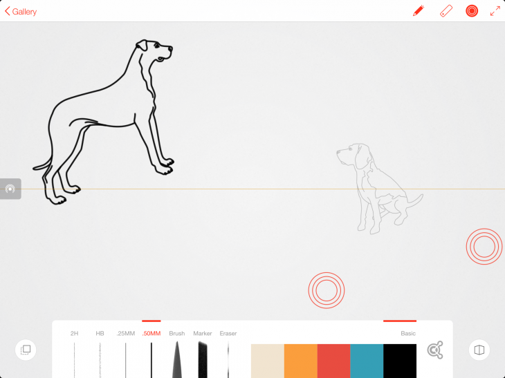
A series of built in sticker sample packs helps you populate scenic drawings with trees, dogs, arrows, foliage, stylish furniture and more. Just choose the type of object you want to include from the menu, resize with gestures, and double tap to place. This is a fast way to place multiple shapes and drawings quickly.
A series of tools corresponding to the Ink pen emerge from the bottom of the window. You can use any of these — pen tips: 2H, HB, .25MM, .50mm, Brush and Marker and there’s an eraser. That’s it.
Need more straight lines? Just replace the slide and the line only mode starts all over again. To manually take the the app in and out of slide mode, tap the circle at the upper right hand side of the screen.
Touch-based undo and redo can be very convenient: just swipe left to undo and right to redo. A three-finger history scrubbing feature takes you back to any point in time in your drawing. But everything has to be in order, so if you want to undo something you did earlier, but not something else later, that will hit a snag.
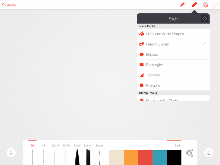
Adobe Line only works in landscape orientation and a control at the top lets you set the canvas to full screen.
Once placed, you can’t pick up an individual figure and move it somewhere else on the canvas. Or even do much aside from enlarging it. There’s also no way to preview how these items will look before placing them on the canvas.
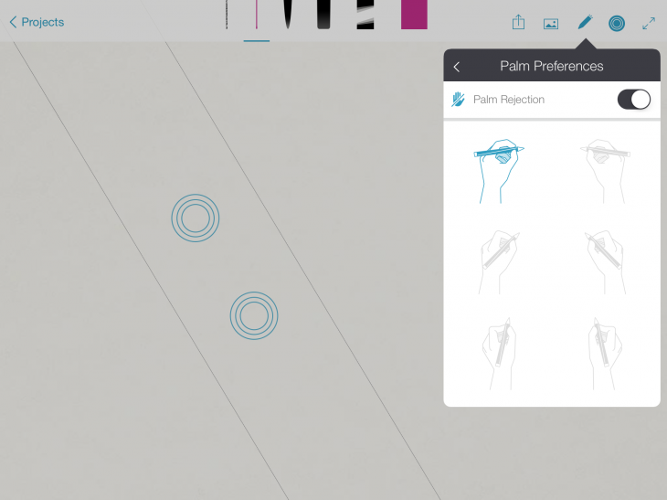
When Palm Rejection is turned on in Line, a new icon appears on the left side of the canvas. To zoom or undo, hold one finger on this button while using other fingers to perform the gesture. This is a temporary toggle to enable gestures, which are normally ignored if Palm Rejection is on. For lefties, that’s a two-handed operation that will make working with Slide and Line together more challenging.
Touch Slide (the two red target icons) offers the same full feature set as Slide and can be used by people who haven’t purchased Ink & Slide, or simply like to work without another physical tool on the screen. Slide works better for desk use, but I found Touch Slide is more convenient when the tablet was in my lap.
Adobe Sketch
Adobe Sketch opens up to a five-part document, where you choose one to begin your project.
Switching the interface from Adobe Line to Adobe Sketch was a little disorienting not only because the tools look so similar, but because in Line, all the tools are lined up at the bottom of the canvas while Sketch has all the tools are lined up at the top.
The Sketch icons are more conceptual — they are not labeled, so you just have to start using them to figure out what they do. And they are not adjustable, as are the ones in Line. As with Line, however, you can enable both the Ink and Slide and they function the same way.
But Sketch is powerful. There’s more of a pixel-based element to Sketch, especially when dealing with images.
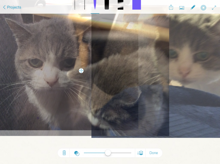
You can, for example, import multiple photos into a document, adjust the opacity of each in a collage style, adjust the position of layers, and then draw or place shapes on the composite image.
A foreground and background control in Sketch places the image parts of the composition in relation to the sketched parts. However with both, you have more choices in how to continue editing your drawing by saving it to and having it launch in Photoshop or Illustrator.
Despite Sketch’s simplicity, and depending on how disorganized you are, you could lose track of where you are, especially if you are enabling or disabling the palm rejection settings.

Overall impressions
Adobe Ink & Slide are very cool tools and can be of huge help to artists who need to sketch from a mobile venue — like the couch. I was especially impressed with Ink, which was extremely light and comfortable to hold for long periods of time. Battery life was excellent; I worked with the pen for days on a single charge.
The idea that you can simply point the pen to the surface of a tablet and be able to choose immediately from available options hastens operations for the coordination challenged.
For a device that had no special connective powers, Slide manages to perform great feats of placing straight lines and serving up objects.
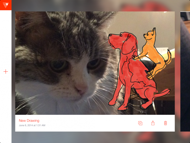
I had mixed feelings about the software. I found myself wishing that certain components of both apps would be incorporated into the other. Indeed, to casual observers, even having two drawing apps that do roughly the same thing seems counterintuitive. Plus, I was frustrated by the lack of flexibility in manipulating objects on the canvas after they were placed. The first thought is not always the best.
Adobe is thinking about these apps long-term, anticipating that they will diverge and develop in different directions over time. Adobe says that you can see strong hints of where Line is going through the inclusion of Shape Packs and Smart Guides. Sketch will eventually gain more expressive brushes, painterly styles and collaging techniques. That’s something to look forward to. Adobe is also looking forward to the contributions of outside developers via its SDK.
Yet, the simplicity of the two apps — just letting you draw and giving you some basic assistance — is alluring.
Also see: Adobe launches Creative Cloud hardware-software combo for drawing on-the-go and Adobe launches sweeping upgrade to its Creative Cloud lineup
Get the TNW newsletter
Get the most important tech news in your inbox each week.
