![Netflix just changed its icon [Updated]](https://media.thenextweb.com/2016/06/Netflix-Old-New.avif)
Netflix looks is gearing up to change its icon. The company is sporting a completely new design on its Facebook and Twitter accounts.
For comparison, here’s the old one:
![]()
And here’s the new one:
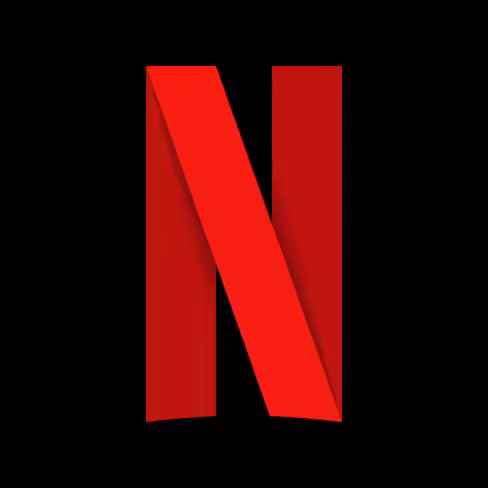
There are two major differences. Aside from the ribbon pattern (hey, that’s familiar!) that evokes a red carpet, the single-letter design makes a lot better use of space in a square or vertical format.
POLL: How do you feel about the new @Netflix logo? 😍 or 😱
More info: https://t.co/vnai2PPdSJ
— TNW (@thenextweb) June 20, 2016
While it’s possible that it’s only using this single-letter design for social media, the curvature at the bottom of the ‘N’ is reminiscent to the bottom curve on the entirety of the old logo. That seems to suggest Netflix is planning on using the single-letter motif as its visual identity across a variety of platforms, if not necessarily all of them.
In other words, expect this to show up on your smartphone too.
That said, we’re not seeing the new design on its main page or its official assets page for media, given it’s already updated its two largest social media accounts, we imagine the company will be rolling out the revamped logo widely any time now.
This is the second time Netflix has updated its visual identity. The first change came in 2014, when it switched from its DVD-era logo with a red background and old-school typeface to a flatter, more minimal design (and as with most logo changes, some people weren’t happy). Looking at it now, it’s quite a throwback:
![]()
No word on whether today’s new logo will be tied to any larger redesign to Netflix’s website or app, but we’ve contacted Netflix for more information and will update this post if we hear back.
Update 3:00 PM EST: Netflix got back to us with the following comment:
We are introducing a new element into our branding with an N icon. The current Netflix logo will still remain, and the icon will start to be incorporated into our mobile apps along with other product integrations in the near future.
Basically you’ll see the N icon on most places, including smartphone apps, social media and whatever those “other product integrations” are. It’s not a logo change, but a new part of the brand
It’s possible the old logo will remain on Netflix.com, but for devices with smaller, vertically oriented screens like smartphones, the new logo leaves less negative space and makes it easier to identify the Netflix app among a plethora of other ones. It also makes sense for social media, where square formats are prevalent.
Certainly better than Uber’s update, anyway. But what do you think?
Tip via Koen Peeters
Get the TNW newsletter
Get the most important tech news in your inbox each week.