First up, it’s worth noting here that we’ve seen a slew of so-called smart calendar apps come to the fore over the past year or so – there’s Readdle’s Calendars 5, Any.Do’s Cal, Tempo and Sunrise for starters. And now there’s Peek Calendar, which is entering the fray with its own unique take on what a mobile calendar could and should look like.
Now, Peek isn’t setting out to be an all-singing, all-dancing jack-of-all-trades that cooks you breakfast in the morning – it is all about the design. For me, Peek is very reminiscent of Clear, the to-do list app from Realmac Software. Indeed, if I’d downloaded this without any knowledge of who was behind it, Realmac would’ve been my first guess.
Steve Jobs famously said, “Good artists copy, great artists steal.” And while the good folks at Square Mountain certainly haven’t stolen anything, they’ve probably borrowed a few design cues – but that’s not a bad thing and it certainly shouldn’t deter you here. Peek Calendar is a beautiful thing.
How it works
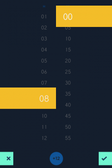
Peek can automatically pull in events from your existing calendar, and it lets you add items too. Peek is all about the swipes and pulls, with little clicks and subtle sounds (these can be turned off) providing feedback for your actions. A long-hold on a specific day lets you add an event, including start time, duration, reminder interval and location.
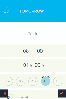
Little sliders are used to set the time, and you can set the event to recur daily, weekly, monthly or yearly.
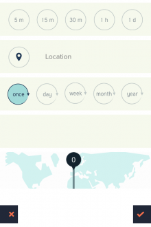
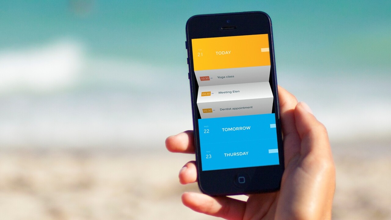
You can opt to have the calendar display no events if you like, but then to reveal each day’s schedule you simply tap the box and the events unfurl as if by magic. While only the event name and time is displayed by default, a swipe to the right reveals the location too.
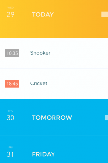
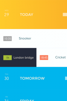
As noted already, it’s the little navigational animates and transitions that really elevate Peek to the next level, as you can see here – things don’t just open and close, they fold, unfurl and generally dazzle.


Over and above the Clear-esque look-and-feel, Peek follows a basic design mantra – keep it simple. This won’t necessarily appeal to uber-busy folk who demand automation. Peek is all about giving you access to your schedule at a glance.
“Apps like Clear proved that simple tools that don’t try to do too much can sometimes be more useful,” explains Amid Moradganjeh, one of the developers behind Peek. “This is mainly the case for the group of people that are not necessarily that busy, and therefore, don’t need an app that thinks for them. We designed Peek for this group of people that simply need to manage time on the go without being overloaded by unnecessary information and features. Peek is not meant to be the primary calendar for power users.”
Peek is available to download from the App Store now, costing $1.99 or your local currency equivalent.
Get the TNW newsletter
Get the most important tech news in your inbox each week.


