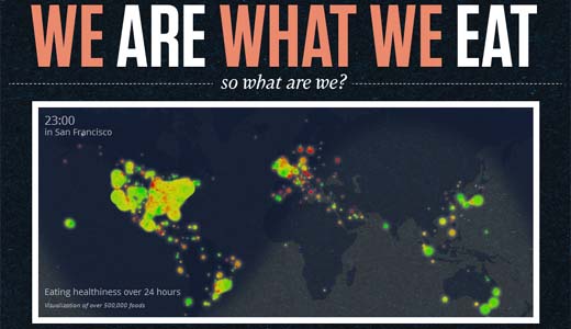
![Eating habits visualized by Massive Health. You are what, when and where you eat [Infographic]](https://img-cdn.tnwcdn.com/image?fit=1280%2C720&url=https%3A%2F%2Fcdn0.tnwcdn.com%2Fwp-content%2Fblogs.dir%2F1%2Ffiles%2F2012%2F04%2Fmassivehealth660.jpg&signature=d1ac6185b7be2091c677681cc4311996)
Massive Health, the firm that hopes to change the way we look after ourselves through better management and data, has released a set of infographics that illustrate the ways in which we are what we eat.
Using data collated from use of Massive Health’s habit tracking app, Eatery the visualisations describe what, where, when and why we eat what the things we do.
The data was obtained from over 7.68 million food ratings by Eatery users from more than 50 countries over 5 months. On the company website there is also a really neat interactive map showing the state of healthy eating around the world in 24 hours.

Massive Health notes that obesity and diabetes are both a growing problem in the United States. It feels that current interventions used to combat this are not working and that meaningful large-scale data should be made available so that people can make informed decisions and effective changes to their habits for better health.

Massive Health provides a ton of information around user habits and eating that could influence non-users too. The collection of user data in this way to influence health choices is an intriguing use for an app.
The company has seen some pretty big changes lately, Massive Health’s co-founder and CEO, Sutha Kamal, has left and will be succeeded by co-founder, and user interface expert, Aza Raskin.
Raskin and Kamal say the departure is primarily a result of different and conflicting visions for the company and it seems that the firm is continuing to transform healthcare without too much disruption.
There are four more revealing visualisations on the Massive Health website. It’s interesting to take a look and see if there are habits that we could all consider changing and how data makes these choices so much clearer.
Get the TNW newsletter
Get the most important tech news in your inbox each week.


