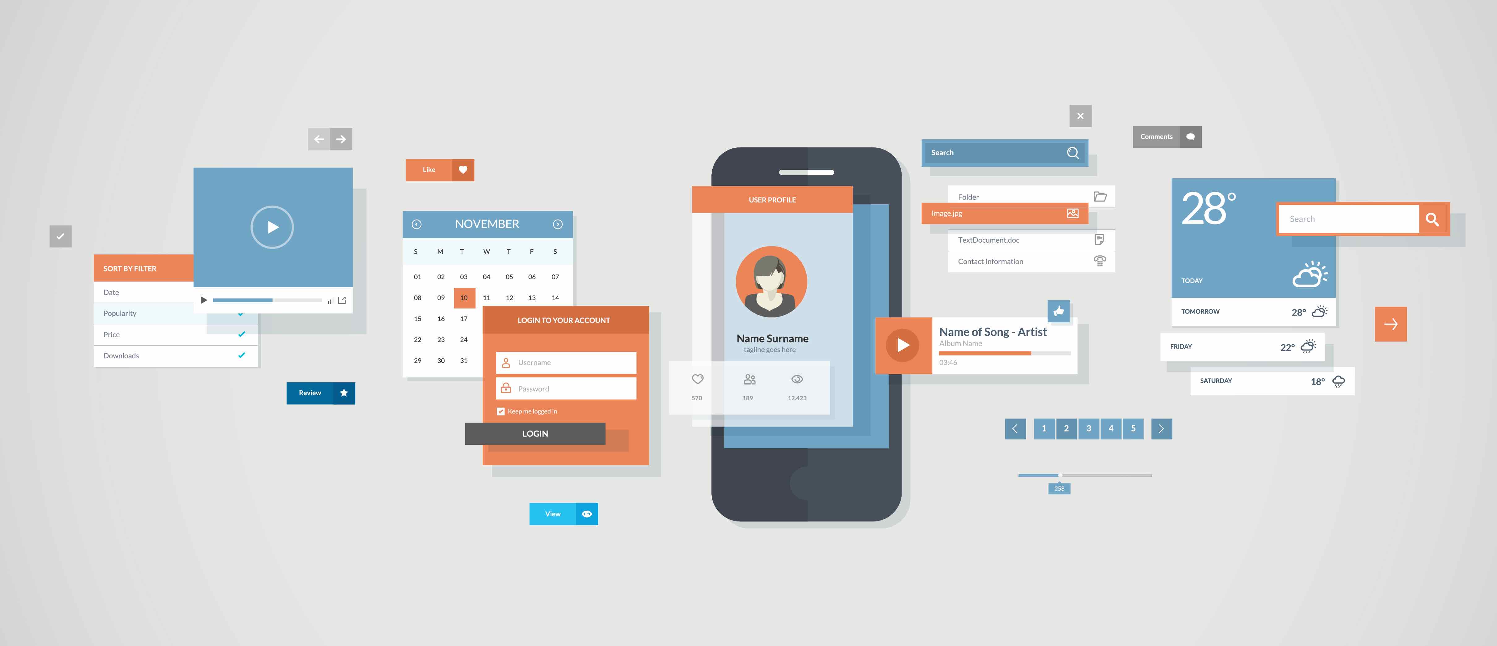
A recent bit of commentary from Macworld posits that Google’s use of Material Design on iOS is a mistake. Another site piled on, going so far as to call it “dumb” and “rude.”
The main takeaway is that design can be divisive, and is always subjective. Material Design is no different, but there needs to be a lot of chill on this one.

I don’t need to like it
So, here’s some personal insight: I fucking hate Material Design. I think it’s too reliant on dumbed-down, wannabe ‘clever’ animations and feigned shadowing. It tries way too hard to look like it’s not digital (Google’s design lead Matias Duarte notes Material Design’s creation had a lot of paper cut-outs at inception to help designers understand its ‘real world’ feel), but it is.
Material Design wants to make you feel as though you’re touching something tangible, but you’re not. You. Are. Tapping. A. Screen.
I don’t care to have a button spin and slide away when I press it, and I don’t need a clever spring-to-life page pop-up. So, no, I don’t like Material Design. I hope that’s very clear.

Don’t drink the ‘haterade’
I will, however, defend Google’s right to use it as they please. Macworld points out that Google’s widespread use of Material Design across platforms is akin to Microsoft in the 90’s, and that’s fair, but it didn’t end there.
Microsoft is still committed to its square design (which I’m also not fond of, and have now realized I’m some sort of design-snob wolf in developer’s sheepish wool), but nobody seems concerned about that. Instead, we laud it for making its apps and services available across platforms.
The convenient trope is ‘if you don’t like it, don’t use it,’ but Google is hard to avoid. I do for the most part, though; I use DuckDuckGo for search, and have eschewed just about all Google-y apps for iOS. There are many reasons for that, and design is definitely part of it.
But many can’t — or won’t — move away from Google. That should tell us that while design is fundamentally important, it takes a backseat to experience, and Google does a great job there.
I do think we should be celebrating diversity in design, even if we don’t like it. The rare times I have to dig into my Google Drive folder (it’s literally my lone holdout; damn you, cloud storage!), I’m reminded just how much i dislike Material Design.
As for the narrative that Google is trying to give iOS users a ‘sneak peak’ of Android — that’s just laughable. Design isn’t likely to make anyone switch platforms. Gotta love the sensationalism, though.

Be fair
The opposite point can be made for Apple. Material Design was built with the Web in mind, so should the iCloud Web client use Material Design? Hell no.
It’s a slippery slope. If we’re asking Google to adhere to Apple’s design philosophy for native apps, are we also going to ask Fantastical to look and act more like Apple’s (terrible) stock calendar? Should PCalc be more like Apple’s (boring) calculator, or your favorite note-taking app more like — well, Notes? (which is awesome, so yes?)
The orginal argument makes Material Design about platforms, but it’s not. Google designed it to be used anywhere and everywhere because it’s 2016 and platforms aren’t as important. The Android vs. iOS debate is tired, and we should stop entertaining it. I doubt Apple cares how many Apple Music users are on Android versus iOS; Google is also a company of services, not a single platform. the same is now true for Microsoft.
There’s something to be said for using platform-specific tools, but even that’s a grey area. Unless Google did something like completely disable the share sheet on iOS, I don’t see much harm.
Material Design is a shitshow, but it’s Google’s shitshow. I don’t have to stop and look (unless it’s Drive; stupid easy-to-use cloud storage). I think a lot of what Apple does with design sucks too, and developers like to bitch and moan about how Apple makes it hard to paint outside the lines in Xcode.
And shouldn’t we be celebrating diversity on iOS, which has suffered through that type assimilation for a long time?
We say ‘damn Google for Material Design,’ then complain about Apple making it difficult to stray too far from center when it comes to making apps. Maybe we should stop complaining so much on the internet (now that’s laughable).
Be fair, be objective, and chill out. Also, try Pages or iCloud Drive on iOS. Complaints about Material Design seems downright trite when you attempt to use Apple’s services on mobile. At least Google nailed UX, even if its UI is terrible.
Get the TNW newsletter
Get the most important tech news in your inbox each week.


