In our Apps of the Year series, The Next Web team shares personal recommendations for our favorite apps of 2015.
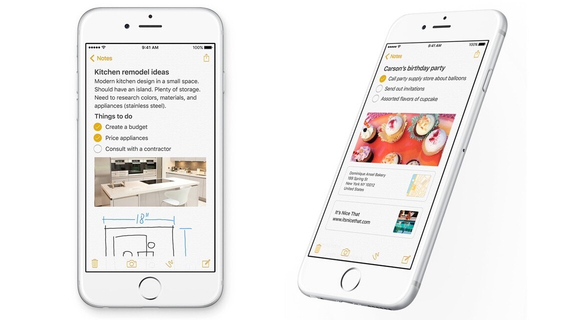
Pen and paper aren’t dead, but you’re likely closer to a phone, tablet or computer than you are something to scribble on. That’s why the new Apple Notes app is so awesome.
In reintroducing Notes, Apple tackled a boilerplate need for users; somewhere to keep their thoughts organized, no matter where they went. Our thoughts go beyond static text; we think about images and links to webpages, too.
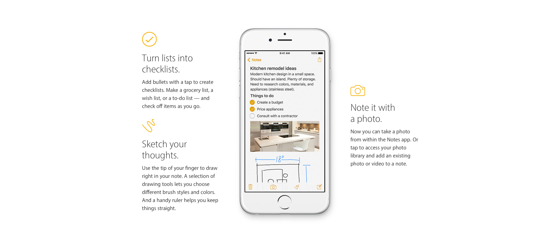
Addressing core needs is what iOS has always been good at. That makes Notes a great mobile app, but it’s equally good on the desktop, maybe better. While I love the ability to sketch an idea on mobile (take that, confusing trips to IKEA!), the desktop is much faster for making longer lists or handling larger tasks.

For me, note taking apps have always sucked. I’ve tried tons of them, too. All the way from Evernote to Day One, each had some niggle I couldn’t ignore, making it unusable or at least not pleasurable.
Apple Notes does exactly what I want and need it to, every time. I can even view attachments in a separate view, and make bulleted or check-off lists. The clean, no-nonsense interface is not going to win any design awards, but neither will a blank sheet of paper.
Notes may not have blown minds when Apple announced it at WWDC, but it’s given me a central place to cobble all of my thoughts and findings from around the Web together, which happens to be accessible from anywhere via my various devices.
Somehow, Apple achieved what nobody else seemed capable of when it comes to note-taking apps: simplicity.
Get the TNW newsletter
Get the most important tech news in your inbox each week.


