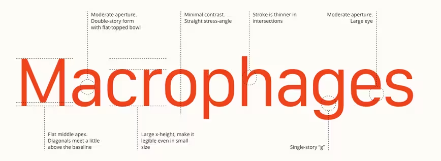
If you’re a fan of fonts and getting into the detail of what makes different typefaces work (or not), here’s a great project: Designer Wenting Zhang’s Type Detail is dedicated to dissecting a different font every day.
His latest analysis focuses on Apple’s new favorite font, San Francisco:
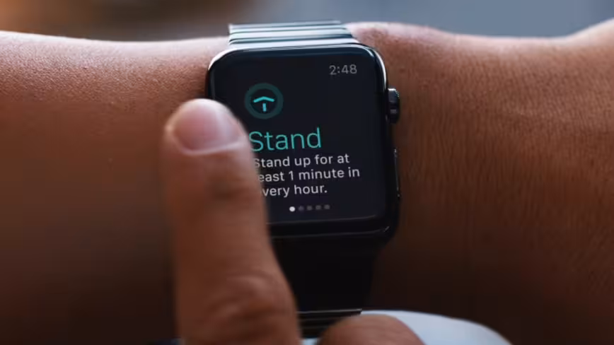
The typeface was designed for the Apple Watch but soon made its way onto the new MacBook with signs that it’ll soon colonise all of iOS and OS X.
Zhang says Type Detail is inspired by Stephen Coles’ book The Anatomy of Type. It’s beautifully executed and if you’re fascinated by fonts, it’s definitely worth adding to your daily bookmarks.

The 💜 of EU tech
The latest rumblings from the EU tech scene, a story from our wise ol' founder Boris, and some questionable AI art. It's free, every week, in your inbox. Sign up now!
Read next: The science behind fonts and how they make you feel
Get the TNW newsletter
Get the most important tech news in your inbox each week.