There are a lot of things that you can say about the reaction to Apple’s next version of iOS, its software for iPhones and iPads. It’s new, it’s very, very different and it’s a dramatic departure from the way Apple has approached the design of iOS over the last five years.
Over and above any superlative or derogate reference you’d like to use: it’s new. Whether that newness is a result of reaction to the market, pre-emptive defense against future competitors or re-invention, the fact remains that new is powerful.
First things first: iOS 7 is young. In look, in feel and in its dismissal of physical metaphor — iOS 7 is made for the next generation of Apple customers. I like to say that it feels younger, lighter and brighter, and those traits work on several levels from the color palette of the icons to the lighter weight text.

The <3 of EU tech
The latest rumblings from the EU tech scene, a story from our wise ol' founder Boris, and some questionable AI art. It's free, every week, in your inbox. Sign up now!
Remember, the next billion customers that Apple has to sell to were around 6 or 7 when the iPhone was introduced. They quite literally have no idea what the world was like without it.
Now, they’re 14 or 15 or 16 and looking for something that doesn’t feel as static, as heavy, as old. iOS 7 looks at home when paired with the iPod touch colors already, but there are even more opportunities to make their play for the younger crowd.
A new iPhone operating system based on motion and context will also encourage developers to create apps which break out of the static screen-by-screen navigation that has dominated all smartphones since 2007 as well. Those interfaces may look sparer in static shots, but will come alive when touched and manipulated.
Part of this has to do with the fact that the iPhone is moving beyond the concept of an ‘information appliance’, something I wrote about last month:
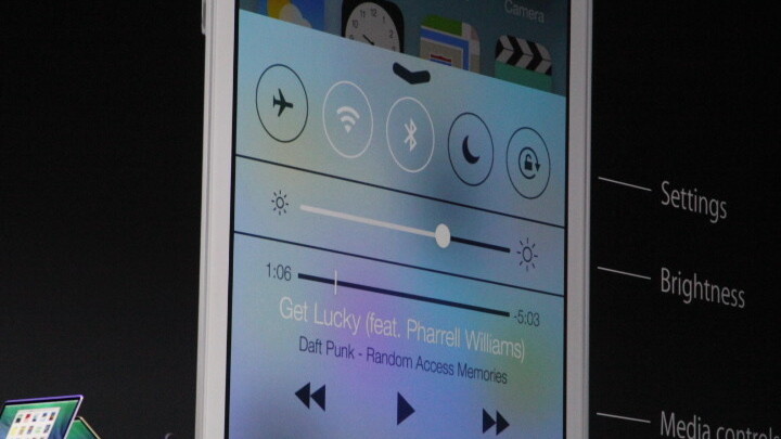
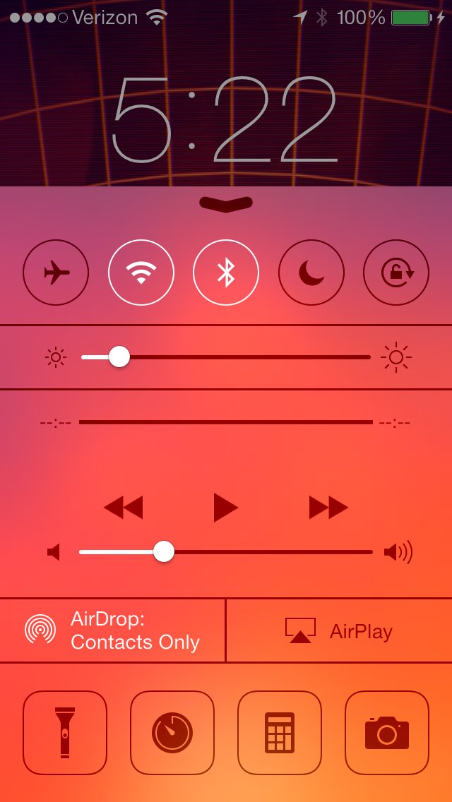
Instead of a rigid ‘gadget-like’ interface with button allegories and opaque panes that convert the device into a new object, there is a series of translucencies and live animation effects that provide the user with a sense that there is more to it than what they’re doing ‘right now.’
This change is a reflection of the fact that there are 600 million devices out in the world, but there are billions yet to be sold — and most of those will be sold to a future generation that has come of age in the era of touch computing. The allegory of a ‘transformation’ into a physical device has had its day, and now we’re ready for a more complex diet.
The translucency of iOS 7 also adds some interesting wrinkles when it comes to customization. Yes, it’s there to offer a sense of place and context when navigating around the more involved interface. But it also allows the elements of the interface to take on the coloration and hue of the wallpaper that a user picks. It’s exactly the way I’d imagine ‘themes’ or ‘skins’ would be interpreted through the eyes of a company that believes in making the hardest choices for its users. Giving up control of the look and feel and color palette of iOS entirely was never going to happen. Skinning has always been one of the major draws of jailbreaking, and will always remain the provenance of jailbreakers.
But customization, personalization, individuality are still incredibly important to the demographic Apple needs to continue to tap into. Apple did a wonderful thing by democratizing technologies so efficiently that the richest man in the world can’t buy a better phone than you and I. But that also flattened the effective choices. Now it’s down to two colors of shell and wallpapers.
iOS 7 opens that back up, allowing its translucent panes to take on a bright red hue or the purples and blues of stained glass, all depending on how a user wants to wallpaper their device.
And don’t think that it’s a coincidence that Apple’s new color palette seems perfectly suited for a series of less expensive iPhones with plastic shells, because it’s not. When (and if, I suppose) those devices make an appearance, they’re going to go over gangbusters, and iOS 7 is going to feel right at home on them. And those next billion customers are going to love them.
As I reported several weeks ago, Apple’s head of Human Interface Jony Ive brought in members of its marketing and communications team to work on icons and design elements. This was done, I believe, to encourage a break with the thinking of the past, to invent a language that will work for Apple’s future. Eggs have been broken, but an omelet is being made. Yes, some user experience ‘best practices’ have been violated — and trust me, my eyebrow is just as high as yours over some of these choices — but Apple has a history of ‘overshooting’ its mark on big design changes and then figured out the best places to nip and tuck.
And overshooting is the best thing Apple could have done if iOS 7 is their plan for the next 5 years.
I don’t know, but I’m convinced that this philosophical break was one that ex-Apple SVP Scott Forstall was unwilling to make. Forstall was anything but incompetent, so it wasn’t that. Instead, I think that his department was entrenched in the hyper-real design aesthetic that got iOS where it was — and brought a lot of delight along with it — and was unwilling or unable to crack the new look that Ive wanted.
In my report, I also noted that the version of iOS being shown on stages was already newer than the version that developers were being given, which had been locked weeks before. Apple is iterating iOS 7 rapidly, and the changes are already far more aggressive than they have been over any beta period in the last 4 years. I can’t remember the last time that a system font was tweaked whole-sale, for instance, and some developers have told us that some APIs introduced with iOS 7 beta 1 have already been deprecated. iOS 7 is in flux, and a lot of the changes have been for the better so far. It may be iOS 8 before we see some real maturity seep into the bones of iOS, but it will come.
But, don’t expect those changes to include the color palette, the focus on simpler, brighter iconography and the general appeal towards the first touch-native generation.
But iOS 7 doesn’t stop at just being better for the next generation of iPhone customers. Its new borderless, edge-to-edge look is also far more flexible for a variety of device sizes. Not in a haphazard ‘one-size-fits-all’ kind of way, like Android. But if Apple carefully and conscientiously expands device support for iOS and its developer community, it has the perfect OS to expand across phones, tablets, the television and yes, even small wearable devices.
For reasons that have crystalized as I’ve spent some time with Google Glass, I feel that Apple’s first foray into a wearable device will come on the wrist. And the simpler, bolder icons and text-based interface makes a lot more sense for a small device that relies puts a priority on visibility and screen real-estate.
You know, for the kids.
Get the TNW newsletter
Get the most important tech news in your inbox each week.