Earlier today we brought you a review of Clear, the first app from fresh development studio Impending.
Clear is the first app from fresh development studio Impending, founded by tap tap tap partner Phill Ryu and David Lanham of the Iconfactory, in partnership with Milen Dzhumerov, and the hugely talented folks at Realmac Software, who made the lovely Analog.
We had a chance to speak with Ryu about the app, how he got started in the development business and what he thinks that the future of application interaction will be.
TNW: What company were you with previously and what are you doing now?
Phill: I’ve always been doing my own things. A few years ago I teamed up with a couple friends to create MacHeist, an indie software bundling event that blew up in a pre-App Store world.
MacHeist was an interesting exercise in selling and promoting quality software, but it was always other people’s apps, so it got pretty boring over the years. Making our own apps is way more fun!
More recently I’ve been working on iPhone apps at tap tap tap with the same friends and business partners, but David and I have our own agenda we want to pursue at Impending, our new studio.
TNW: To delve a bit deeper into ‘pre-history’, how did you get started in the app development business? How people get from there to here is a subject that we’re highly interested in here. Everyone is interested in ‘what have you done today’, which we’ll get to. But I think it’s worth exploring the paths that people take to working in this field.
Phill: When I was a kid in middle school, my dad decided to pick up Cocoa to help with his simulations at work. (He’s a research physicist.) So that summer we worked on a couple apps together, sitting side by side. I cooked up some crude graphics for ping pong paddles and the like.
Back then OS X was brand new, and there were pretty much no apps out there for it. So when we put out this donationware Pong clone it got disproportionate attention. I remember it was even shown on TechTV’s The Screensavers and I still remember Leo Laporte’s kind of confused look of derision when he saw how simplistic the game was. (He was a PC guy back then I think.)
My dad and I worked on a couple more apps together, but eventually he got busy with actual work, and dropped the side projects as they started eating up his time. I was obviously really upset. I kept on getting into fights with him over cleaning up the interface and adding useful features, but in the context of a hobby project to learn programming, these things struck him as a waste of time. So after yelling over toolbar icons for the nth time one night he fired me, and I started looking for other things to do.
I ended up starting a community site for fellow GUI customization nerds, kind of like grease monkeys but UI, called MacThemes. I hung around there a lot, made a lot of designer friends. And of course I started bubbling up with random ideas for projects and products to design with them.
MacThemes was an amazing, creatively stimulating community to grow up in. But I think I started really getting into product and app design when I became obsessed with developer Adam Iser’s chat client, Adium.
TNW: Adium has long been one of our favorite apps, it still gets bug fixes but hasn’t had a major update in a while.
Phill: Back then, there was no iChat. Chatting applications were shit, the official AIM app was a piece of shit, still is. I tried this app called Adium. It had multiple tabs for different conversations. It was genius. I found the developer’s screenname and started chatting with him everyday.
He was in the process at the time of rewriting the entire app, and starting over from scratch. Adium 2 would be entirely plug-in based and designed to scale to fit its users needs and whims. Everyday he would be working on re-imagining a new piece of the app, and we would pick through usability issues and perks, and the pros and cons of various approaches, or going Aqua vs. brushed metal. And then blow off some steam sometimes with matches of Warcraft 3. It was just awesome.
So I think at this point I was just completely addicted, bitten by this bug of working on products used and beloved by tons of users. And around then Tiger was announced with the Dashboard.
Something about the Dashboard completely lit me up. I think I was a freshman in college at the time? But the idea of this brand new platform for a new class of app, completely clear of entrenched competition, rules and guidelines, etc. was unbelievably exciting to me, and I convinced a bunch of friends to get together to produce quality widgets for it, which we would sell for a price.
TNW: So the excitement of a new platform was what jump started you here.
Phill: Yeah, there was that frontier spirit, the feel that anything was possible.
So we made some beautiful widgets. Panic even called us up before we released them, interested in maybe buying them out. We went ahead on our own, and I think our best moment was having our VoiceNotes widget featured for a full day on the Apple.com frontpage.
Of course, the Dashboard never ended up blowing up to the degree I had hoped. And I don’t think almost anyone ever bought widgets. But, if anything, it was a nice practice run for the real thing to come in a few years. I could go on, much of my life has been driven by this unquenchable thirst to produce awesome apps and products. Curiously though, the talented group of designers I worked with on those widgets… we’re all still working together today.
TNW: So lets jump past MacHeist, I’m assuming it was the same desire to make good apps and that ‘new territory’ vibe that made you want to pounce on iPhone apps?
Phill: Yeah, my friend and developer Andrew Kaz and I were working on a cool Mac app at the time called “Rock Show”. I can’t go into detail with that but it was a pretty cool project. But then the App Store came out for iPhone and we needed to get in on that.
So I was playing around with my new Kindle I had just gotten that day, and I was like “Kaz, this thing feels like a piece of shit. We can do this so much better.” And we spent the next 3 months making [Classics for iphone].
I know it’s commonplace now, but a touch-responsive page flip, following your finger…when we first prototyped it, I sat there stroking the screen for hours.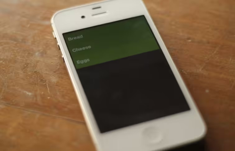
And that’s the awesome part about technology, suddenly you have this new amazing touch input that’s in everyone’s pocket
and you can latch onto that and create completely novel experiences. I don’t know, there is somethiing just magical about that.
TNW: So your first instinct was to utilize the natural UI in a way that felt different. Not just emulating physical buttons, but translating touch.
Phill: Buttons are about the most unsatisfying interaction you can have in a touchscreen device. Just think about it. At least when you’re using a mouse, you click a button, and you’re clicking a button. When you’re using a phone you are smudging glass, and there is absolutely zero feedback.
I think when you have a new platform with all kinds of new possibilities, you are really doing yourself a disservice by not exploring these new paths and sticking to worn grooves you’re familiar with.
TNW: Like emulating physical buttons
Phill: Yes, I’m not saying there’s no place for them in mobile app design, but you are designing for the past if you can only think in buttons.
TNW: And that’s the kind of mentality that went into the design of Clear?
Phill: Yeah. The very first mockups started with more traditional and expected features and UI elements. It had a header bar, it had an add button, it had recurring features and lots of other things.
TNW: And those were stripped away over a series of discussions? Or was it more of a breakthrough moment where it all went away?
Phill: I think pretty much in our first chat, I was harassing Dan to remove things. That we don’t need almost -any- of this. And we kind of consciously wiped the slate clean, and started over, to free ourselves of unnecessary constraints. If I remember correctly most of it happened in the initial chat. I wanted no header bar, no ‘+’ button, no UI chrome. I was convinced we could do all of this better, starting with this idea of pinching to insert.
Of course the hard work came after, I think we wrote a 2000 page novel over email, figuring out the nuances of how all these brand new interactions would work.
TNW: Yeah, that ‘pinch apart to insert’ action is probably the most memorable gesture of the app, a real eye opener when you try it for the first time.
Phill: You know, you were the very first person outside of the Clear team to see it. When we got coffee that day, that alpha build, it was literally the first alpha build in my hands. All it had was pinch to insert, and it sort of reduced you to a giddy schoolgirl [ed. Sadly true]. That was definitely the moment where I knew were on the right path.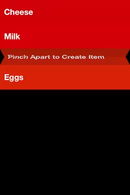
TNW: Haha yeah, memorable first impressions aren’t easy to make on me either, I’ve seen a lot of apps.
Phill: Yeah, I think it’s because it’s so blindingly obvious, yet we’ve all seen 10,000 list-view apps without it. And that is kind of shocking and delightful, when something so obvious and right in retrospect is finally put into place. We intuitively get that I think.
TNW: Right, it’s what I call the “of course” moment. Where you accept a new feature as if it was inevitable.
Phill: Yeah. I mean hell, it can even be a bit frustrating sometimes. When you create something that ‘of course’, it tends to result in a lot of people cloning it. Because, how else would you design it better? And a lot of users will never comprehend the hard work put into something that looks and feels so simple and effortless. But at the end of the day, simple and obvious is pretty much always the way to go.
TNW: There are situations that arise where those features get copied, Tweetie’s pull to refresh is one that easily jumps to mind, but it just means that it was so absolutely right in the first place.
Phill: Yeah, and I think that is great. I’m actually really looking forward to some of our interactions spreading across other great apps, and I’m sure Loren [Brichter, the developer behind Tweetie] is proud of his contribution to the ecosystem, and how widely adopted it’s become.
TNW: Do you think that natural UI, specifically the stripped down kind that is on display in Clear, is the next step for apps as we let go of this ‘button’ obsession and move into a new generation of people who are so used to touch screens that it feels like second nature? The way that a small child can use an iPad for a few minutes and grasp it right away. That natural interaction.
Phill: Totally. I think what makes that possible, as opposed to a 2 year old mousing around, is it removes layers of abstraction. Pushing an object around on a touch screen, is direct manipulation, and completely intuitive. And for sure, that 2 year old kid is going to grow up comfortable with more gesture based interactions and less comfortable with concepts like hotkeys and right clicking.
Personally though I hope we have mind control input or at the least eye-tracking iGlasses in 10 years.
TNW: One step at a time I suppose!
Phill: [Laughs] Yeah I tend to think of Apple’s R&D labs as a sort of Willy Wonka factory of fantastical things
TNW: So is using the touch screens, and other sensors, of iOS devices something that Impending will focus on as it gets rolling?
Phill: To us it’s just a part of doing this correctly, and designing for the platform, so I’m not sure if I can call it a focus. We just have an optimistic vision of the future here at Impending, and we’re trying to pluck some of these apps from there and ship them in the present. That may include some nice jumps ahead in UI design too, after all things generally trend better in the future.
TNW: So to wrap up, is there anything you can tell me about what we should expect from Impending in the future?
Phill: Well you saw the other app we’ve been working on for the past year and a half! But we’re not quite ready to share details on that yet, so I’ll say more news is Impending. Gotta focus on Clear and the present for now.
If you haven’t had a chance to check out Clear, we highly suggest you do so. And if you’re not sold, feel free to check out our review here.
Get the TNW newsletter
Get the most important tech news in your inbox each week.

