Apple’s OS X 10.7 ‘Lion’ operating system has been released to the world today. With OS X Lion, Apple is releasing the first desktop OS to be heavily influenced by a Mobile OS. Apple’s iOS devices, now numbering some 221 million, are a runaway success, impressing casual users with their simplicity and ease of use, as well as technically savvy users with their attention to detail and breadth of software support.
When early details about OS X Lion first started appearing, many began asking questions about just how much of iOS would end up in OS X Lion, now that the Mac was no longer the flagship Apple product, having been usurped by its palm-sized cousin, the iPhone. This question becomes all the more poignant now that the iPad has surpassed the Mac in sales, becoming the second biggest selling product that the company offers. This began discussions about whether Apple would use iOS as a jumping off point to abandon the Mac entirely. There were camps that claimed that features coming from iOS couldn’t possibly mesh with the Mac and that we were instead heading for a gradual assimilation, starting with OS X Lion.
If we’re going to get any answers, we have to first break down this new offering to take a look at some of its key facets. Does the heart of OS X still reflect the light of Apple’s long-lived gamechanging desktop? Or does this freshly polished gemstone mark the center piece of Apple’s new crown jewel, a post-PC and Mac free line of iOS powered computers?
You say Mac OS X Lion, I say OS X Lion
Throughout the history of OS X Lion, Apple has been referring to it by both ‘OS X Lion’ and ‘Mac OS X Lion’, seemingly at random. The banners at WWDC dropped the ‘Mac’ from the title, but the subsequent Developer Preview release listed the full name with the Mac added back in. It’s all a bit frustrating for a technical writer, to be honest.
So, to that end, I’m making an executive decision to refer to it as OS X Lion for the duration of this review. I’m making this decision based off of the fac that, as of now, Apple is referring to OS X Lion as, well, OS X Lion on its site. So there it is.
Installation
If you work with computers regularly or have been downloading and installing apps to iPhones and iPads, then you’ve known for some time that the future of content delivery is digital-only. It’s an inevitability that has been slowed only by the size and ubiquity of the pipes that deliver our content to us. But now that broadband penetration is reaching the point of saturation, its possible to get pretty much any movies, music or software we want without buying a physical product.
That’s why Apple’s decision to make the delivery of OS X Lion available only by download from the Mac App Store shouldn’t come as too much of a shock. Apple serves up millions of gigabytes of data a year to iPhones, iPads, and now Macs, already, why wouldn’t it step up to the next level and find a way to deliver its next OS as a digital download?
Now that Apple has the Mac App Store, it even has a distribution channel for the Mac to call its own. Instead of offering OS X Lion separately from the website, it can ensure ease of delivery and install, as well as the security blanket of an officially approved digital download store for consumers to turn to. It’s possible that something like the digital-only delivery of OS X Lion could have been attempted before the Mac App Store, but the adoption rates would surely have been much lower than they will be with it. Microsoft did the download thing with Windows 7 of course, but there was always a retail box for a wary customer to cuddle up to if they couldn’t bring themselves to grab a file.
Compatibility and preparation
OS X Lion is compatible with any Macs that use an Intel Core 2 Duo processor or newer. This means that any Macs purchased since late 2006 should be fine, but some older Macs might not be compatible. Make sure to check your processor to see if it is a Core 2 Duo, i3, i5, i7 or Xeon powered machine. To do this, click on the Apple in the upper-left corner of your menu bar and choose About This Mac. You’ll see what processor is running your machine in the pane there.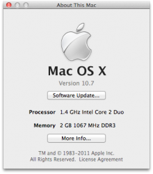
In addition to the processor, you’ll see the amount of RAM that your Mac has installed. This needs to be at least 2GB to install and run OS X Lion properly, although 4GB is recommended to run it properly. That being said, you can see by the screenshot above that my MacBook Air only has 2GB installed and runs OS X Lion very smoothly for the most part.
Aside from a minimum of a Core 2 Duo and at least 2GB of RAM, your Mac needs to be running at least Mac OS X 10.6.6 or newer, although Apple recommends that you upgrade to Mac OS X 10.6.8 for the latest compatibility fixes for OS X Lion installation.
Stop reading and back up your Mac
If you’re in the process of getting ready to install OS X Lion and you’re reading this article to get an opinion on it, then stop reading this and start backing up your Mac. You can let it back up while you read the rest. If you’re just reading this for the heck of it and have no interest in installing OS X Lion, and you still don’t have a backup, stop reading and go back up your Mac. If you have backed up your Mac then you can continue.
I cannot stress enough how important it is to regularly back up your Mac. At least with the Time Machine backup utility that comes pre-installed on every Mac, or better yet with a hard drive cloning utility like Super Duper. If you have a hard drive backed up with Super Duper, you can be back up and running on your Mac within minutes, rather than the hours it might take to restore backed up data from a Time Machine archive. Not only is it completely free to use the cloning features of Super Duper, it’s incredibly simple to set up and use. I highly recommend checking it out. Better yet, use it alongside Time Machine to get the best of both worlds, quick access to your files and a complete clone of your hard drive for catastrophic failures.
Once you’re comfortable that you have a complete copy of all of the data that is important to you outside of the Mac that you’re installing OS X Lion to, then please move on with the process of installing, but not before.
Preventative maintenance
These steps are simple preventative measures that you should take before upgrading any operating system installation. Although I found the upgrade of OS X Lion from Mac OS X Snow Leopard to be a simple, clean procedure on a relatively new Mac, there are dozens of variables that could mean trouble on your machine. A couple of things can help to prevent this.
First, turn off any encryption software that you have protecting all or part of your hard drive. This includes the built-in File Vault utility that comes pre-installed in Mac OS X Snow Leopard. OS X Lion uses a new version of the utility called File Vault 2 that works significantly differently, so it would behoove you to turn it off and back on once you’ve made the switch.
Next, you should launch the Disk Utility application installed on your Mac, select the drive that you’ll be installing OS X Lion to and select the First Aid tab. Click on Verify and wait for the results. If you find any errors, use your Mac OS X Snow Leopard install disk to repair the problems by dropping it into your CD drive, holding down the Option key while you restart and using Disk Utility from the Utilities menu to perform the First Aid operation. If you’re using a MacBook Air, use your provided install USB drive in the same manner.
Application compatibility
The biggest hurdle for upgraders is probably going to be application incompatibility with OS X Lion. There are three types of apps that you’re going to need to investigate before you make the switch. Applications that you’ve installed from the Mac App Store, applications that you’ve downloaded recently and legacy apps that you’ve been using for a very long time that just aren’t going to make the jump.
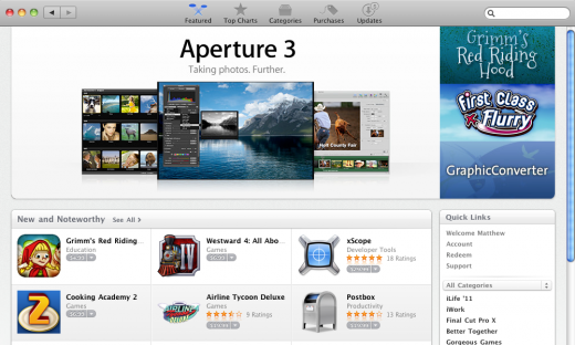
If you’ve purchased an app from the Mac App Store, then you’ll probably be ok to upgrade after opening the store and checking the Updates section to make sure all of your apps are up to date. Apple has sent out an invitation to developers to submit OS X Lion compatible versions of their apps, so they should be showing up soon if they’re not there already. If you purchased your apps outside of the Mac App Store, from a developer’s website for instance, or on a CD, then you should check Software Update, which can be found under the Apple in your menu bar, to see if there are compatibility updates available for it.
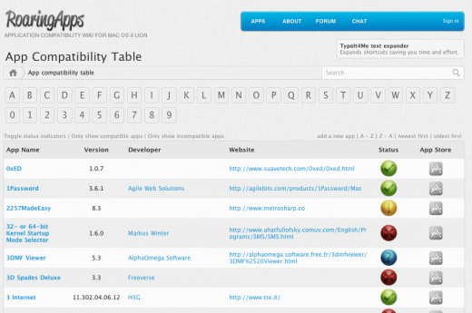
If you need to do a manual check on your apps to see if they are already compatible with OS X Lion or they have been updated previously, use the excellent Roaring Apps Wiki to search for all of your critical, most-used apps to ensure that they do work on OS X Lion. If they don’t, check the app’s website to see if the developers are going to update it for OS X Lion or have an update on the way.
The last type of app is the kind that OS X Lion will never support, the kind that still uses the older Rosetta translation software to allow applications written for the older PowerPC architecture to run on the new Intel-powered Macs. Apple has announced that it will no longer support Rosetta and it is not built into OS X Lion. This means that any applications that you’ve been holding onto that depend on Rosetta are now officially dead unless they are re-written for the Intel platform. To find out which of your apps fall into this category, launch System Profiler, located in you Applications/Utilities folder, scroll downwards and click on the Applications section. Then sort them by kind and seek out the ones that say ‘PowerPC’ in that column. These are the apps that will never work under OS X Lion. Try to find replacements for these or see if the developers have newer versions designed to work without the help of Rosetta.
Procedure
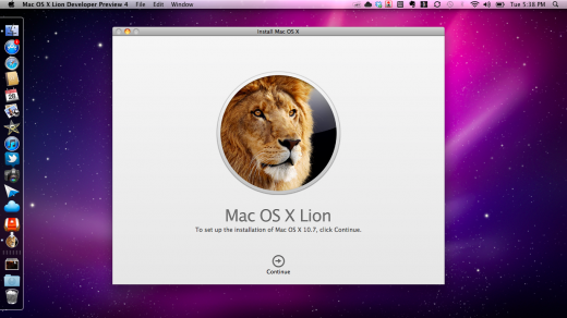
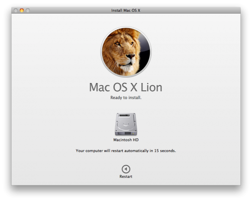
With OS X Lion, the process of downloading and installing something as major as an operating system has been refined to an art. After you make your purchase in the Mac App Store, the icon for OS X Lion drops onto the dock and displays a download progress bar. Once your download is complete your default course of action is simply to launch it. You will be presented with confirmation page, a license agreement and a choice of install destination. Once those three pages have been navigated, your installation will begin.
In my experience, the process can take as little as 15 minutes on a Macbook Pro with a Solid State Drive installed, or as much as 45 minutes on a computer with a traditional 5400 RPM drive. Apple’s onscreen estimates almost always state around 30-33 minutes at the start regardless. My late 2010 MacBook Air took around 22 minutes to finish installation and reboot. All in all, one of the quickest and easiest operating system upgrades I have ever done.
Creating and installing from a bootable USB drive or DVD
If you absolutely can’t stand the idea of installing directly from an application on the dock, or you would like the safety net of a bootable USB thumb-drive that you can use to install OS X Lion on any computer, the process is mercifully simple. Just follow this procedure to make yourself an installation-ready USB drive or DVD.
- You will need to locate the OS X Lion installation package on your Mac. The easiest way to do this is to Option + click its icon on your dock and choose Options>Show in Finder.
- Once you’ve located the package, Option + click it and choose Show Package Contents.
- Open the folder titled ‘SharedSupport’ and find a file called ‘InstallESD.dmg’. This file contains everything you need to boot up a computer and install OS X Lion. Drag this file out to your desktop or another easy to find location.
- At this point, if you just want to make a DVD, open up Disk Utility on your Mac, find this image in the list on the left, Option + Click on it and click ‘Burn’. You’ll have a bootable DVD.
- Now prepare a USB thumb drive at least 8GB in size by opening up the Disk Utility application on your Mac, plugging it in and choosing to Partition it in a 1 Partition scheme. Note that this process will erase your thumb drive, so make sure you’ve backed it up.
- Highlight the single partition and use the pull-down menu to select ‘GUID Partition Table’ as the type and click ok.
- Name the USB drive anything that you would like, make sure that the Format option is set to ‘Mac OS X Extended (Journaled) and click the Apply button.
- Now, click on your new partition and click on the Restore tab at the top right. In the Source section, click on Image and choose the ‘InstallESD.dmg’ file from step 3.
- Make sure that the Destination field displays the name of your USB drive and click Restore. You will be prompted to enter the password for your Administrator account. Once you’ve done so the copying process will begin.
- Once the process is complete, you can verify the bootable status of your drive by selecting it and clicking Info in Disk Utility. Bootable status should show ‘Yes’.
Now that you have a bootable USB drive (or DVD) that contains OS X Lion, you can boot from it by plugging it in to any Mac and holding down the Option key while its booting. Once the screen appears that asks you which volume to boot from, choose the bootable OS X Lion drive. This will enable you to install OS X Lion on any compatible Mac without using the standard upgrade procedure. If you’re the kind of user who likes to perform a clean install instead of an upgrade, this is a great option for you.
In general, I like to perform a completely fresh installation of OS X every 4-5 years if I haven’t changed machines in that time. If you’re still running on an install of OS X that is older than 4 years or so, read this excellent answer by Ryan Block to the question of whether Macs stuffer from ‘rot’, a condition that affects the speed and performance of machines with years of built up digital ‘plaque’.
Thoughts on installing OS X Lion
If you went back in time trying to find a version of me that didn’t believe that we were going to be getting our operating systems installed over-the-air, you’d have to travel back a ways. Call me optimistic, but the way that OS X Lion installs is the way that I always thought it should work. Simple, effective and painless, and all without a disc of any sort.
That future felt inevitable even to me, a self-confessed computer nerd who ran both Mac and PC machines and custom-built the latter by hand starting back when monitors only had one color of phosphor. Green, like it or not.
The process, being a completely new concept for many people, will no doubt ruffle some feathers. Some will fall into the crop of people just used to buying a disc at the store and confused about the process, some will deny the inevitability of the process, claiming its just another way that Apple is showing its lack of concern for the ‘power user’.
But there’s going to be a far larger segment of people who will just install the thing and move on with their lives. They’ll do it because its logical, they’ll do it because it’s easy, and they’ll do it because it was inevitable. This is the segment of people that is the largest, the most willing to spend a few bucks for some cool new features and to ‘stay up to date’ and who are so busy that they would write an email thanking Apple for making the process so painless that they didn’t have to set aside a whole day to break down their machine, wipe the drives and install from scratch. Or they would if they had the time to write an email.
This is supported by the fact that, during the install process, OS X Lion actually creates a recovery partition on your drive and tucks away all of the files that it needs to boot your computer and reinstall itself directly over the Internet. This way any user can always get their Mac back to factory stock, sans disk, as long as their hard drive doesn’t go down. All you have to do to use this emergency partition is hold down the Option key while you boot up and you’ll be able to use it to diagnose issues, restore from a Time Machine backup and even reinstall OS X Lion.
If you’re having a tough time accepting that this is the way that things are going to be from now on, think about it this way. There are probably going to be thousands of people that see the OS X Lion update appear in the Mac App Store, click on it to take a look, think it sounds interesting and install it without any thought, and they’ll probably be just fine, despite having missed my review.
When is the last time you ever heard of any OS installing like that? Never. That’s the power of the Mac App Store and a company like Apple, that isn’t afraid to cut ties, regardless of the cost in the court of public opinion.
Starting to use OS X Lion
There are a host of things that are immediately and dramatically different about the way that OS X Lion looks and feels, as well as the way that it operates. If you’re a student of OS X history then you may find it helpful for me to tell you that OS X Lion falls somewhere in between the deep, hardly visible, undercurrents of code that rippled throughout Snow Leopard and the very visible addition of persistent features like Time Machine and Quicklook that were introduced in Leopard.
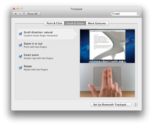
There are some 250 documented features of OS X Lion that are deemed new and interesting by Apple and many of those are visual or interaction changes that will jump right out at you at first launch. Most of them will not affect your basic day-to-day operation, but some will, and they’ll do it immediately. Not the least of which is the way that it wants to you to scroll, which is to say, backwards.
Let’s panic over scrolling for a bit
During the OS X Lion demo portion of the WWDC 2011 Keynote, Apple’s SVP of Mac Software, and Bertrand Serlet’s replacement, Craig Federighi stated that they realized through their experience with iOS that the scrolling actions of OS X weren’t ‘natural’. “We’ve been moving the portal,” he said, “not the content.” OS X Lion’s new scrolling style aims to ‘fix’ this behavior by reversing the scroll direction of content in windows and elsewhere throughout the system.
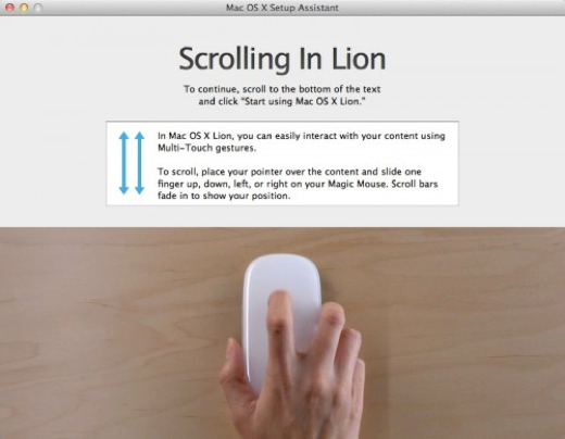
To this end, the moment that your machine starts up, you’re presented, not with the normal welcome video, which is missing, but a dialog that describes the new way that you’re going to be scrolling in OS X Lion. The dialog is customized to the type of input device that you’re using, whether it be a Magic Trackpad, Magic Mouse or a multitouch MacBook trackpad. It describes the new direction and two-fingered multitouch scrolling technique that OS X Lion uses throughout.
This decision to dump a user right out to a tutorial on the scrolling speaks to the importance that Apple places on the change of this behavior. For better or worse, Apple is committed to this new way of scrolling, popularized on iOS devices like the iPhone and iPad, which Apple sees as gateway devices for potential future Mac customers.
My advice? Just get used to it. If you use an iPad or iPhone and a trackpad of some sort then you’ve probably done it by accident a few times on a Mac already. Just let those instincts take over an you’ll be scrolling like a pro within a day or two of using OS X Lion. I’ve been using it concurrently with Snow Leopard now for some time and I can tell you that it’s the traditional scrolling that feels like it’s the odd man out these days, not the new juice. If it’s not for you, you can toggle this behavior off in System Preferences and go back to the old way of scrolling.
Along with the new scrolling behavior comes a change in the way scroll bars are displayed in Safari, Finder and most apps. The default behavior on any Mac with a touchpad is now to show no scroll bars whatsoever, and only to show when scrolling is activated. This all changes, though, when you plug a standard mouse in. The scrollbars appear in their new muted grey oblong form and remain visible as long as there is scrollable material in the window.
This means that you only get visual feedback of document position while in the act of scrolling, unless you have a mouse attached, in which case you get a visual upgrade and no scroll arrows.
Even this is evidence that Apple is transitioning its users to touch and away from the mouse. It’s been proven on their portable devices and now Apple wants to make it the default across the entire product lineup. When I spoke to Andy Hertzfeld, a lead designer on the original Mac project, and the mind behind the Circles interface of Google+, about the future of computer interaction, he said that he felt positive that this ‘natural UI’ concept would define the way that users made computers do things in the future. It looks like Apple is of the same mind.
Let’s get visual
OS X Lion has been gone over with a monochromatic brush to give it a much more unified, but colorless, feel. Different portions of the OS now feel significantly more unified, rather than disjointed parts of the system with a similar theme. To this end, a bunch of different visual changes have been made.
Both the default graphite and blue themes have been muted significantly, giving OS X Lion a serious tinge of grey to the whole thing. This isn’t necessarily a bad thing, as it helps the splashes of color that are there to stand out more easily. Color represents action areas and points of notification, so it makes some sense to have them stand out, rather than flooding the interface with different hues.
Action buttons like ‘Accept’, ‘Cancel’ and ‘Close’ have all been given a visual polish and are now much more ‘rect’ than ’round’, although they do very much still carry on the OS X tradition of those rounded-corner shapes that Steve Jobs is so obsessed with. In addition, the gradients have been adjusted to make them look a lot less like real, physical buttons. They now appear much flatter and more muted in 3D shape.
This is also true of the traffic-light close, minimize and fit buttons, which are not much smaller in OS X Lion than in Snow Leopard. If you leave the theme the default blue, these buttons retain their coloration, and their actionable clicking area, as it seems that didn’t get smaller. If you switch it over to the Graphite theme, the buttons actually lose their color altogether, and when the symbols only fade in on rollover, making them a set of small grey pearls when the mouse is not hovering.
The icons of the finder sidebar have also gotten a working over and are monochromatic as well. They’re nicely done and retain enough of the character of the older versions that they’re easily recognizable. Some of them, like the AirDrop icon, have gained a nice ‘active’ animation when clicked on.
There are also 15 new desktop backgrounds in OS X Lion including the default shot of the Andromeda galaxy that mimics the nebula of Snow Leopard.
iCal and Address Book: Skeuomorphowhat?
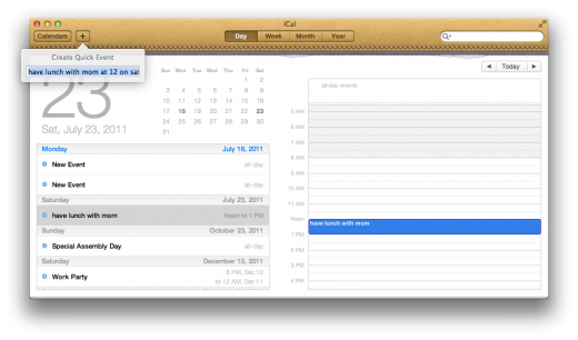
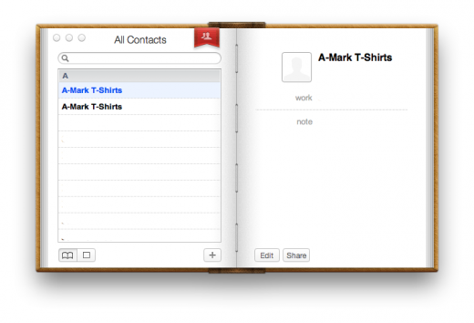
The visual changes of the finder and windows are just a part of the overall redesign though. Many of the default apps have been tweaked in appearance, including Mail, which we’ll talk about later. Aside from Mail though, the two biggest refreshes are iCal and Address Book, both of which have been given a skeuomorphic makeover. They both closely resemble physical, leather bound versions of themselves that you might find on a desk.
I’m not going to pass judgement on the design here because I think that whether you enjoy them or not is really going to be a matter of personal taste. The designs do rest heavily on the analogy to the real-world counterparts of these items though, down to the torn paper edges along the top edge of iCal and the binding staples of the Address Book. Not only that, but not all elements of the design obey the rules like to do lists and availability popups, making the design a tad neurotic.
There are some usability concerns though, as the page turning animations are distracting and relatively useless. They’re much less of a bother here than they are on the iOS versions of say, iBooks, but they’re definitely not needed. Although both applications have gotten a serious visual workover, there are only a few key additions to their functionality.
There is a new annual view in iCal, a feature that made it’s way from the iPad into OS X Lion, and a fairly solid ‘natural language’ parser under the quick event button. This means that you can type something like ‘lunch with Mom at noon on Saturday’ and iCal will automatically create an event with those specs for you. It’s a feature that we’ve seen in other applications like Fantastical, but that has been absent in the native version of iCal until now.
Other than those new features, if you’re using iCal as your primary calendar app now, there’s a slim chance that you’re going to find what irritates you about it, or what you love about it, missing in this new versions.
Address Book, however, is a fairly agonizing example of what is wrong with a digital design that closely resembles a physical counterpart. It’s probably going to be fine for very casual users, but there is very little here that could be considered better than the version of Address Book that shipped with Snow Leopard. The absence of the three-column view is especially irritating, and makes it much harder to navigate through multiple groups of contacts.
Casual users of Address book should be fine with the newer, less efficient, design, but frequent and aggressive users of the app should look to third-party alternatives like Contactizer.
Linen, Linen, Linen
Yes, there is a lot of linen textures in OS X Lion. This is something that also began on iOS, where much of the staging areas behind apps are coated in the same grey cross-hatched fabric design. The login screen, Mission Control and the background behind pages in Safari are all coated in the stuff. It’s relatively pleasant, if a bit overdone. There has to be some sort of design decision behind the use of linen in Apple’s two operating systems, but whatever it is it’s beyond me.
If I had to conjecture on the frequency of its use then I would say that it’s because the texture gives you a platform with which to differentiate windows. It’s a universal identifier that you’re seeing ‘backstage’ and that your attention should be diverted elsewhere. As to the reason for the linen texture specifically? No idea.
The login screen and stray circles
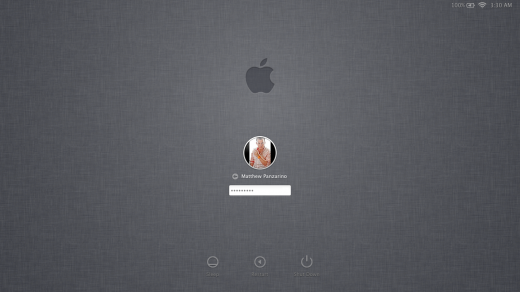
The login screen of OS X Lion has also gotten a nice visual refresh, adding the aforementioned linen texture as well as refreshed icons and the ability to customize login screen text via Preferences. You’re presented with users accounts to choose from here, but they are now presented in a circle, not a round-rect, which is the norm.
The circle isn’t a 100% foreign shape in OS X Lion, but, aside from details like the window control buttons, it only takes a prominent place on the login screen and in the AirDrop interface. AirDrop, the new WiFi sharing utility, presents discovered users in a circle of circles that mimic the feel of the login screen. While the traditional round-rect of Apple’s UI design is still much more dominant throughout the OS, it’s interesting to see the addition of a prominent use of circles to their visual language.
There’s also one other use of circles in OS X Lion, the curious Lego base-plate background of the Dashboard, which has been given its own space in Mission Control. It’s actually pretty eerie how closely it resembles the standard click-brick pattern.
New app sauce
Full screen apps
Another big feature of OS X Lion that made its way from iOS devices to the desktop is the ability to make apps full screen. This allows an app to use 100% of the screen real-estate, transforming your Mac into a modal device, similar to an iPad. The methods of interaction are different of course, but the feeling of focus and purpose that comes from running an app in full-screen translates well here. Much in the way that many writing applications offer a full-screen view to users to help them eliminate distractions, a full-screen app tends to offer a higher amount of engagement between the user and the interface.
Games have benefited from this additional focus for some time, as users who launch them are expecting to be transported. Running a game in windowed mode is considered to be outside of the norm. Instead, your attention is undivided so that you can immerse yourself in the experience and dedicate your senses to performing well according to the rules of the game.
So, adding this kind of full-screen view as a basic supported feature that developers can implement easily brings more than just an ‘iOS-like’ feel to OS X Lion, although that definitely is part of it. In addition to a bit of a blinder effect, you also get the ease of switching between the additional open apps with a simple three-finger swipe on a touchpad or Magic Mouse. This is made possible by the fact that when you launch an app, it automatically gets assigned to its own space.
When an app is launched, at least in the case of the apps included in OS X Lion, its interface changes to accommodate the new view. You’re not getting the exact same interface stretched to full screen, but a seemingly custom version that’s designed for full-screen display. This is a trend that Apple no doubt wants to see continue on in apps that integrate the new full-screen API’s. It remains to be seen how third-party apps with complex layouts will adapt to this view, but I’ve been using writing apps like MarsEdit, which I’m writing this review on, and it exhibits some of the same alterations in field widths and layout that the included apps do, so it appears to be a function of the API. I wouldn’t be surprised if Apple has specially tweaked the way that its apps display in full-screen mode though.
The size of your screen will most likely have a lot to do with which apps you run in full-screen mode. Many apps simply don’t have the information density necessary to justify a full-screen view and end up looking silly and wasteful when projected to 20-27″. As long as users are on a desktop Mac, or are using an external monitor, I’d imagine apps like Aperture, iPhoto and iMovie will be used heavily this way, but apps like iCal, Preview and text editors may not.
Full-screen apps are a fantastic addition to OS X Lion, and should make many users much more efficient. I especially love the ability to switch between apps running in full-screen mode when I’m working on my MacBook Air, where screen real-estate is at a premium.
There is, however, some potential for confusion when confronted with your first full-screen app. Full-screen mode is enabled by clicking a pair of arrows in the upper right corner of a compatible app’s window. These are reminiscent of the iconography used elsewhere in OS X to denote full-screen modes, like the Quicktime player. This makes it a comfortable way to get people to try it. But once they’re in full-screen, the controls disappear along with the menu bar. This can make it tough for casual users to figure out where the controls, and the bar, went.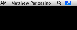
Thankfully a swipe of a touchpad or a smack of the Escape key will take them out of the app and back to their standard desktop space, but the bar isn’t as easy to discover as it could be. That being said, if they’re able to move the mouse up to the top, searching for the menu bar, then they’ll likely see the ‘minimize’ button there and be able to return.
While apps will have to build in this support, the fact that there is now an official method and API for doing so should make it a lot easier. This means that we should see many, if not the majority, of apps for the Mac supporting this feature soon.
Hey look, it’s Launchpad, get him!
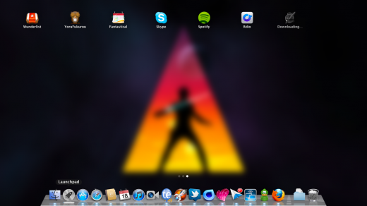
If there is a poster child for the convergence of OS X and iOS, it’s Launchpad. With its evenly spaced rows of apps, page-by-page navigation and regularly sized icons, it’s the spitting image of the Springboard application that runs on every iOS device. In fact, Launchpad is Springboard, just ported to OS X. Prior to OS X Lion entering the ‘developer preview’ stage, Launchpad was even called SpringBoard and, as of this writing, you can still see files that reference this previous name in the system files of OS X.
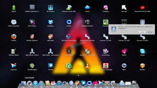
Launchpad shares much of the design philosophy behind SpringBoard in addition to being a visual ringer. When users download applications to their Macs from the Mac App Store, the Launchpad icon shows a progress bar and jumps once when the download is complete to indicate that the app is ready to use. It gets quietly placed onto the Launchpad for a user to access. Apps can be deleted by clicking and holding, or holding down Control + Option + Command and clicking on the ‘x’ at the corner of a familiarly wiggling app icon. Note that only the apps that have been installed from the Mac App Store are available for this ‘direct deletion’ method, other apps must be dragged from the Applications folder to the trash to delete them.
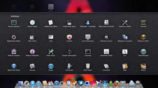
You also create folders and move apps around in much the same way as iOS, by clicking and holding down until they wiggle, although the process is significantly less finicky on OS X Lion than it is on an iPad or iPhone. You can fit a maximum of 32 apps inside a Launchpad folder, as opposed to the 12 max in a Springboard folder.
One behavior that does differ from iOS is that apps are placed in alphabetical order starting on the second page, rather than in the first available open slot. The first page is reserved for apps installed with OS X Lion and iLife apps. This highlights one of the irritants of Launchpad in that every app that you have installed is shown here. This means that you get every conversion droplet from Quicktime and every standalone add-on for Office cluttering up your view. The ability to remove apps from the launchpad simply by dragging them to the trash would have fixed this. This irritation is only exacerbated by the fact that there is no searching while in the Launchpad, swiping or clicking from page-to-page is the only way to find an app here.
Launchpad is beautifully animated, with a very nice ghosting fadeout/in on entry and exit. Launching an app combines the fade with a zooming feature as the app moves in from the middle distance to appear on the screen. Very pleasant and yes, very iOS-feeling.
The addition of Launchpad to OS X Lion quickly became a focal point for anyone who was concerned that we were going to be getting an OS X that felt and acted far too much like iOS. The extreme similarity to iOS caused a lot of people to jump to the conclusion that we were seeing the end of the Mac approaching. After using and living with OS X Lion for weeks now, I can tell you assuredly that OS X is still here and intact in its original form in a big way. There is very little about the core of the way OS X works that has been changed beyond recognition.
In fact, Launchpad feels much more like an appendage, something to ease users of iPhones and iPads into using Mac OS X, for sure, but nothing that feels all that integral to the operation of a Mac. If you drag the Launchpad icon off of the dock, nearly nothing would change about the way that most people will use the Mac. The Launchpad icon only makes one half-hearted hop once it’s done downloading and app, and there is little incentive for a user familiar with launching a newly downloaded app on OS X to use Launchpad otherwise.
Launchpad is a place for apps downloaded from the Mac App Store to go besides the dock. It is, in some ways, an homage to the Windows Star menu. It’s an easy landing pad for people used to using an iPad but intimidated by the Mac. What it is not is a harbinger of the Mac becoming just another iOS device. I honestly think that Launchpad will prove to be of great use to many users that have always been hard pressed to find apps that weren’t added to their docks by a relative or helpful friend. For those of us used to using Quicksilver or Spotlight to launch apps, it’s simply a footnote.
In fact, I’ll amend my earlier ‘appendage’ remark to say that Launchpad is in fact a vestigial organ that no modern user really needs, it’s the appendix of OS X Lion.
I don’t want to sound too flippant about Launchpad’s longevity however. It doesn’t feel like a feature that’s going away any time soon. And if it proves to be as helpful as I think that it is to the journeyman user, then I’d expect to see it in OS X Garfield and beyond.
Mission Control to Major Tom
It’s been a long time since I’ve seen Apple execute a feature as well, and make it look as bad, as Mission Control. Best described as a mashup of Exposé and Spaces, with a little app switching thrown in, Mission Control is one of OS X Lion’s marquee additions and working with its various knobs and bits is mostly a joy.
Exposé, a visual window manager introduced with Mac OS X 10.3 Panther, allows you to see a visual representation of all of the windows open on your Mac at once. Exposé has several modes that show you open windows for a specific app, all open apps and reveal the desktop. It remains intact in OS X Lion, but the ‘all windows’ mode is now usurped by Mission Control, which is activated by the standard f3 shortcut, the Control + Up Arrow or a three-fingered stroke upwards. If, however, you like the standard ‘Exposé’ implementation better, you’ll be happy to know that it’s actually still there and you can assign a keyboard shortcut to it in Preferences.
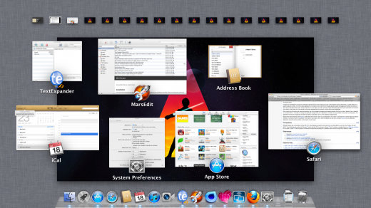
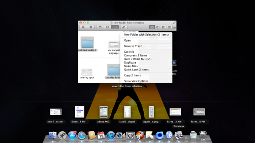
Although the standard Mission Control view now occupies the ‘all windows’ slot in Exposé, you still have access to the ‘all windows for this application’ mode and desktop modes via their normal keyboard shortcuts. In addition, OS X Lion also adds a ‘two-finger-tap’ gesture that you can perform on any app in the dock to see just the open windows that belong to it. It’s a clean, easy and logical addition that makes much more sense than seeing every window from every app like the old Exposé method. If you do this with an app like Preview, you also get a clickable list of previously opened apps that display in a row above the dock.
You can also use the age-old Command + Tab key combo to cleanly switch between apps.
Spaces was only introduced along with Mac OS X 10.5 Leopard, although the virtual desktop concept has existed in computers almost since the Macintosh came into being. In Leopard, you could create up to 16 virtual desktops that acted as alternate workspaces that you could flip through to get access to different applications and window layouts.
Spaces, unlike Exposé, has been completely rolled into Mission Control, making its old form extinct. You still have access to up to 16 different virtual desktops that you can arrange any combinations of windows and apps on, but they’re accessed from the Mission Control view rather than from a discreet Spaces view.
When you pull up Mission Control, you’ve got the dock still appearing below, although I don’t know why, the open applications being displayed in the middle, and your spaces along the top. Having them all in once place is actually quite nice from a functionality perspective.
Unfortunately it’s also fairly hideous, with a hydra-like appearance that feels very much like a bunch of cobbled together UI elements all strewn out on a linen carpet.
Yes, linen is here and in full force, with much of the screen real-estate being dominated by the grey carpeted backdrop. Aside from that, the way that each application is represented in its native shape and relative size to other apps, along with all of its active windows tucked in behind it, well, it’s a sight. There is a lot of information on display here for sure. You’ve got icons for apps, the windows of those apps, a row of spaces, a dock and a linen backdrop setting it all off. You just can’t help but think that there could have been a better way to display all of this.
On the positive side of its appearance, not that there is much of one, all of the animations are once again very well done. Smooth fade-ins and zoom-outs are used to launch spaces and bring apps to the forefront. Very subtle, but very, very good work here by Apple’s UI animation wizards. Every action feels rewarded with a tactile and attractive response, making you much more likely to understand what just happened and more likely to do it again.
Aside from the way it looks though, Mission Control is a massively important move forward in the way that Spaces and Exposé are implemented. Moving applications from one space to another is as easy as dragging its icon from the Exposé area to the space that you’d like to assign it to. Want it to go to a new space? Drag it to the upper right corner and a ‘new space’ button will fade in for you to drop it on. It’s all very drag-and-drop friendly and, despite being jarring visually, does give you an overall map of what’s running on your Mac and where exactly it’s doing that. And yes, you can now set a different desktop to each of your spaces.
There are two special use cases in the new way that Spaces are implemented, Dashboard and full-screen apps. The Dashboard is given its own dedicated space on the left end of the Spaces row. This makes sense as it means that the Dashboard is no longer hovering out there in the ether, it has an official home and a place in the overall desktop hierarchy. Who knows, this could get people to use it more. Full-screen apps are automatically given their own space on which to exist, making them occupy a full slot of their own in Mission control.
Sliding back and forth with three fingers while in Mission Control or on any desktop will move you through your spaces, giving you a smooth page sliding animation that is repeated in Mail, as well as applications like iPhoto. This works great in practice and allows you to cleanly get from one desktop to another, making them more accessible and more likely to be used by the casual user. I’m especially loving this implementation on my MacBook Air as it finally fulfills the promise of an expanded desktop at your fingertips in the way that Spaces, at least natively and without modification, ever did.
Once you add in an additional monitor though, things start to get a bit more complex. By default, Mission Control operates on a ‘carousel’ principle. This means that if you have two monitors up and you switch from one space to another, both monitors will switch spaces on you. This is logical and works pretty well, as long as you don’t have any full-screen apps running. If you do, the second monitor is consigned to an oblivion of, you guessed it, linen coated blankness. you can’t use that space for anything because technically, it doesn’t exist. It’s just an extension of the space on which the full-screen app is running.
This is just downright stupid and needs to be fixed as soon as possible. It takes everything that’s great about full-screen apps in OS X Lion and just makes it irritating. Ironically, if you’re using an app that does not use the new OS X Lion API’s to go full-screen, you can use the second monitor’s space to your heart’s content for palettes, windows and whatever else you need. Not being able to do this with an ‘officially supported’ app is confusing.
By and large, Mission Control is successful as a control center that gives you an overview of your applications and spaces all at once. Once it gets a visual design that lives up to the promise of its capabilities, and fixes full-screen, multi-monitor use cases, it is going to be my absolute favorite feature of OS X Lion.
Mail, brought to you by the letter iPad
It’s immediately clear that many man hours went into improving Mail 5. From the moment you open it, it’s a completely different experience to using Mail under Snow Leopard, or any previous version of OS X. You can see that Apple learned a lot about how to make Mail quicker, faster to navigate and better to look at from making the iPad version.
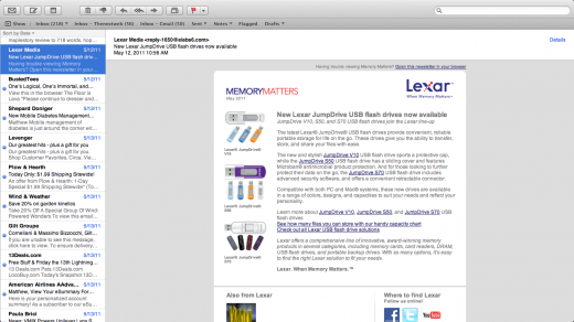
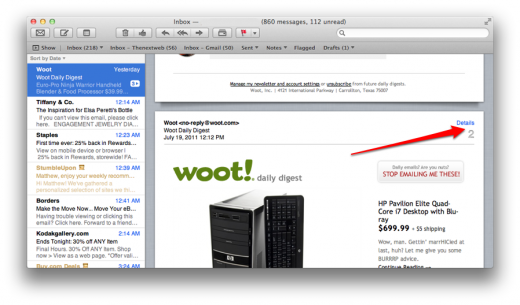
The default split-view is similar to the iPad Mail.app, and to good effect. Mail is easier to skim, read and delete quickly, even across multiple accounts. There are very few things about Mail in OS X Lion that are slower than the Snow Leopard version, but there are many things that make reading and organizing email quicker.
Threaded messages are a welcome addition to Mail 5, as almost every major mail application for the last 5 years has had some sort of conversation threading. What’s especially nice about the threading in OS X Lion’s Mail is that it will actually import threads from most major email services. This means that when you sign in with an email address, your inbox is populated with conversations, not hundreds of individual messages. This attention to context and detail is a welcome addition to Mail.
The sign-on is handled with OS X Lion’s universal accounts pane, which allows you to sign in with an email address and a username, and it automatically completes your information for you. This should make the barrier fairly low for adding accounts, something that is much more difficult to get people to do when they have to enter these details manually. Most of the major services, such as MobileMe, Gmail, iCloud, Microsoft Exchange, AOL and Yahoo are represented here, although there is an option for manual configuration too.
The toolbar across the top can be customized with various folders and inboxes that are revealed by clicking the ‘Show’ button in the upper right corner of the app. The folder list takes on the basic look and feel of the finder Sidebar, with some animated icons when retrieving mail or updating inboxes. The default view is a unified inbox, but if you like to view your mail one inbox at a time, the easiest way to do this is to move your inboxes to the shortcut bar at the top. Then, you can navigate from one to another by hitting Command + 1,2 or 3 for the first three options. You can also expand the pane and just click on an inbox, if you like to use a mouse.
An updated, real-time search is also included in Mail 5, with results populating the list and the reading pane as you type. You can use text from any part of the message without having to specify what content area you’re looking for, which makes searching that little bit faster. Just start typing in a date, name, bit of text or anything else that you might remember and Mail starts searching immediately. It’s very convenient and very fast, even with up to 40,000 messages already populating the database.
Mail in OS X Lion is equipped with a full-screen view, just like most of the major pre-installed applications. The full-screen mode has become my default for using Mail fairly quickly. With the ease of switching spaces, it allows me to dedicate an entire screen, without distractions, to organizing and prioritizing my mail. The one major complaint I have is that the design can be a bit too slavish to the iPad aesthetic.
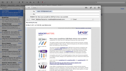
When you’re replying, for instance, your reply window is pinned to the bottom of the screen and you can’t move it around. This means that it’s impossible to reference other messages in your inbox while you’re replying to one. This can be counter productive when you’re trying to reference specific information sent to you in an email from a different sender. It makes it tough to recommend Mail 5 in full-screen to anyone who needs to copy technical data out of other emails with accuracy when replying.
In a twist similar to the way that spaces work when not using OS X Lion’s full screen view, you can move windows, activate other messages and generally poke around to your heart’s content while you’re replying, as long as you’re not in full-screen mode.
Archiving is handled better in Mail 5 than it has been previously, but it’s still not quite right for Gmail users. You can quickly archive messages, tucking them away, out of sight but preserved for later, by selecting messages and choosing Archive from the Messages menu. But unfortunately for Gmail users, Mail 5 insists on using its own folder called ‘Archive’ instead of the standard ‘All Mail’ folder that Gmail uses. There could be some technical issue here related to Gmail integration, but as you can see the All Mail folder plainly in the folder structure of Mail 5’s sidebar, I would think that it would be possible to use it, instead of some new random folder, to store archived messages. So, easy archiving is great, but the implementation is a bit off for some web mail services.
Mail is a great example of OS X Lion that borrows liberally from the iPad and makes itself better in almost every way. Yes, there are tidbits of the mobile experience that make it through in a way that doesn’t quite translate, but by and large, Mail 5 is a better app specifically because of the iPad. As Macs gain more touch gestures and a greater support for natural UI, we’ll be seeing more of this design crossover, I’m sure of it. For the last 5 years, Apple has had an incredible testbed of touch-capable devices to learn from and experiment with and if they can bring those years of experience to other Mac apps as well as they have Mail, then we’re just starting to see the really good stuff happen now.
Safari touch
Safari 5.1 is fast. Easily as quick as Chrome on OS X Lion and far faster than Safari 5.05 on Snow Leopard. In general, browsing and noodling about, it responded quicker, scrolled faster and switched tabs more smoothly than any version of Safari I’ve used lately. Even on my upgrade install it felt like browsing on a new machine. But the speed isn’t even the best part, that’s reserved for the stability.
The addition of system-wide application sandboxing in OS X Lion is definitely something to be happy about. It will encourage app developers to work in their own space, making applications less likely to create system-wide meltdowns. This sandboxing has been brought to Safari via the new WebKit2 engine powering it, as well as the new Mobile Safari in iOS 5. The new WebKit engine supports sandboxing, which means that the content on a page, like Javascript, HTML and layout files, are all running on their own discrete process, separate from the interface. This has the effect of making the entire browser much more stable, especially for people who like to have a lot of tabs open at once.
As I regularly have between 20 and 40 tabs open at the same time, this is an incredibly welcome addition. This way, if a script or plugin running on one page causes a catastrophic failure, the worst that will normally happen is the loss of a single tab’s process. I may have to reload that page, but I won’t have to re-launch them all. As an additional bonus, this makes browsing much more secure, as each tab is playing in its own bubble with access to only the system resources it needs. This will limit a piece of malware’s ability to reach outside the bounds of the browser and install items on your machine or cause failures.
Safari 5.1 isn’t the first browser to use sandboxing to cordon off web content. Google Chrome has been doing it for a while, but it is nice to see this modern feature finally coming to Safari in WebKit2.
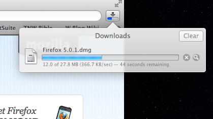
A with many of the standard applications in OS X Lion, Safari also gives a UI nod to iOS in the form of the Downloads popover. No longer its own window, Downloads is now presented as a button to the right of the search box in Safari and opens as a modal popover reminiscent of the iPad. The implementation is gorgeous, I love the translucent window and the cumulative progress bar that I can check at a glance. It won’t please everyone however, and if you’re in the habit of leaving your Downloads window open, off to one side of your browser and eyeing the progress of your downloads separately, then the popover will most likely feel limiting to you, as there is no way to ‘detach’ it from the button and view it constantly.
If you’re okay with only having the one progress bar for all of your current downloads though, the new view should actually save you desktop real-estate and window management troubles. Over the course of the last few weeks, I’ve found it helpful to just relax and trust that the downloads will be there when I want them. This approach won’t work for everyone, of course, and if it’s really imperative that you have a visual progress indicator at all times, you’ll probably want to look into using a download manager of some sort that catches links that you click in Safari.
Yes, it seems counter-intuitive at first to have a dialog that is expressly designed to give you constant status tucked away in this fashion, but if you give into it, you’ll realize that it’s actually quite handy as it’s always within reach if you need it.
Previously, the Downloads list provided you with a tantalizing selection of icons that couldn’t be dragged, forcing you to click on the ‘reveal in finder’ button and then move them from the Downloads folder. No more, as Apple has made it possible to drag items off of the Downloads list directly. Yes, now when you see that a file is done, you can simply reach for it and drag it off the list to wherever you want it. I can’t count the number of times that I’ve reached for a download in the list to attempt to drag it out, only to remember that no, you can’t do that.
It was a behavior that feels like this is the way that it should have always been and that’s always the sign of a change for the better when it comes to software.
The Show in Finder button is still there, off to the right of list items, but the individual buttons for clearing single items is gone, with only a ‘clear all’ at the top.
Safari retains its ability to reopen windows from the last session, but now due to OS X Lion’s system-wide Resume feature, they will simply stay if you quit the app, or even shut down your computer. This means that you can quit Safari to free up memory for other applications, then launch it again and all of your windows will re-open to their last visited pages and in exactly the same spot on your screen. At least theoretically.
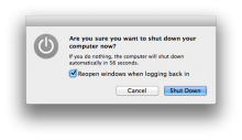
In my experience, the automatic resume feature worked most of the time, but there were some scenarios where it failed. For instance, if you’re in the process of shutting down your computer without quitting any of your apps, and an app cancels shutdown because of an error or dialog that can’t be automatically cleared, you lose all of your Resume data. This causes your machine to boot up in its ‘default’ state rather than the one you left it in. This quirk also seems to erase all of the page positioning and data that Safari has saved for use with Resume. you are still able to manually use the Reopen all windows from last session option in the History menu however.
In general, I’ve become pretty reliant on the ability of Safari to get me back to where I left it. Enough so, I routinely quit Safari during tough photo or video operations in order to free up resources, then restart it once I’m done, with very few operational hiccups. It’s not perfect, but it’s a very nice continuation to the promise of the ‘last session’ command.
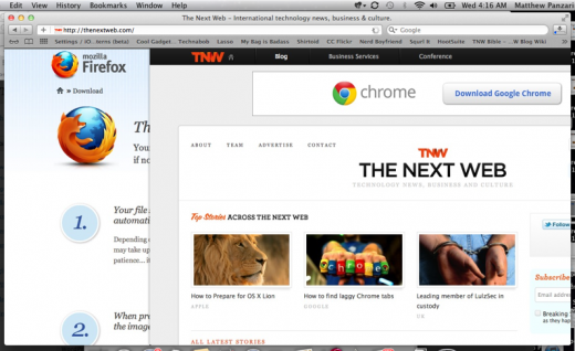
The way that gestures are used in Safari is a real standout example of how appropriate touch gestures are for things that we do every day. After only a few days of swiping two fingers across a touchpad or Magic Mouse and you’re going to fall in love with the two-finger swipe motion that allows you to move back and forward through your browsing history.
The animations are also gorgeous, with the current page sliding out over the top of the previous page in a very smooth motion. It’s really a job well done and a great addition to the navigation options available to Safari users. In addition to the excellent history navigation, you also get very smooth momentum-enabled scrolling with a pleasant elastic bounce when reaching an upper or lower limit on a page.
These gestures, combined with the system-level gestures like the two-finger double-tap-to-zoom, make moving between spaces and navigating the web feel more natural and more integral than ever. I also enjoyed the “Use this account for” feature that reared its head the first time I logged in to my Gmail account in Safari. It gives you the option to automatically apply that account to other services like iChat, Mail and iCal, which is pretty slick. This same option is available in System Preferences as well, but it’s nice to have it organically presented this way.
Reading List is a bit of a non-feature at the moment. Although many claim that it spells trouble for other ‘read it later’ services like Read it Later, or Instapaper, it really competes with none of those, at least for now. The pages aren’t reformatted for easy reading, there are no social features and it only syncs with iDevices running iOS 5. In its current form it’s little more than a ‘temporary bookmark’ syncing service. Once it adds a reflow engine and more ways to share the articles, it may become more of a contender in this space. For now it seems like a casual experiment that could become serious business with the right attention.
Finder’s fees
The Finder in OS X Lion has undergone some nice improvements in usability and looks, fixing some small issues and refining behaviors. Aside from a new coat of monochromatic paint, the most obvious change is that every folder defaults to the new All My files view instead of the Home Folder. Note that your local hard-disk can be added back to the list of options in your sidebar with a visit to Finder’s Preferences menu, but read on before you jump to conclusions, All My Files might just have something to say about that.
You also get some changes in sorting, including a new toolbar button. There haven’t been any revolutionary changes to the fractured way that Finder works, unfortunately, but there’s enough here to like.
Files my way, it’s a new road
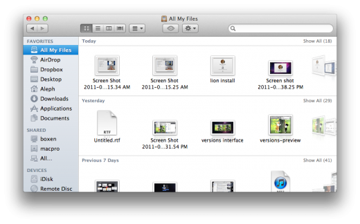
All My Files started out as something I was prepared to toggle off as soon as I was done reviewing OS X Lion, but it has grown to be my favorite Finder enhancement. It’s basically a catalog of your files, wherever they may be, that you can sort individually by all the standard methods, such as date created, name and size. But it can also be sorted in one important new way, Date added. I cannot stress enough how dear to me this new sort order is. If you work with files on a daily basis that you refer to mainly because they’re new, say screenshots or documents that you’re editing and the passing along to other team members, this is a godsend.
With your files sorted by Date added, your new stuff always makes its way to the surface of the All My Files section automatically, organized in nice clean rows that can be sifted through in a cover-flow like array. Sure, you can just go for the classic list too, this will get you the new stuff at the top. But the way that All My Files sets them into ordered rows gives it a nice balance of ‘here’s your stuff’ and a good old-fashioned structure. At first it may seem a little haphazard, but if you give it time it will grow on you.
Think of All My Files like your workbench, where the things that you need are all up front and as you add new items, the older ones get pushed towards the back.
As the files get older, they’re moved to yesterday, then lumped in with this week, this month and then ‘Earlier’. This creates a subtle automatic prioritization that I’ve grown to really like. As a file gets older on your hard drive, there is less and less of a chance that you’re going to need to grab it at a moment’s notice. This way, the items that you want to keep can be surfaced by search or browsing, but the stuff that you’re working on now is right there.
This eliminates the need to clutter your desktop with stuff from today just so you have it at hand. You can tuck all of your screenshots and random files away into any folder in your Home directory, and it’s automatically surfaced for you in All My Files. It’s clever, It’s useful and it really does work, give it a try. If you’d rather not, however, you can visit the Finder>Preferences menu and choose the Home folder, desktop or any other location as the default when new windows are opened.
As far as the Date added option, this is one that’s useful throughout the finder to help you find things by the date that they appeared on your computer. It’s amazing that it took this long to prioritize files by when they entered your life, not when they were originally created.
But as rosy as the Date added sorting and All My Files additions are, there are still some darker grey tinges on Finder’s new monochrome lining.
How do you solve a problem like the Finder?
The finder still retains many of the quirky inconsistencies that have irritated users since the version that shipped with OS X. These include smaller things that fall into the irritation category, as well as larger problems that speak to an underlying thought process that the Finder team, or someone higher up on the food chain at Apple, just refuses to give up on.
One of those items is that windows still do not retain an individual state with regards to things like sorting. You can test this yourself if you like. Open a folder on your desktop, change the view to list, close the folder, open another folder, change the view to icon, then close that folder and reopen the first folder. I’ll spoil the surprise so that you don’t have to do it. If you make a change to the sorting order of any folder, all folders explicitly adopt the last change made to any folder. In order to make it stick, you have to dig down into the folder options, and you have to do this to every folder that you’d like to change the appearance of.
The retention of a sorting state, along with size, shape and position, is a defining characteristic of a spatial file management system. Many critics of Finder have been griping about the way it handles this for years. The reason that people like John Siracusa, or John Gruber of Daring Fireball, keep harping on about this is because the Finder doesn’t just make a decision not to be a spatial file manager, it can’t seem to make up its mind, waffling between something that is a pure browser and something that feels like a physical file system. OS X Lion’s Finder is no exception.
Proponents of spatial file managers state a variety of reasons for preferring a spatial model over the browser model, but the underlying principles are simple. Humans relate to things on a spatial level naturally. The ‘browser’ model is an inherently artificial one. This means that no matter how simple your file structure, asking a person to browse down a path of folders to find the file that they’re looking for is trending against thousands of years of behavioral training that we get from the real world.
If a folder is placed on your desk in the physical world, you have an innate understanding of where it is, what size and shape it is and how to get your hands on it. It’s this same spatial awareness that allows athletes to catch a ball without looking to anticipate the moves of an opponent who has passed out of their field of vision.
The early Mac presented this kind of physical metaphor to the user almost exclusively. Anyone using a Mac had the concepts of a folder or file couched for them in traditional spatial terms that they understood naturally. If this is a folder and you have a file inside of it, you have to open the folder. If you open the folder and place it just so on the desktop, there it will stay in this size and shape, and everything inside will look exactly as it did when you re-open it. It was only with the introduction of the revamped Finder in Tiger that things started to get a bit more messy. All of a sudden you had the standard spatial model intersecting with the newer, more modern, browser model.
The mixing of the two styles is what leads to user confusion. Have you ever opened a Disk Image or a folder on the desktop to see a window with no sidebar? Ever asked yourself why? Don’t think too hard, there seems to be little rhyme or reason for it. It’s possible, in fact, to have several windows open at a time, some with the sidebar and some without. The ones with the sidebar will open any folders you click on inside the same viewport. Any folders without the sidebar open those in a brand new folder, in keeping with the spatial model.
There are proponents of both sides in this debate. Some feel that giving users access to paths and toggle down trees of files will make it easier for them to see where files are located on their hard drives. Whereas proponents of the spatial model argue that the closer that a computer interface is to the way that we interact with things in the real world, the better off users will be.
In the end, the debate isn’t really the issue, it’s the fact that the Finder hasn’t chosen a side.
You get a mixture of behaviors here that have real potential to confuse users. If you teach someone to always carefully use the sidebar and the three-pane browser to navigate their files, and they’re suddenly presented with a window with no access to the file browser, what’s going to happen? Likewise if the window they’re clicking on suddenly stops spawning additional windows and instead begins replacing itself with the contents of the click-on folder instead.
Thankfully it’s not all bad news. OS X Lion’s Finder is admittedly a bit more aggressive about keeping the experience uniform for users than previous versions. The instances of a window showing up without the sidebar, for instance, are much lower in OS X Lion than it has been before. The Finder also seems to remember almost everything about window placement, size and shape on a much more consistent basis. But not 100% of the time. Even with the system-wide restore function as a basis for offering users this, there are still times where windows will open as they wish, rather than how and where they were.
And, as mentioned, the sorting of a window still cannot be set individually without tweaking each and every window individually. OS X Lion’s Finder still cannot manage to just leave things how the user left them last. This is not entirely surprising, as this behavior has been around through seven public iterations of Finder by now, so there’s no telling when and if this will ever change.
While I could probably dedicate an entire section of this review to conjecturing why this annoying behavior remains, I won’t. Instead, I’ll briefly posit that it must be either an underlying issue with the way that the Finder works that would take a(nother) complete rewrite to get rid of (unlikely), or it’s an intended feature that is aimed at starting a user from a zero point every time that they open a new window, creating a memory map that they have to traverse from a common reference point. Sort of a ‘browser-based’ boot camp that is attempting to make this the default way that people think about navigating a file system.
What’s to like?
Leaving behind the Finder’s ongoing personality struggles, we turn the corner onto some positive changes and additions that should bring a smile to your face.
![]()
The new sidebar icons in Finder are all extremely snappy and well designed, especially the new ones like All My files and AirDrop. An interesting tidbit from a Macrumors forum member; the full-size 512px version of the All My Files icon from the Finder is inscribed with Steve Jobs quotes, including one of my favorites, “You can’t just ask customers what they want and then try to give that to them. By the time you get it built, they’ll want something new.”
If you’re a photographer or artist that navigates folders that are chock-full of large files, you’ll be happy to know that scrolling feels incredibly smooth when compared to Snow Leopard, even on relatively low-powered machines. There is now a very nice ‘Keep both files’ option when you’re copying a file into a location where a file of the same name exists, something that took a confusingly long time to show up in Finder.
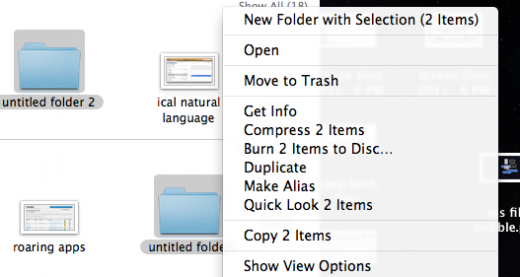
Alongside All My Files, one of my favorite additions to Finder is the ability to group two or more folders together into a new folder by highlighting them, Option + Clicking one of them and choosing New Folder with Selection, which creates a new folder containing the ones that you’ve highlighted. This is a huge timesaver and cuts down the process significantly from creating a new folder and dragging folders into it.
You can even mix folders and files together and Finder will just move them down one level in the hierarchy while maintaining their current relationship. OS X Lion even takes a nice action when you combine two folders this way that share the same name, merging them into one. Super slick.
All the windows in OS X Lion also now have a darker, but more diffuse shadow, which helps to separate windows out visually from one another a bit better. Yes, you can now resize windows from all edges and corners, that’s 8 points of articulation!
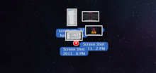
There are also now iOS-like badges while dragging multiple files around for moving or copying purposes and while you’re toting them around with your mouse or touchpad, they will ‘flock’ together, making it easier to navigate a large group of files without a bunch of ghosts floating around your desktop.
Preview and Resume and Versions and Auto Save and kittens
Out of all of the apps shipping with OS X Lion, I was least prepared to be surprised by Preview. The default document viewer has really been fine-tuned in its latest incarnation. All of its controls, like Annotations and view options, are now located conveniently at the top of the window, making it less of a button hunt when trying to add simple notes to pictures or documents.
Preview is also one of the apps shipping with OS X Lion to integrate Versions, the new system-wide automatic archiving feature that gives you access to an extensive set of versions of any document that you’ve been fooling around with. Versions displays in a view that’s similar to Time Machine, offering you the ability to flip through the various changes to a document in order to revert it to a specific point in its history.
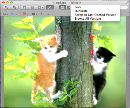
Versions is tied in tightly with Auto Save, the feature of OS X Lion that goes about creating all of these versions for you. When these two features were talked about on stage at WWDC, the basic premise was that you’ll never have to save again. To access Versions, click on the name of the document that you have open, you’ll be rewarded with a small pop-down menu that gives you options to Lock, Duplicate, Revert or Browse all Versions of your file. Noticeably absent from the file menu of most apps with Versions? The option to Save. Instead, you’re provided with the option to Save as a New Version, which will manually tack on a version to your stack.
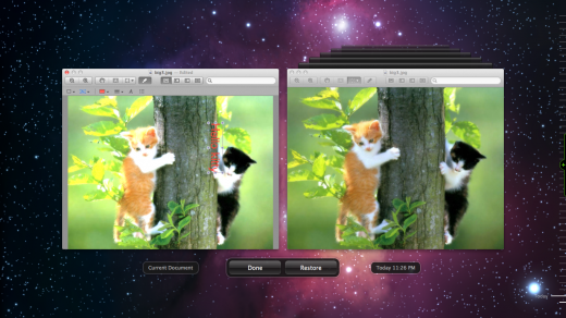
If you select the Browse all Versions option, you’re taken to a familiar looking interface that allows you to browse through the various versions of your document on the right, while comparing it to the current version on the left. Each of these versions technically represents a point at which OS X Lion decided to Auto Save your document for you. This is where it gets a tad fuzzy, because with certain documents, like pictures, it’s pretty easy to save a new version procedural after each major change. With something like a text file it gets a bit harder. Is it supposed to save on every keystroke? How often does it save? How soon from opening and starting a new document does it begin?
The answers are actually pretty simple. When you’re working, OS X Lion will perform an Auto Save every 5 minutes, creating an additional Version of your document. If at any time before those five minutes, or between then and the next 5, you begin working again and then pause, it also creates an Auto Save. So it does not track every keystroke, but instead works with the natural flow of your work. If you’re typing and reach over to grab a drink of water? OS X Lion is Auto Saving a new Version of your document for you.
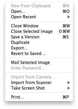
In practice, I found that there are some occasions where a manual save is still required. If, for instance, you start a new document in Text Edit, you must choose a save location using the standard Save option before it will begin automatically saving your file. If, however, it was a pre-existing document that you open, you’re getting Versioning right out of the gate. If you start a new document, don’t save it and quit, you’ve still got the system-wide Resume that will bring the document back up when you re-start the application.
As mentioned in the Safari section, Resume is a system-wide feature that saves your applications’ states when you log out or shut down your Mac. Then, when you fire it back up, you’re right where you left off. As before, this works until it doesn’t. It seems that any interruption for error in the shutdown process will result in a loss of Resume data, causing your Mac to boot back up as if it was starting fresh. If you’d like this behavior by default, you can un-check a box in the restart dialog to get a clean start.
FileVault 2, Find My Mac and sandboxing
The security of OS X Lion has been beefed-up in a number of small ways, but there are three major features that will contribute greatly to your newer, more secure Mac.
FileVault 2 is a completely revamped version fo the much-maligned FileVault hard drive encryption in Snow Leopard, every application that is compatible with Mac will be required to have sandboxing enabled and, once it’s working properly, Find My Mac will be a must-have.
FileVault 2 will now encrypt external drives as well as your entire internal drive, not just your Home folder. This shortcoming, along with the fact that the original FileVault only uses the standard 256-bit AES encryption, led many to rely on third-party software instead of Apple’s built-in solution. Now, with FileVault 2 capable of encrypting all your drives with the enhanced XTS-AES 128 standard, many who were using other solutions might want to take another look. The inspiration of FileVault 2’s hardware encryption key and ‘instantaneous wipe’ no doubt lies in iOS devices, where this feature has been standard since the iPhone 3GS. The erasure of data key will make the data completely inaccessible to unauthorized users if your computer is stolen or fiddled with without your consent. Once the key has been erased, your Mac will perform a DoD standard data wipe of your hard drive.
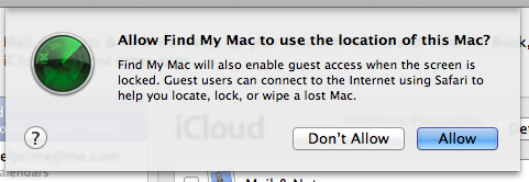
The remote wipe features of OS X Lion are activated through an iCloud account and are iCloud only. You cannot use the Find My Mac feature to locate, erase, lock or message your Mac with a MobileMe account. Since iCloud isn’t fully functional yet, this makes the implementation of the feature sloppy still, because you cannot be signed in to a MobileMe account and an iCloud account at the same time, but the rest of iCloud’s features, like Back to My Mac, are not up and running yet. Once iCloud is fully armed and operational, Find My Mac should be a default option that everyone should have enabled, just in case.
Application sandboxing is one of the best tools that Apple has to combat malware and crashing due to apps taking too many liberties with system resources. To quote my article on how Apple will use sandboxing in OS X Lion:
“Sandboxing limits the resources available to applications and restricts their access to areas of the operating system, or bits of hardware, that they don’t need to function. This technique is what makes iPhone apps so stable and unlikely to affect the system as a whole. If an iOS app undergoes a horrific crash the most that will happen to a user is that the app will close and they will be dropped back to the home screen of the device.
This kind of stability and security is where Apple wants to be with the Mac. To that end they’re going to be moving all Mac App Store apps to sandboxing very soon. Some of the information about this transition is protected under NDA but it’s safe to say that it won’t be optional and it’s going to be soon. Apple wants apps using only the resources that they need unless they have a very good excuse to do otherwise.”
I’m not really sure if the NDA still applies in this case, but I’m going to err on the side of safety and say that it does. So I’ll just say that within the next few months, every app coming through the Mac App Store will have to be using resources in a closed off area of your Mac’s system, AKA, the sandbox. This will make your apps, and your entire system, more stable and resistant to malicious code. It’s a good thing.
Odds and endings
Along with the major changes that we’ve talked about, Apple has also gone through and given much of the rest of OS X Lion a good once-over. Some old applications and a couple new ones are definitely still worth mentioning here.
FaceTime has been given a minor overhaul, giving it full-screen capabilities, HD support and is linked up to Address Book to start calls. I was unable to test the HD capabilities of FaceTime as I don’t have an HD camera. The full-screen view seemed nice, if relatively unspectacular due to the quality of my cameras.
AirDrop is a very cool concept in that it offers peer-to-peer file-sharing with zero configuration over a local WiFi network. If there is another Mac running OS X Lion on the same WiFi network, it will appear in the AirDrop interface and you can drag and drop files on the person’s profile picture to share it. The first time that you share a file, AirDrop will ask the person’s permission, then you’re good to go. Early reports indicate that this works well, although we only have one machine running OS X Lion concurrently here so I was unable to test it. Once we rectify that we’ll bring you our impressions.
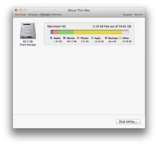
About this Mac gets a very nice visual makeover that spruces it up considerably. Along with a sleeker tabbed view after you hit the ‘More info’ button, you also get an iTunes/iOS device inspired storage menu that shows you exactly how you’re using up the space on your hard-drive. There’s also an additional tab which tells you how much RAM you have installed and what slots it’s taking up, which is information that’s rarely easily exposed to the user.
Time Machine has been upgraded to support encrypted backups to external drives that are encrypted using FileVault 2. In addition, Time Machine will now perform backups even when you’re way from your Time Machine drive or Time Capsule. It does this by creating copies of files that you edit, saving them to your Mac’s hard drive. Then, when you come back to your home base and plug your backup drive back in, Time Machine will merge those backups, creating a seamless timeline out of the two sources. This is very slick and very welcome for heavy MacBook-users.
Back to the Mac
If you’re to glean anything from this in-depth look at OS X Lion, it’s that the Mac is safe for the foreseeable future.
The core of what makes OS X one of the best operating systems ever is still intact, despite the influx of new blood in the form of features inspired by iOS. What is most telling is that some of those features, like the implementation of extensive multitouch and natural UI, hardware encryption and sandboxing, all feel organic, as if they were always meant to be on the Mac.
Others however, such as Launchpad, feel as if they never should have left the confines of iOS. Something like the SpringBoard is to be tolerated on the iPad, but it just doesn’t feel like it belongs on the Mac at all.
When you look at the ways that OS X and iOS are converging in light of the massive performance of iOS devices over the last two quarters, it’s easy to see that Apple’s portable business will continue to be dominant and inform the Mac for many years to come.
But remember that the Mac isn’t standing still either, with sales up 14% year-on-year, despite the massive impact of the iPad. Even Apple’s COO Tim Cook was realistic about the impact that the iPad was having saying that “some customers chose to purchase an iPad rather than a new Mac,” then adding, “but what we’re excited about is that people chose to buy an iPad instead of Windows PCs.”
Yeah, yeah, but should I buy it?
If I was nice, I could have just added a link to this paragraph at the beginning, right? The short answer is yes. OS X Lion offers enough value in its security enhancements and improvements to features like Exposé and Spaces, in the form of Mission Control, to justify the $29.99 price tag alone. There’s really very little reason not to purchase the upgrade if you’re already a Mac user on Snow Leopard.
In addition to new features and additional security, you’re also getting a solid look at what the future of UI on the Mac looks like. That is to say, gestures, and naturalized interactions with our tried and true friends like the web browser that are inspired by portable devices such as the iPhone and iPad.
Within one, perhaps two generations of the Mac, the mouse will be as outdated as a keyboard-only interface was in those years after the Mac was first released. Upgrading to OS X Lion now will acclimatize you to the new way before you’re thrown in head-first.
I would also note that if you’re on a portable computer like the MacBook Pro or MacBook Air, OS X Lion is absolutely made for you, so the recommendation to jump on board applies double to you. The combination of Spaces and Mission Control, along with slick gestures, make a small, single monitor workflow feel like an entire desk full of monitors. It’s really something you have to try for yourself.
In the end, both OS X Lion and iOS are solid enough to shape and harden each other without losing their individual luster. OS X Lion’s surface is especially shiny and polished, but if you look deep inside there is still a flawed Finder that needs fixed, as well as a new, useless appendage called Launchpad. If Apple finds a way to remedy those flaws then they’ll have one of the finest and most worthwhile OS offerings in the company’s history.
Get the TNW newsletter
Get the most important tech news in your inbox each week.

