I’m gonna say this loud and proud: the new Google Docs sharing menu is absolute wank.
Yes, I know lots of people are gonna read the headline and say things like “who gives a shit?” and “grow up” and “who the fuck are you?” but they can do what they want. I’m on a mission. Nay, quest. The new Google Docs sharing menu is my One Ring and this article the Mount Doom I must cast it in.
Don’t think too hard about that metaphor.
[Read: This AI-driven meme generator delivers the avant-garde content you need]
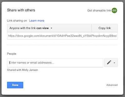
At this point, I should probably actually tell you about the new Google Docs sharing function. Back in thee goode olden dayes — let’s say about two weeks ago — sharing a Google Doc was simple. One could almost say transcendentally so.
With a simple, everyday click you could create a link that people in or outside your domain could view, comment on, or edit. Hallowed times.
To refresh, have a look at this:

And — if you’ve lucky and pray to the Big Dog — you might still have this menu.
According a Google blog, the release date of this new feature stretches from April 28 (for Rapid Release domains) to June 10 (when the final Scheduled Release domains will get the menu).
What I’m saying here is, if you do still have the OG menu, enjoy it while you can, punk.
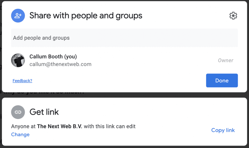
Oh — you want to see what awaits you with new Google Docs sharing function? Don’t ever say I’m not here for you:

On first reflection, the new Google Docs sharing menu doesn’t look that different. But it is. Oh lord, it is.
To give a full and balanced view of this update (note: this is a lie), for some people this change might be okay. For example, I can concede that with the new Google Docs sharing function it’s now tiny bit easier to share a document with specific people.
But I’m not one of those people.
Look, all I want is to click the share button and have a link I can easily, you know, share. Like before. Instead, the whole experience has moved from being an easy-to-use feature, to an unintuitive nightmare — one founded on more steps.
It might sound stupid, but adding extra clicks to complete the same task is not good design. Sharing something should be fast and automatic, not something I have to fiddle with.
Listen, I don’t want to bring back putting people in stocks and flinging rotten vegetables at them, but can we truly say that the Google Docs UX team deserve any less than that?
I, for one, cannot.
Will I eventually get used to the update? Yeah, in the same way I’d get inoculated to the smell of shitting myself. I’ll make it through, but barely.
Until then, thanks Google, I hate it.
Get the TNW newsletter
Get the most important tech news in your inbox each week.


