In the final weeks of 2019, a virus slipped furtively from animal to human somewhere in the Chinese city of Wuhan. This inauspicious moment marked the sounding of a starting pistol, unheard at first but now echoing deafeningly across the globe. The race to stop a pandemic had begun.
We have been trying to keep up with the novel coronavirus ever since. Each day, we are faced with worrying headlines reporting the latest twists and turns of this outbreak. We have seen the virus spill over China’s borders and spread to at least 25 countries worldwide, and watched with mounting anxiety as the number of cases creeps ever higher. We wait apprehensively to see where the virus shows up next.
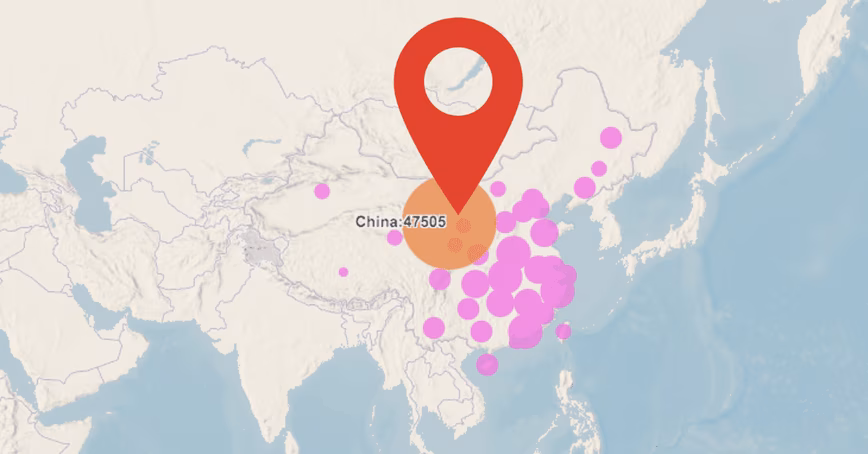
At the time of writing, there have been 43,036 confirmed cases of the novel coronavirus and the death toll stands at 1,018. Both of these numbers will be out of date by the time you read this.
In isolation, the daily headlines can be difficult to interpret, offering a static snapshot of a moving target. It is hard, for instance, to tell if the situation is getting better or worse, and to what extent control efforts are having any effect.
To provide a clearer picture of this evolving story, at the London School of Hygiene & Tropical Medicine, we have developed a new outbreak mapping tool.
The site is updated daily based on figures published by the World Health Organization (WHO). While other live trackers developed by Johns Hopkins University and the WHO are updated more frequently, our tool enables users to wind back the clock and view the global situation on any given day of the coronavirus outbreak. It also enables the unfolding situation to be compared with other recent outbreaks, including the epidemic of severe acute respiratory syndrome (Sars) in 2003 (also caused by a coronavirus), the 2009 swine flu pandemic, and the 2014 Ebola outbreak in West Africa.
Providing context
Our hope is that this tool will provide more context to the daily headlines and a fresh perspective on key turning points in the disease’s history. For instance, by tracing the course of the outbreak, it is clear that the last week of January was pivotal for the international spread of the virus. In the space of a few days, the number of affected countries increased from seven to 20, while the number of confirmed cases outside China increased almost tenfold (from 11 to 106).
On the other hand, confirmed coronavirus cases have been reported in just four new countries since the start of February – a testament to the rapid, coordinated international response to this new threat. One can only hope that things stay this way, though mounting evidence that people can carry the virus without showing symptoms is worrying.
The situation in China is clearly rather different. Not only has the country seen more than 99% of the confirmed infections, but the total number of cases doubled every three to four days throughout January. Yet there is room for optimism – while caution must be taken when attempting to anticipate the future trajectory of this virus, recent predictions from mathematical modelers at our university suggest that the outbreak could peak in mid to late February if current trends continue.
Comparisons with other recent outbreaks are also revealing. At one end of the spectrum, the 2014 Ebola epidemic can be distinguished by its devastating virulence (killing nearly 40% of the 28,600 people infected) but narrow geographic range (the virus was largely confined to three countries in West Africa). On the other hand, the 2009 swine flu pandemic was far less virulent (with an estimated mortality rate of less than 0.1%), but reached every corner of the globe. All in all, swine flu is thought to have infected more than 60 million people, causing somewhere between 123,000 and 203,000 deaths.
The novel coronavirus outbreak currently sits somewhere between these two extremes. Its geographic distribution is most similar to that of Sars, with China at the epicenter and smaller clusters cropping up across Asia, Australia, Europe, and North America. While the mortality rate of the novel coronavirus (currently estimated at 2%) is well below that of Sars (10%), it already far outstrips the 8,096 confirmed cases of Sars, and the death toll of the novel coronavirus recently surpassed that of Sars.
The critical question now is whether the situation will turn into a full-blown pandemic. The novel coronavirus virus is clearly adept at passing from person to person, but outside of China, it has yet to ignite. We must do everything in our power to keep it that way.
This article is republished from The Conversation by Edward Parker, Research Fellow in Systems Biology, London School of Hygiene & Tropical Medicine under a Creative Commons license. Read the original article.
Get the TNW newsletter
Get the most important tech news in your inbox each week.