You only get one chance to make a first impression, so you better get it right — isn’t that what they say? Here are four things I (honestly) don’t want to see in your portfolio:
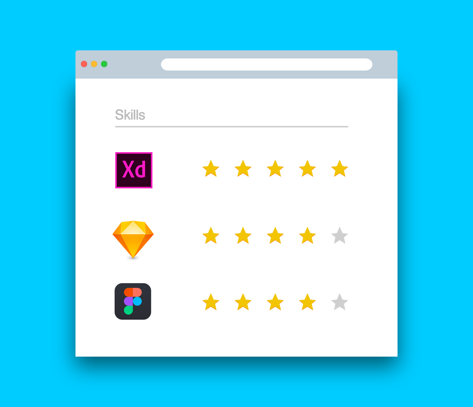
Skill charts
I am not hiring a robot.
Tools change every few months.
We might have different view of what the word “skill” means.
I hope you are able to flex your tools once I hire you.
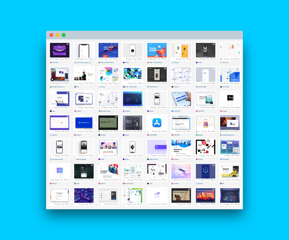
Dribbble shots only
When I brief you on a project, I hope you’re able to design an entire flow — not a single shot.
I’m curious to learn how you managed to navigate all the constrains in the brief. Oh wait, there wasn’t a brief?
Not every brand uses bright colors.
I also hope you know not everything in life moves as seamlessly as Principle makes it seem.
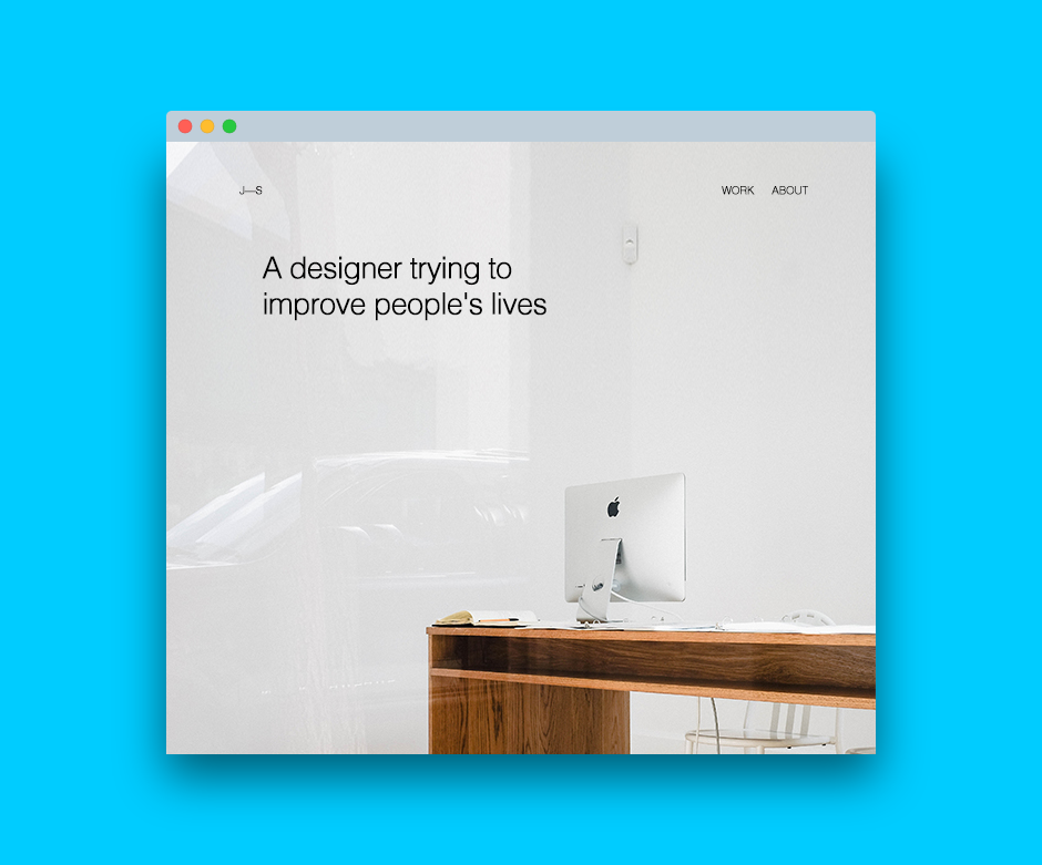
Generic taglines
“I design meaningful experiences”
“Living at the intersection of design and tech”
“A designer trying to improve people’s lives”
So are a million other people.
Get the TNW newsletter
Get the most important tech news in your inbox each week.
