From the way we ask our users an ethnicity question in an online form to the promise of designing an entire world in Virtual Reality, we, as designers, could be missing the opportunity of breaking stereotypes and misconceptions, instead of perpetuating them.
Design can’t just be incidental. Our work has an impact on people’s lives.
Inclusion should be a key design principle, just like (if not above) any other design principle your company decides to follow. When inclusion is not part of a brand’s or designer’s core values, there is a chance it will be forgotten, de-prioritized, and become a distant, utopian concept.
Designing for inclusion can be a long walk, but hopefully throughout this article we will be able to break it down in a few steps.
Here are a few ways we can design more inclusive experiences.

The 💜 of EU tech
The latest rumblings from the EU tech scene, a story from our wise ol' founder Boris, and some questionable AI art. It's free, every week, in your inbox. Sign up now!
By not making “diversity” just a buzz word on a slide
The first step is, of course, bringing diversity to our design teams. We need to acknowledge the problem and understand the benefits of a diverse team.
Just keep in mind that learning and talking about diversity is a big step, but far from being the solution.
Any progress is dubious if your organization treats diversity just as a nice word in a slide deck and does not act accordingly in their hiring policies and through more tangible inclusion initiatives.
As Rachel Thomas, a Deep learning Researcher who writes about diversity and tech on Medium, stated on her article about the issues with companies using diversity as a branding strategy:
No donation is ever a substitute for the hard work of self-reflection and company-wide change. The “easy” changes are necessary, but they are not sufficient.
What are your company’s inclusion and diversity goals for this year? When was the last time your team talked about diversity?
By removing bias from the design process
You can start with a post-it on your desk reminding you to question your bias in every step of your process. But there is also an opportunity to be more inclusive on the methodologies and tools that you use on your day-to-day as a designer. Here are a few examples:
When creating your personas, move away from assumptions and stereotypical information about your audience.
Does it really need to be a man? Are you assuming that your persona is not familiar with technology just because of their age? How does the location of your persona impacts your design decisions? Isn’t the funny/catchy name carrying too much bias?
This is also valid for user journeys, task analysis and any other methodology trying to document who the user is and how the user behaves.
When asking for feedback on a project, go beyond your inner circle: sometimes just getting feedback and thoughts from someone in a different team is a good start to have your bias questioned.
Ideas need to be prototyped, tested and iterated upon with many different inputs.
— Jen Heazlewood
When setting up a usability test and recruiting participants, the insights will be more helpful if you have a diverse pool of users, representing the same diversity than your audience likely has. Remove specific demographics criteria from your recruitment process and ask the recruiter for a good mix of gender, age, location.
If you are doing just some guerrilla testing, try to go to different places and neighborhoods to get your participants.
What can you improve in your process and tools to bring more diversity to your designs?
By making interfaces accessible
The power of the Web is in its universality. Access by everyone regardless of disability is an essential aspect.
— Tim Berners Lee, inventor of the World Wide Web
To achieve a truly inclusive design solution, accessibility should be a no-brainer. After all, in a diverse world like ours, we cannot simply assume that all users access and experience digital products in the same way.
“Accessibility” might sound like a complicated thing, but it’s actually pretty far from it. The renowned World Wide Web Consortium (W3) has created an accessibility Web standard detailing the steps to make websites that work for everyone. There is no need to re-invent the wheel.
To make our lives even easier, Adhithya, Product Designer at OpenDNS, created a useful guide so you can apply the basic concepts of accessibility in your next project: checking the contrast, labeling the elements correctly and fixing the focus behavior are a few of small actions that can make a significant impact for the users.
Accessible design aids in creating a better experience not just for people with disability, but also for people without it
— Adhithya
As Conversational UIs, Virtual Reality, and Augmented Reality are looming, there are new challenges and cases to be considered — hearing, speech, mental and physical attributes also comes to focus. These will require a new set of guidelines that still need to be better standardized. And designers willing to create them.
When was the last time that you checked the accessibility of your product? Are you bringing visually impaired users to your user testing sessions?
By making icons and labels inclusive
Beyond the accessibility of the graphic and the interactive elements of your product, how the users understand the words and the icons has also a relevant impact on inclusion.
Icons and text labels form the language used by your product to communicate with users. As such, they need to be carefully crafted, since icons and words can carry more meaning beneath the surface. John Saito wrote a great article about how words can carry different meaning or baggage in various countries, cultures and generations:
Product design is all about metaphors. Every icon, every button, and every interaction is a metaphor for something in the physical world. But some metaphors mean different things in different cultures. In the United States, an owl represents wisdom. In Finland and India, an owl can represent foolishness.
— John Saito
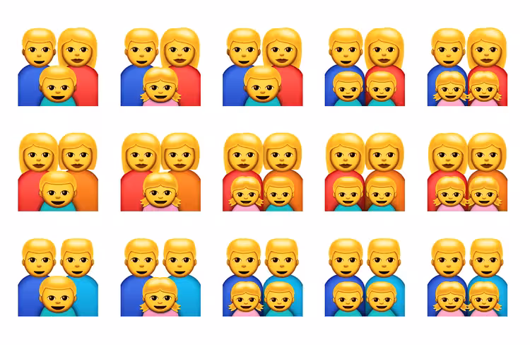
Another prominent example is the emojis with different skin tones and family compositions to make all users feel included and recognized. A milestone for bringing more diversity to our interfaces, but still a work in progress.
Do all your icons mean the same thing across different cultures?
By making our products inclusive
Whenever a user has to input a personal data, from a name to a profile picture, we can’t simply assume that all the names are like “John Doe” or that every user will upload a hip B&W profile picture. How many last names can someone have, if at all? How long can it be? Will the photo work with the color element of the page? If we are doing something clever with the photo, like a filter, will it work with every skin color?
There are even more complex questions like gender and ethnicity. Because someone’s identity can be anywhere in a broad spectrum of variables, the input provided needs to be mindful about it. Facebook, for example, lets the user customize the gender and nicely asks which pronoun they prefer.
Every day we design digital products and interfaces that prompt users to identify themselves using pre-defined categories provided by the system. It is part of our responsibility as designers to create mechanisms and design solutions that enable less binary, more flexible, and more inclusive denominations.
— Fabricio Teixeira
To solve this issue, we need to step back first. How is that information going to be used throughout the product experience?
Identity questions add a cognitive load and unnecessary discomfort for the user. For example, I don’t expect Mint, my finance management app, to know my gender or ethnicity. Removing unnecessary question fields is still the best way to respect someone’s time, effort and privacy.
However, let’s say that your website will use that information in a meaningful way. Then, it needs to be clear to the users why and how this information is going to be used and, of course, provide a meaningful array options for them to choose.
What personal information are you requesting from users? Are all of them really necessary? How can you make sure it covers a diverse range of answers?
By removing bias from the user’s behavior
We have talked about our biases as designers, but we also have to take into consideration that our users have their own bias.
Because the concepts of inclusion and diversity are still not fully understood and followed in our society, it is likely that a user, many times unconsciously, might be using your product in a harmful way to others. This is especially true if your product has any social interaction, like online games, social networks or even an e-commerce marketplace.
In the past years, companies started to realize that they have a big responsibility on this journey, especially as they learn that it can harm their businesses profitability as well. The neighborhood social network Nextdoor, is already an iconic example of it:
As Nextdoor has become one of the places where neighbors talk about how to make their local communities better, it is natural for the issue of race to be discussed and debated. But it’s not acceptable when mentions of race take the form of racial profiling.
Racial profiling runs counter to everything that Nextdoor represents. Over the last year, we’ve made a number of significant changes to our product to address it, including a new racial profiling flag on posts, updates to our member guidelines, and a mandatory warning screen before posting in Crime and Safety.
— Nextdoor’s blog
After a research paper from Harvard pointed out the racial discrimination is an issue in the sharing economy business, Airbnb, a leading company in this market, made inclusion and fighting bias one of their goals:
We have clear goals: we want to eliminate unconscious bias in the Airbnb community and fight discrimination. Airbnb has demonstrated the ability to bring people together and make it easier for more people to explore the world and we’ve seen how the simple act of sharing a home can unite people from all walks of life.
It’s a tough, ongoing, battle, but it shouldn’t hold us from using technology to build communities.
When designing for social interactions, we need to question and consider how a user generated-content or action can be negatively perceived by others. And keep an eye on user’s reports, keywords and other signs that can help you identify any issue in our platform.
Does your product have a clear mission and guideline for making its community respectful and inclusive? Are you looking beyond just quantitative metrics to understand how people are using your platform? How else can you check and measure the health of the user’s interactions?
Get the TNW newsletter
Get the most important tech news in your inbox each week.