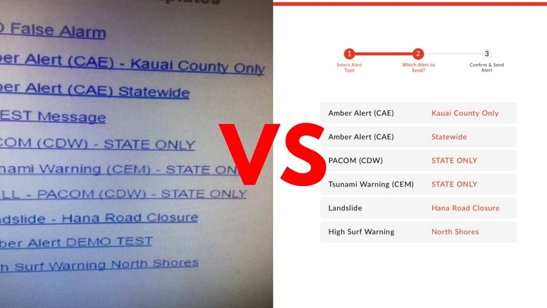
Honolulu Civil Beat managed to get a screenshot of the system that was used to accidentally launch the wrong emergency alert. It’s an absolute mystery why such a high-impact task has an absolutely horrible interface:
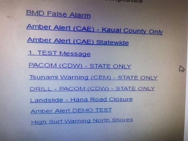
As a UI designer, I was stunned and embarrassed that these types of interfaces are out there. A bad interface can cause harm to people.
So I decided to spend the evening redesigning the part of the Emergency Alert System’s UI where the decision is made to send an alert.
Here’s my suggestion:
- Instead of hiding such an important action somewhere in a drop-down menu, there needs to be a clear call to action in the interface to kickstart the process of sending an alert:

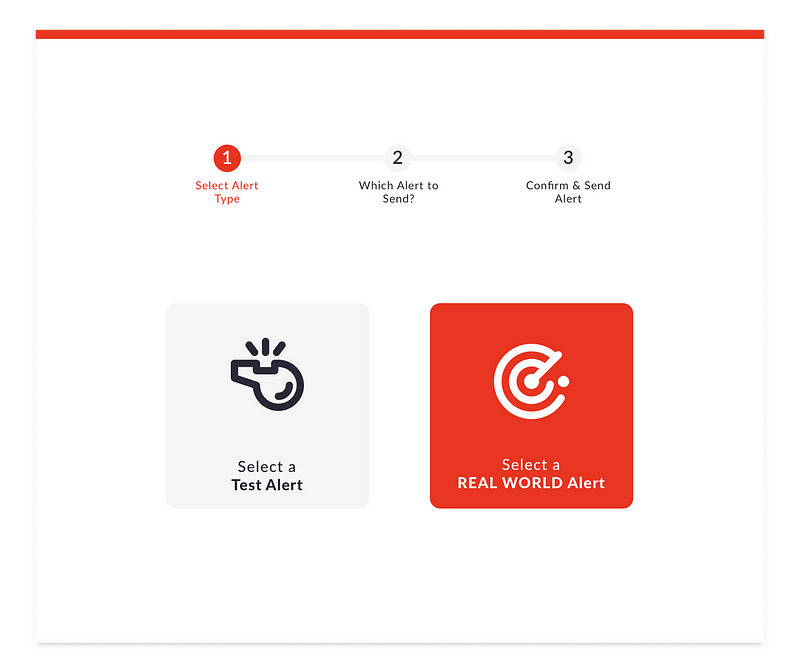
2. Now that the decision is made to send an alert, it’s key that we guide the user through the process carefully and decrease any chance of human error. First, we separate the test and drill alerts from real-world emergencies:
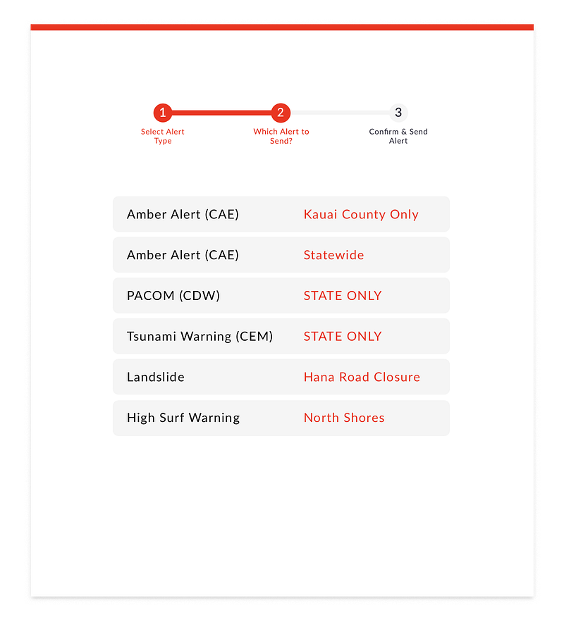
3. Now that the user has made a deliberate decision to send a test or a real-world emergency alert, we show the options:
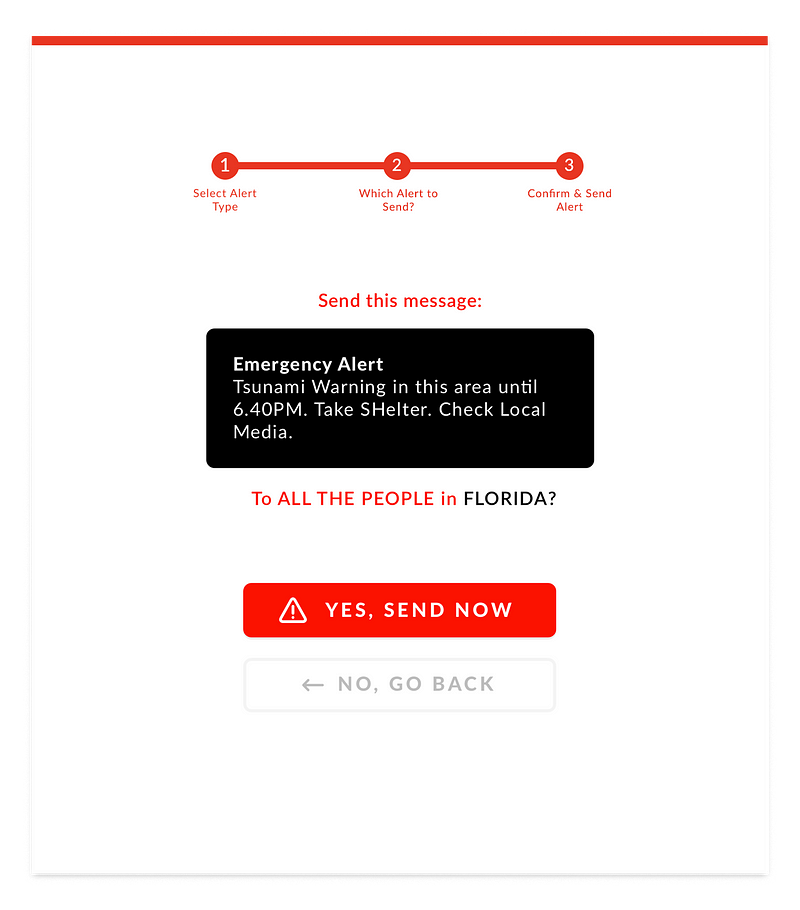
4. Finally, before confirming and sending any alerts, let’s first preview the exact message & make it crystal clear who the recipients are. The user can go back and make a change, or confirm & send the message.
As an Interface Designer, it’s usually my goal to remove as many steps as possible between the users and their objectives. But with interfaces like these, where human error can cause major problems, the key is to focus on clarity.
Is this ‘the perfect design’?
No.
This was done in an evening, with zero user testing or feedback loops. There are lots of ways to refine it, but it’s a start.
So… For all the Emergency Alert systems out there, feel free to copy and mostly: improve any of these proposed ideas and make them part of your interfaces.
Let’s use design to make the world a better place.
This story is republished from Hacker Noon: how hackers start their afternoons. Like them on Facebook here and follow them down here:

Get the TNW newsletter
Get the most important tech news in your inbox each week.


