The concept of “embracing failure” is big in the tech industry. Fail fast, fail often! is almost an industry mantra. But there’s an everyday type of failure that doesn’t get much attention in the product development process.
That’s right. The humble error message.
Why error messages matter
We’ve probably all seen an “incorrect password” error once in a while (or, um, daily). While it can be frustrating when things don’t work as expected, we usually just brush it off, no big deal. But what’s the cumulative effect of these small moments?
Each error message is a tiny roadblock that gets in the way of what we were trying to do. Depending on the context, an unhelpful message can be the difference between continuing or giving up. There’s even some research to suggest that there’s a physical stress response: error messages can raise cortisol levels.
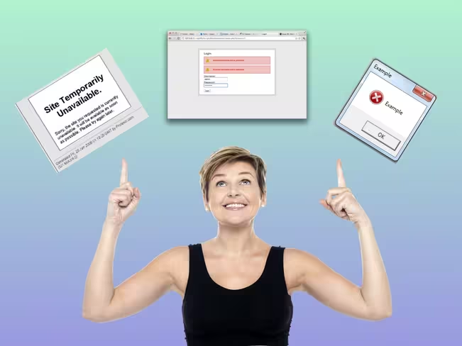
Just think of the difference between seeing something like this:
And seeing something more actionable, like this:
So what can design teams do?
If you’re a writer, designer, or developer working on an app, you can help reduce your users’ frustration by being more thoughtful about the errors you display.
To start, ask yourself if you even need the error message. Before writing anything, consider if there’s a way to redesign the experience so there’s no error at all. Is there a way to just make it work? (Really, the best error message is no error message.)
But if you do need it, think carefully about the message. When things go wrong and the app “fails,” say something useful. The message should help the user solve the problem and move on.
Tips for writing helpful error messages
If you can’t fix the underlying issue and need to show an error message, here are some things to keep in mind.
1. Say what happened and why
A lot of error messages are vague. Really vague. When possible, be clear about what’s going on. Give the right amount of detail, but don’t get too technical. Write in a way that anyone could easily understand. Ahem. That means no jargon.
Imagine you see an ad about oh, say, Spotify Premium, and you click on the link to start a free trial. Then, you land on a page and see something like this:
It’s not clear why you’re ineligible, especially since you just got an email saying, “Hey, get this thing.” What’s the deal?
In this case, it’s important to tell the user what happened (they’re ineligible) and why (they signed up for a free trial before).
And yes, this message did get longer — but sometimes we need to addinformation to make it useful.
2. Suggest a next step
After you say what happened, tell the user what they can do to resolve the issue: include a button, link, or another type of call to action. And write a clear headline that gets the point across quickly.
Imagine you want to look for some new podcasts. You fire up the app, and see an error message that says:
This tells you that something went wrong, but it doesn’t suggest a next step. It’s better to include a clear headline (App is out of date) and call to action (the download button).
3. Find the right tone
As UX writers, we want to convey the right information at the right time. But it’s not only about what we say, it’s how we say it. When it comes to tone, we try to find the right balance, or as we say in Sweden, lagom.
Tone refers to the character or the attitude of the language. Within the same brand voice, your writing can take on a different tone depending on the situation. It can be more serious, or neutral, or friendly—it all depends on who you’re writing for, and what you’re writing about. You vary your tone constantly—just think about the way you talk to your friends, your parents, or your boss.
OK. So how do you choose the right tone? You can start by asking yourself:
- How might the user feel in this situation? If it’s a stressful or serious issue, then a silly tone would be inappropriate.
- Would you actually say this? Reading the message out loud can help you pinpoint words or phrases that need to be revised.
- Bad request. Password supplied is invalid. → Words like “bad request” and “supplied” make it sound robotic.
- That password doesn’t match. Try again? → This one’s pretty clear and approachable. Nice.
- Problemo! The password you provided doesn’t match. Wanna try that again → Would you actually say this? It’s a bit too silly.
These three messages communicate the same thing, but the tone is different. When you’re writing an error message, choose the tone that best fits the audience and context.
A quick recap
When it comes to a good or bad user experience, the difference is often in the details. Writing clear error messages can reduce frustration and help people continue using your app or service. So it’s worth it to give these little guys some love.
The next time you’re writing an error message, keep these tips in mind:
- Say what happened and why
- Suggest a next step
- Find the right tone
And lastly, don’t forget to read the message out loud and take out any pesky jargon words.
We’d love to hear what you think. If you have more tips or different approaches writing error messages, please share in the comments!
Bonus: If you’re just getting started as a UX writer, or your team doesn’t have a dedicated writer, here’s a one-page guide to common types of error messages and how to write them.
Get the TNW newsletter
Get the most important tech news in your inbox each week.