Annotating and notating websites are an important thing for designers and developers when building together, especially if you don’t work together in the same office. Similarly, when you want to point something out on a page to someone, taking a screenshot can be a pain.
The company behind the Axe App is ZURB, whose goal is to help people build awesome products online. We’ve covered some of its services before, such as the popular notation sharing site Notable. It was built specifically for the iPad but works on all tablets.
I spoke to ZURB Marketing Lead Dmitry Dragilev about the launch today. I asked him about the product side of the ZURB business, and was told that the company plans on releasing a few more apps this year, and some of them will be paid. Axe is a free app.
ZURB also provides consulting and training services that are focused on “helping people design for people”. We can see why Axe is a nice app to add to your designer toolkit, as it help you collaborate on finding the right design for your audience. Using your finger to circle something or draw an arrow to something is a lot faster and more intimate than simply using Photoshop or another image editor to annotate something to communicate to your team.
Using Axe to share your thoughts about a web page
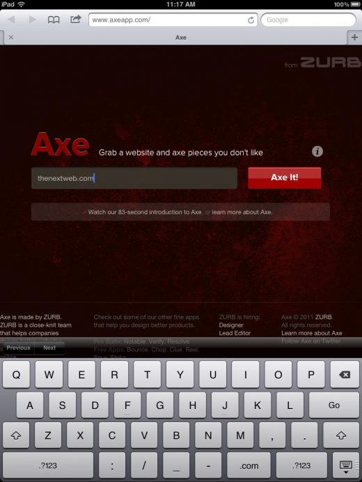
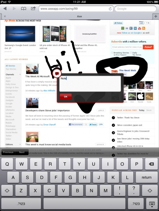
By visiting http://www.AxeApp.com, you can simply enter the URL of the site that you wish to mark up. Once the page loads, you can simply use your finger to notate, and hold your finger on a section of the site to add an actual note that is stored by Axe. Once you’re done annotating, you can share this with anyone that you like via email. A URL is sent to them and they can visit the site with your notes. It’s that simple.


The app also let you add your Axe annotation to your Notable account if you have one. If you don’t have an account, it has a free option for you to give it a try.
ZURB has created a video to show you Axe in action:
When asked why Axe was built for the web and not a native App Store app, Dragilev responded simply:
We just didn’t want to make people download and install stuff
Axe is smooth, runs beautifully on the iPad, and makes you think that you’re running a robust native app. Design should be made for people, and the people doing the designing should have simple tools to make things better. ZURB has most certainly done that with its latest launch, Axe.
Get the TNW newsletter
Get the most important tech news in your inbox each week.


