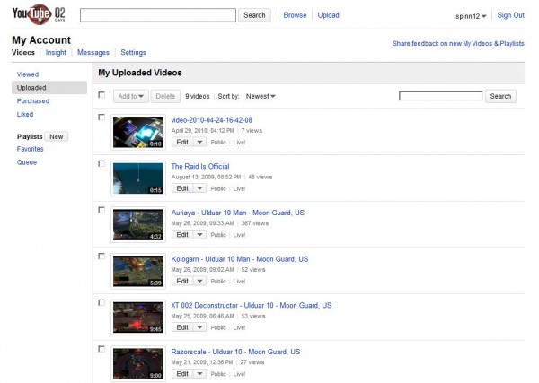
In typical Google-property fashion, the rollout is coming somewhat slowly. However, for those who have it, YouTube’s new design on the My Videos page is looking pretty slick:

In the Support Forum, there’s a pretty great rundown of the new features, but the reaction appears mixed, so far, with a healthy dose of “YouTube-style” comments thrown in from the pre-teen crowd.
*** New access to Insight (and Promoted Videos) info:
To access Insight or Promoted Videos info, just click the Arrow on the right hand side of the “Edit” button, and you’ll be able to access Insight or Promoted Video stats/campaigns.
*** We’ve centralized the way you can find the videos you’ve viewed over in the navigational column on the left-hand side of the page. Including…* Uploads
* Viewed videos
* Purchased videos
* Liked videos
* Playlists
* Favorites
* Quicklist (Queue)
What are your thoughts on the new look? Better or worse than before? Personally, I really liked the slimmed down tone, overall.
Get the TNW newsletter
Get the most important tech news in your inbox each week.


