YouTube annotations – often useful uploader addendums, other times annoying distractions. Today though, the video platform is announcing a new and improved tool: cards.
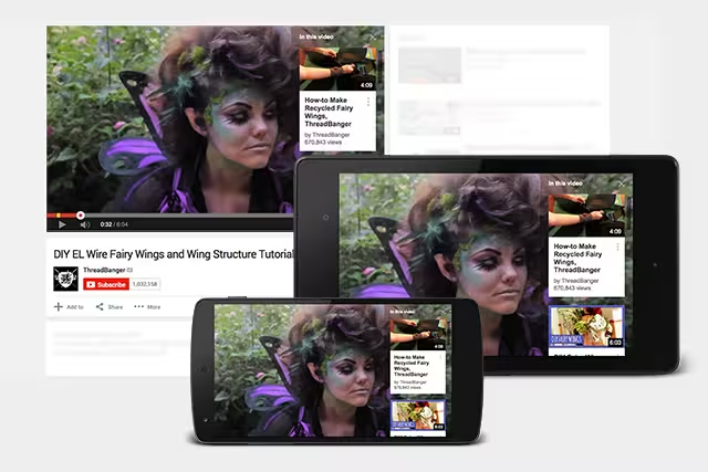
Cards are like interactive annotations that allow creators to add outside links and images in addition to information. Like annotations, they can be set to pop up at any time. The most important change however, is perhaps that they finally make in-video notes from the uploader viewable on mobile devices.
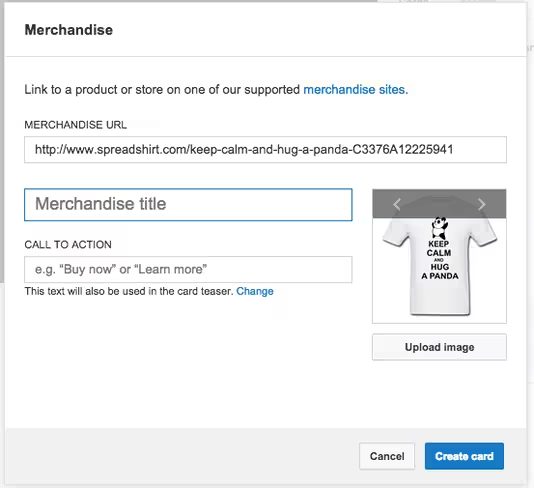
There are currently six card types covering merchandise, fundraising, video links, playlist links, associated websites and fan funding. Uploaders will see a new “Cards” tab in the video editor where they can set them up, and can view stats for them in YouTube Analytics.
Each type of card has its own settings. Merchandise cards let viewers add images, a merchandise URL and a call to action, while fan funding cards allow viewers to donate to creators right in the video itself.

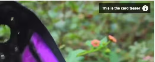
Cards will show up first as a small pop-up at your designated start time. Users can then click on the teaser to see more information. 
An information button will remain throughout the video; viewers can click on this to see all the cards in a video at once. These will work in livestreams as well as pre-recorded video.
Though replacing annotations is the eventual goal, that’s not happening yet – cards can’t quite do everything annotations can. You can’t choose their size or exactly where to put them, for instance (they all show up on the right edge), they’re limited to five per video and you can’t set your own colors.
YouTube also currently recommends creators not point to cards within their videos, as their location will change slightly depending on which device they’re viewed on.
Still, it’s a useful addition that will relieve many a confused mobile commenter who can’t see annotated corrections from uploaders.
➤ Make your videos even more interactive with cards [YouTube Creators Blog]
Get the TNW newsletter
Get the most important tech news in your inbox each week.


