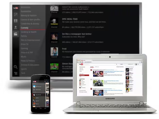
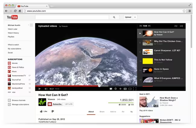
YouTube has released new features designed to help make it easier for viewers to subscribe and watch channels on its site. Part of this effort is the expansion of its Guide feature, which now reaches across multiple devices. Additionally, the service is rolling out a new look to the site that it says is cleaner and simpler.
With channel subscriptions, YouTube has been focused on helping users to discover new videos. Although rolled out five years ago, it was last year when the company made it easier for people to subscribe by adding the Guide on the homepage.
As you may have seen, when you add subscriptions to your Guide, it shows you videos related to what you’ve seen before. Now, the Guide follows you across all of your devices, including Android, iPhone, iPad, Playstation 3, Google TV, and more — never again will you need to remember what channel had your favorite video.
There are over 4 billion hours of video watched on YouTube alone each month. Within the last year, the number of users subscribing to channels has doubled, and the company is estimating that an additional 30% rise is to be expected. In other words, managing subscriptions is definitely important.
With over 800 million people visiting the site each month, discovering videos isn’t enough — YouTube is also rolling out a new layout where its “crucial elements” are up front and center: the video is at the top of the page with the subscribe button, social actions, and video info are below it. This places the emphasis on the video content, and nothing else. Your playlists are also available on the right-hand side so you can navigate through other videos as well.
It appears that YouTube had been making some design changes to the service for a while now. As TechCrunch reported, a YouTube spokesperson stated that “with more videos coming to YouTube every minute, we’re always experimenting with ways to help people more easily find, watch and share the videos that matter most to them. As always, we’ll consider rolling changes out more broadly based on feedback on these experiments.”
For those participating in the YouTube Creators program, a resource to help users create better content by taking advantage of the service’s tools, there are at least three things to note about what the new design means: the Guide is everywhere and will promote channel activity to fans, the video now becomes center stage on the viewing page, and lastly, it’s now easier for fans to subscribe along with what it calls “enhanced channel recommendations”.
Photo credit: ERIC PIERMONT/AFP/Getty Images
Get the TNW newsletter
Get the most important tech news in your inbox each week.
