
Yahoo continued its corporate and product revamp today by rolling out an entirely new layout for Yahoo News, which slims down the sidebar and places greater emphasis on featured articles in the central column.
Noted by TechCrunch, the various sections are still listed down the left-hand side of the page, although the typeface is cleaner now and everything generally looks far less archaic.
Three news items are displayed right at the top, with a larger one taking the lead and two smaller ones bolted on the side. Photographs are given more space to breath and this helps the trio of featured articles really come to the fore. Headlines are clear and there’s even room for a sub-header on the lead story, dragging the homepage up to date with most modern newspaper sites.
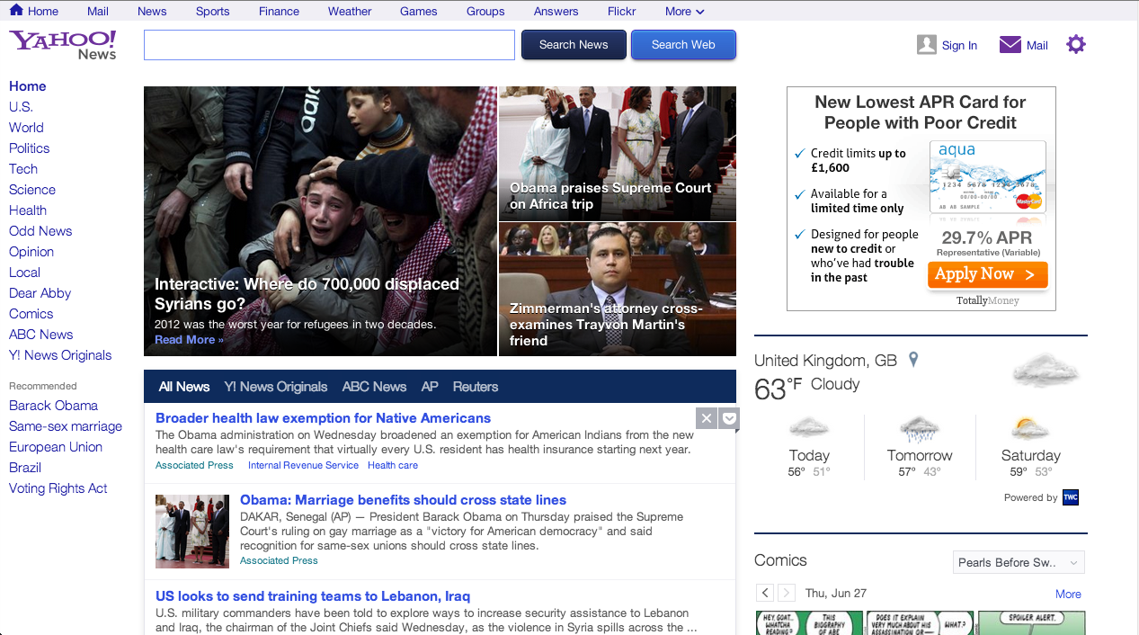
The column underneath lists all the available news stories for that day. Yahoo has a small team producing its own editorial content, but the company still relies on heavy syndication from the Associated Press and Reuters. The balance here is illustrated more clearly than ever before, thanks to a number of corresponding filters at the top of the feed.
The news stream is also customizable; users can roll over the story with their pointer and click the cross symbol to dismiss it. Yahoo will ask the user if they want to receive less stories on a number of relevant stories, effectively curating the coverage shown to the reader. The topics are served up automatically, so Yahoo is clearly categorizing these stories in one way or another.
The news feed supports a number of different story types. Most show a very small thumbnail image next to the clickable headline and the opening line of the article, but the site also supports gallery-led stories and pieces with a single, albeit much larger image.
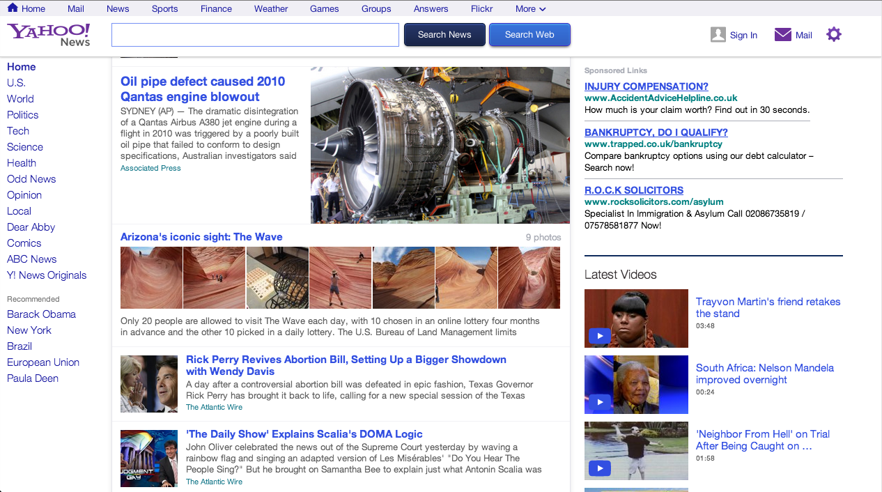
Popular videos are listed on the right-hand sidebar, but feel a tad buried under the adverts, weather information and sponsored links above it. Yahoo would be wise to move this higher, although it would inevitably reduce its advertising opportunities.
The new design is being introduced in the United States first and foremost, although it’s already live in the United Kingdom too. It’s an improvement on the previous iteration, but there’s still a huge amount of work that can be done to take the design further.
It’s another small step forward for Yahoo. We just can’t wait to see them running at top speed.
Image Credit: Justin Sullivan/Getty Images
Get the TNW newsletter
Get the most important tech news in your inbox each week.